Canary Yellow & Indigo
Feeling courageous? Make bold canary yellow your living room's focal color! Indigo tones down this powerful hue while giving it an inviting feel. Try adding texture and pattern to your palette by introducing a shibori throw or pillow as your indigo accent. For extra impact, paint a complementary statement wall for a unified, well-rounded look that shines.
More photos after this Ad
Hot Pink & Turquoise
Surprisingly versatile, this bold color combo works well with a number of design styles. Think a bold pop for southwest patterns, or a striking splash in a midcentury space. This combo is playful and bright, yet a trend you’ll still love mixing and matching next season.
More photos after this Ad
Crimson & Sage
Soothing earth tones get a jolt of energy when paired with a bright red rug. This contrast creates a happy balance, especially when there are patterns and textures involved. The key to this color combo is to anchor the floor with the bolder color so the room doesn’t feel too busy, keeping the walls airy and light.
More photos after this Ad
Vibrant Blue & Yellow
More hip than highlighter, this electric pairing makes a big impact without being overwhelming. This duo looks especially stunning when paired with neutral tones such as black and white.
More photos after this Ad
Mustard & Salmon
Warm, golden mustard gets a punchy pop when paired with salmon. These colors work well together when combined with a cool tone such as navy. When playing around with a triad of tones, try choosing them from a large statement piece, such as an area rug, for a pulled-together palette.
More photos after this Ad
Grass Green & Tangerine
When paired with other bold tones like blue and tangerine, grass green walls evoke the feeling of a tropical getaway. In this space, these vibrant hues bring a contemporary look to a built-in bookcase and a mix of traditional furniture pieces upholstered in unlikely textiles.
More photos after this Ad
Periwinkle & Fuchsia
Add a fun splash of color to an all-white room with this pink and purple palette. Bright fuchsia pops against the soothing periwinkle, making this room feel energetic yet refined.
More photos after this Ad
Photo: Jacob Hand Photography
8 / 40
Emerald & Cantaloupe
Pale yellow and orange can sometimes feel drab and lost in a room - that is, until you give them a daring backdrop of luscious emerald. These colors contrast in a dynamic way, making for an energetic sitting area that exudes creativity.
More photos after this Ad
Bubble Gum & Black
Precious pink gets a modern makeover when paired with a striking black wall. These colors set the stage for neutral tones and a mix of eccentric patterns that make this room feel exotic but not overly wild.
More photos after this Ad
Blush & Sky Blue
Popularized by Pantone in 2016, this blush and blue pair feels serene and stylish while playing nicely with warmer tones such as orange and yellow. This look is as mellow as modern can get, and we love it!
More photos after this Ad
Olive & Magenta
Olive no longer feels stuffy when matched with lively magenta. This punchy pink brings new life to the classic green and feels especially playful when mixed with bold patterns like chevron and stripes.
More photos after this Ad
Cobalt & Berry
Playful yet sophisticated, these colors will instantly infuse personality into any room. Not into purchasing such a bold piece of furniture? Try out the look with a colorful tapestry tacked to the wall and make over your room in minutes. For extra punch, showcase these colors with a few additional throw pillows.
More photos after this Ad
Granite & Green
Grays and greens are quite a handsome duo! Whether you’re looking to create a light-filled lodge or a dapper reading nook, these colors can bring on the cozy without feeling tired.
More photos after this Ad
Navy, Coral & Goldenrod
Playful fabrics and finishes in a trio of stimulating colors make this eclectic living room feel stylish, not stuffy. Try echoing one of the colors around the entire room with accents (in this case navy), which will tie the whole look into a more cohesive, less chaotic space.
More photos after this Ad
Photo: Tessa Neustadt
15 / 40
Lilac & Leopard
Let it be known that animal print is indeed a neutral, and it should be considered its own color as well! It pairs well with almost every palette but looks especially elegant when layered over lilac, a hue that can immediately wake up even the smallest of spaces.
More photos after this Ad
Emerald & Cadet Blue
A wash of blue makes this room - and its elegant emerald chairs - feel more relaxed. Use this color palette to bring a casual look to traditionally formal fabrics such as velvet.
More photos after this Ad
Citrus, White & Chrome
Minimalist rooms boasting mostly white and chrome can feel cold and stark. Create a softer surrounding by bringing airy tones of citrus into the mix. Like the perfect golden hour moment that lasts all day long, this combo is as chic as it is calming.
More photos after this Ad
Primary Pop
Liven up a space by introducing bright, bold primary colors in the form of repeating patterns. By splashing one or two of the colors on statement window treatments or artwork, you’ll create a cohesive look that’s not too intense.
More photos after this Ad
Rust & Rouge
Rust is having a major moment in design, and we can see why. Warm and inviting, this color looks dashing when paired with complementary hues of pink and orange. Modern monochromatic at its best!
More photos after this Ad
Sage & Ivory
A palette of pale sage and crisp ivory can transform a room into a spa-like sanctuary. If painting the entire floor sounds intimidating, try layering light green rugs for a similar effect. The key to achieving this serene look is to keep the furniture and accents neutral, while allowing a few plants to add movement to the space.
More photos after this Ad
Slate & Marigold
A moody backdrop of slate blue gets a pick-me-up from pops of warm marigold. This room proves that you can go minimal with your color accents while still making a big impact.
More photos after this Ad
New Wave Neutrals
Who says neutrals can’t be dramatic? Brighten up beige and wood tones with a brush of sky blue, proving that even the subtlest color additions can make a stylish statement.
More photos after this Ad
Photo: Graham Joyner, Metal + Petal
23 / 40
Poppy & Robin’s Egg Blue
Cool, robin’s egg blue cabinets perfectly balance the bold, poppy-colored accent chairs and wallpaper in this room. This warm red is best used as an accent to not overwhelm a space.
More photos after this Ad
Violet & Gunmetal Grey
Vibrant violet wakes up this room, while moody gray adds a sophisticated edge. The color combo brings out the hues in the bold floral accent wall, creating a space that’s eclectic yet pulled together.
More photos after this Ad
Sherbet & Sea Glass
Shades of sherbet spring to life when paired with green and blue hues of sea glass. Whether you introduce these cool tones as artwork, accessories or even a tiled fireplace mantel, they’ll bring a refreshingly hip touch to a posh parlor.
More photos after this Ad
Ballet Slipper Pink & Teal
The lightest of pinks balances out the colorful palm wallpaper that blends shades of teal together. Keeping the wallpaper to one accent wall allows the pattern to enhance the space without overwhelming it. Natural woods and warm tans add warmth to the palette.
More photos after this Ad
Midnight & Scarlet
One step into this moody abode and you're instantly enveloped in a sea of blue from floor to ceiling. Breaking up the primary hue, but with no less intensity, is a deep, saturated red. Oversized florals punctuate the walls, and a scarlet armchair and throw pillows create a noteworthy juxtaposition to the sectional and ottoman.
More photos after this Ad
Orange & Blue
As complementary hues on the color wheel, orange and blue are favorites of sports teams and kids' spaces — though not typically seen in sophisticated living areas. However, this living room shows how shades of blue and just a touch of orange make for an elegant and inviting palette.
More photos after this Ad
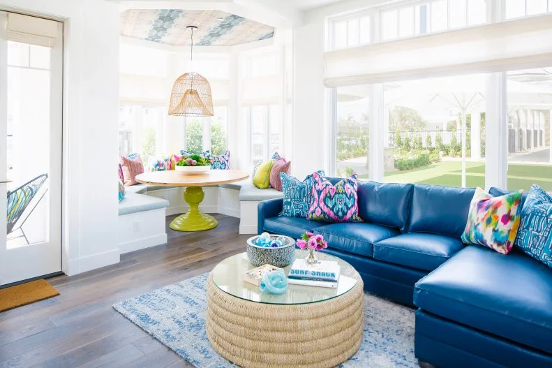
Lime & Egyptian Blue
Brilliantly bold, this living space not only combines two striking shades — bright yellow-green and radiant blue — but it also pulls in vibrant ikat and graphic prints. Large windows and white walls flood the space with natural light to neutralize the abundance of color and pattern.
More photos after this Ad
Mauve & Dusty Blue
Although nothing may be more unexpected than a giant buffalo head above your fireplace, this vintage color combo shows it can still pull off a fresh, modern vibe. Low-slung furniture with unconventional silhouettes give the entire space an eclectic, yet unified atmosphere that's a fun mix of cozy and retro.
More photos after this Ad
Shamrock & Tan
The two-toned chaises longues grab your attention with a shocking jolt of green. Typically, the vibrant shade would be paired with white to create a counterbalance, but this rustic living room uses hues of tan and brown to offset the eye-catching green.
More photos after this Ad
Chocolate & Pastels
The thought of chocolate and pastels may conjure up visions of Easter baskets, but here the combination equates to a warm-meets-light living space. The deep brown of the fireplace surround is picked up in wood detailing and the window treatments, while soft hues of pink, blue, gray and cream round out the rest of the scheme.
More photos after this Ad
Rose & Prussian Blue
Jewel tones abound in this dramatic living room. The deep blue sofa paired with rose red armchair create a striking combination. The color scheme is continued on the wall with a dramatic floral wallpaper paired with a painted blue ceiling.
More photos after this Ad
Teal & Garnet
Notes of blue-green and dark red infuse the whitewashed brick and neutral sofa with color in this living space. The cool and warm shades play off each other and create a lively energy.
More photos after this Ad
Aqua & Gray
Soothing shades of aqua and gray are a cool combo, especially for a sun-drenched living space like this beachside escape. Moments of navy blue throughout the room add depth to the color scheme.
More photos after this Ad
Daffodil & Black
The never-ending versality of a black-and-white scheme means it works with any hue. We love how this spot takes inspiration from the bumblebee by incorporating a subtle yellow into the contrasting palette.
More photos after this Ad
Indigo & Teal
Panels of indigo-dyed fabric establish wavy backdrops to stunning black-and-white photography in this cushy theater room. To keep the room from feeling too neutral, graphic-patterned teal armchairs take the overall energy of the space up a notch.
More photos after this Ad
Royal Blue & Gold
Board and batten walls, woven furniture and driftwood decor are all hallmarks of beachy design – as is anything in blue and white. To glam up the traditional take on nautical style, try chic metallics, such as these hammered gold coffee tables.
More photos after this Ad
Chartreuse & Pink
The perfect mix of green and yellow, chartreuse is a cheerful pairing with classic pink. In this contemporary living space, the ebony walls really allow the artwork and furniture to pop.
More photos after this Ad
Merlot & French Gray
Blue-gray walls set the scene for this calming sitting area, while the jewel-toned sofa strikes a contrasting note. Geometric pillows deliver the two hues to the elegantly cozy armchairs, and a faux animal-hide rug grounds the space in natural texture.