Next Up

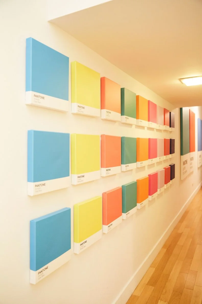
Pantone's Color of the Year Through the Years

December 15, 2021
Follow Caroline on:

Color us curious, but we created the ultimate Pantone Color of the Year inspiration gallery. Here, you'll find every single one of Pantone's past picks. Let's take a trip back in time, shall we?

Price and stock could change after publish date, and we may make money off these affiliate links. Learn more.
Photo: Stephanie Diani
Scroll For More Photos
1 / 24

Let's Get Colorful

Every year since 2000, Pantone Color Institute graces us with the annual Pantone Color of the Year. And every year since 2000 we get excited — not because we can’t wait to redecorate in Pantone’s COTY, but because the chosen tone puts a magnifying glass up to what’s happening in society. It makes us think. It gives us a close-up of what the next year will look like in terms of interiors, fashion, beauty and design. So, while we wait patiently for Pantone to kick off the coming year’s color conversation, we’re taking a look at all of the past picks.
More photos after this Ad

2 / 24

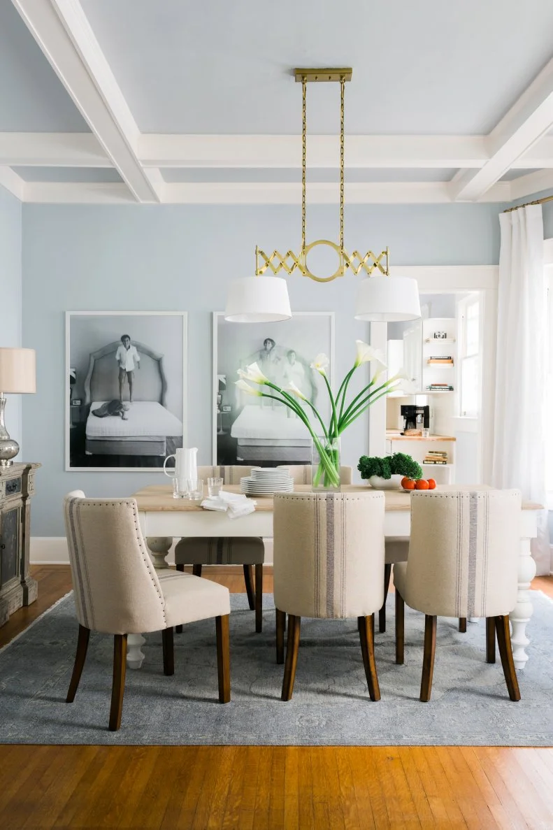
2000: Cerulean Blue

When Pantone released the first-ever Color of the Year in 2000, the world was on the precipice of a new era. There was uncertainty, and sky blue Cerulean (15-4020) suggested inner peace and spiritual fulfillment in the new millennium, according to Pantone. Plus, physiologically, looking at the color blue reduces blood pressure. Seems like Cerulean is a color we can all get behind — even today!

More photos after this Ad

Photo: Ryan Garvin. From: HGTV Magazine
3 / 24

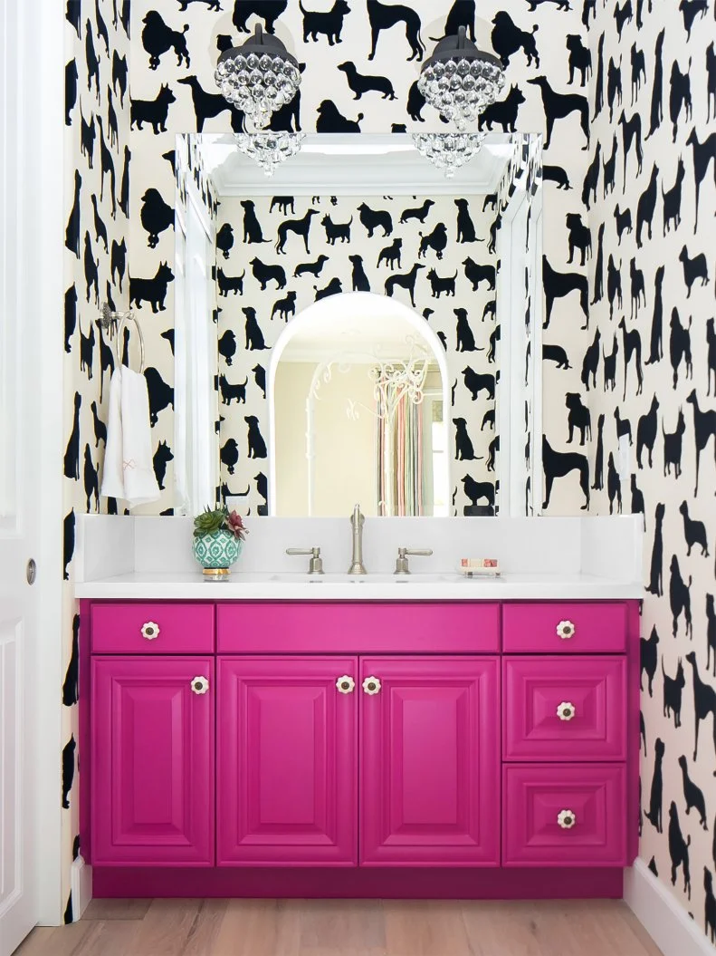
2001: Fuchsia Rose

Straying far from Cerulean in 2001, Pantone experts went with bright Fuchsia Rose (17-2031) for the second-ever Pantone Color of the Year. And what’s not to love? This powerful shade summons femininity and sensuality.

see more photos

More photos after this Ad

Photo: Photography: Durston Saylor; Design: John Beckmann, Hannah LaSota . From: Axis Mundi
4 / 24

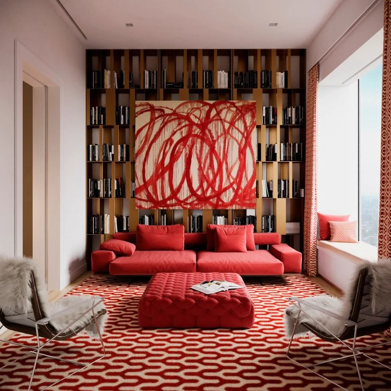
2002: True Red

For Pantone’s third Color of the Year back in 2002, the Institute chose True Red (19-1664), a vivid hue we all associate with passion, power and love. We recommend showing off True Red in airy, open spaces in your home — a sitting room, perhaps?

More photos after this Ad

Photo: Havalah Carlson. From: HGTV Magazine
5 / 24

2003: Aqua Sky

Aqua Sky (14-4811)’s eminently calming presence was no accident. Cooler than other blue-greens and (per its namesake) reminiscent of the sky on a cloudless day, Pantone picked this hue in hopes of infusing 2003 with serenity.

see more photos

More photos after this Ad

Photo: Courtesy of Thibaut ©
6 / 24

2004: Tigerlily

Subtle and exotic, Tigerlily (17-1456) stole the show in 2004 when the Institute named it Color the of the Year. And this reddish orange color is still trendy and fresh. Try sprinkling it through your space with poppy accessories: pillows, lampshades, dried flowers.

More photos after this Ad

Photo: JENNA PEFFLEY. From: HGTV Magazine
7 / 24

2005: Blue Turquoise

Pantone moved right across the color wheel in 2005, taking on Blue Turquoise (15-5217) as the official Color of the Year. Similar to 2003’s Aqua Sky (but a tad darker), this nature-inspired shade has us dreaming of the ocean. Gentle waves and a cool breeze? We’d put this shade just about anywhere — in particular, on kitchen cabinets or the walls of a main bathroom.

see more photos

More photos after this Ad

Photo: Tracey Ayton. From: HGTV Magazine
8 / 24

2006: Sand Dollar

Back to neutral in 2006 with Pantone’s Sand Dollar (13-1106), an organic shade that evokes the subtle warmth of desert sand. It’s rich yet light, and back in 2005 it spoke to the organic movement relevant to health and diet, but also home, fashion and beauty. Pair it with crisp white for an all-around neutral look, or make it pop against light blues.

see more photos

More photos after this Ad

Photo: Brittany Ambridge. From: HGTV Magazine
9 / 24

2007: Chili Pepper

This spicy hue can’t be ignored, which is exactly why Pantone plucked Chili Pepper (19-1557) out of the mix to dub it 2007’s Color of the Year. Back then, social media was just getting started and this deep red shade oozed the confident, outgoing and design-savvy attitude of personal expression. Besides home design and fashion, World Wide Web users may have used this shade on the social media platform of the time. MySpace, perhaps?

see more photos

More photos after this Ad

Photo: Jane Beiles. From: D2 Interieurs
10 / 24

2008: Blue Iris

Combine calming, deep blue with spiritual dark purple and you’ll get Pantone’s 2008 Color of the Year: Blue Iris (18-3943). Dependable, strong and soulful, this particular shade of blue is meant to anchor us. For an extra-tranquil mood, try pairing it with lighter purples, creams and grays.

More photos after this Ad

Photo: Luke Cleland. From: HGTV Magazine
11 / 24

2009: Mimosa

Maybe the best color to-date, warm and engaging Mimosa (14-0848) brought the optimism in 2009. According to Pantone, “Mimosa speaks to enlightenment, as it is a hue that sparks imagination and innovation.” Sipping on a mimosa can certainly spur optimism, so imagine decorating with Pantone’s Mimosa. You'll create a super-sunny space.

see more photos

More photos after this Ad

Photo: Mark Molthan, The Page Agency
12 / 24

2010: Turquoise

Turquoise (15-5519): Maybe you picture a tropical island … or even a crisp, cloudless sky. Either way, Pantone’s 2010 Color of the Year is inarguably a calming, relaxing shade we’d happily paint onto the walls of our bathrooms, bedrooms or sunrooms. According to Pantone, this hue offers an escape. So, why not get lost in its inviting, comforting depths?

More photos after this Ad

Photo: John Cole. From: HGTV Magazine
13 / 24

2011: Honeysuckle

Captivating and stimulating, 2011’s hue Honeysuckle (18-2120), “emboldens us to face everyday trouble with verve and vigor,” according to Pantone. It’s a hot hue with a delicate name, but somehow it just makes sense. Use Honeysuckle to liven up a small bedroom or a powder room.

see more photos

More photos after this Ad

14 / 24

2012: Tangerine Tango

It’s dramatic yet seductive, and emanates the energy Pantone thought everyone needed heading into 2012. That’s right: It’s high-impact Tangerine Tango (17-1463), a coveted, energetic color we still love to use in home design today. Why not try incorporating orange accessories throughout your space? We’re talking pillows, lamps, whatever you love! Plus, tangerine really pops against its opposite, turquoise.

See More

More photos after this Ad

15 / 24

2013: Emerald

We all need a little luxury, and in 2013 luxe entered our lives by way of majestic Emerald (17-5641). This powerful color is lively, radiant and bold — meant to enhance well-being, balance and harmony. Add some sophistication to your space with emerald chairs, dark-green-painted kitchen cabinets or a green velvet couch.

More photos after this Ad

16 / 24

2014: Radiant Orchid

While 2013’s Emerald served as a symbol of growth and prosperity, Radiant Orchid (18-3224) sparked imagination. We’re talking expanded creativity and originality, which, according to Pantone, was a vital part of 2014. And what better way to flex creativity than a little home revamp?

More photos after this Ad

Photo: RACHEL McGINN. From: HGTV Magazine
17 / 24

2015: Marsala

It’s dramatic, yet grounding, which is why Pantone chose earthy Marsala (18-1438) for its 2015 Color of the Year. Pantone describes it as naturally robust — like red wine! — so what's not to love? This special shade also translates into fashion, beauty, and of course, home design. Make Marsala sophisticated and organic with a matte finish or add sheen for a super-sleek look.

see more photos

More photos after this Ad

Photo: Design by Simone Haag in collaboration with Nathan + Jac; Photo by Eve Wilson
18 / 24

2016: Rose Quartz and Serenity

In 2016, Pantone shocked us all with two different shades. An ode to mindfulness, Rose Quartz (13-1520) and Serenity (15-3919) offer an escape from the stresses of everyday life. Both hues are, according to Pantone, “welcoming colors that psychologically fulfill our yearning for reassurance and security.” For a tranquil space, pair Rose Quartz and Serenity with sage greens or silver grays.

More photos after this Ad

19 / 24

2017: Greenery

Pantone’s 2017 COTY, Greenery (15-0343), hit 2017 like a breath of fresh air. Vivacious and invigorating, Greenery’s restorative and natural qualities remind us all to take a step back into nature. Though the shade evokes connotations of warm, breezy spring weather and lush vegetation, rest assured: Greenery is “trans-seasonal,” pairing well with neutrals, brights, deeper shades, metallics and even pastels. Fun fact: Greenery was almost named Pea Soup, but it didn't quite have that fresh, nature-y feel — so, Greenery it was!

More photos after this Ad

20 / 24

2018: Ultra Violet

Experimentation and unconventionality abound with Pantone’s 2018 COTY: Ultra Violet (18-3838), a mystical, extraterrestrial shade symbolic of possibility. Pantone dubbed it a peaceful escape from “today’s over-stimulated world." So, naturally, it works well in gathering or meditation spaces (Pantone recommends using purple-toned lighting).

see more photos

More photos after this Ad

Photo: Kim Cornelison (Styled by Elizabeth Demos). From: HGTV Magazine
21 / 24

2019: Living Coral

Amidst a world run by phones and technology, Pantone introduced 2019’s Living Coral (16-1546) as an authentic and spirited solution to the digital movement (which has slowly consumed our brains). Vibrant and mellow, this tone pairs well with blues and greens to provide a nurturing color palette that offers comfort in a “continuously shifting environment.”

See More

More photos after this Ad

Photo: Erin Kestenbaum
22 / 24

2020: Classic Blue

Solid and dependable, 2020’s Color of the Year Classic Blue (19-4052) is a hue we can rely on, according to Pantone. This steady shade of blue is reflective, anchoring and self-assured. It’s relaxed and restful — exactly what we needed to get through the ups and downs of 2020. Plus, it’s totally timeless.

See More

More photos after this Ad

Photo: Jeff McNamara. From: HGTV Magazine
23 / 24

2021: Ultimate Gray and Illuminating

Surprise, there are two 2021 hues — because we all needed some extra color in our lives as we left 2020 behind. The combo is one part Ultimate Gray (17-5104), a strong and sturdy shade of gray, and one part Illuminating (13-0647), a warm yellow hue that oozes positivity. Together, these colors are meant to fortify and inspire; embolden and cheer-up; ground and assure.

See More

More photos after this Ad

Photo: Jenna Peffley. From: HGTV Magazine
24 / 24

2022: Very Peri

For the first time ever, we were given an entirely new hue for the Color of the Year. Yes, Pantone invented a brand-new color for 2022, and the vivifying violet with electric red undertones is called Very Peri (17-3938). Of course, the nature of Very Peri’s conception represents its importance. The color reflects global innovation and transformation. It's both consistent and exciting, highlighting the possiblitibies that lie before us. Basically, it's the most promising shade of periwinkle around.

see more