Ugliest House in America — 2024 Edition
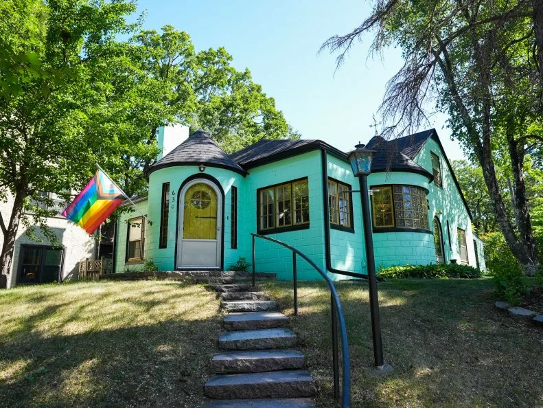
Ordinarily at HGTV, we specialize in beautiful, skillfully designed spaces and inspiring homes. But when it comes to the Ugliest House in America, it's all about seeking out and celebrating "ugly" — then fixing it. During Season 5, Retta traveled across the United States looking for the most unattractive, dysfunctional and bizarre homes. She found what she was looking for in a St. Cloud, Minnesota, home, which featured a patchwork of strange design, weird construction and questionable color choices.
More photos after this Ad
First Impressions
Then Retta enlisted the assistance of Alison Victoria, host of HGTV's Windy City Rehab, to undertake a bold and ambitious $150,000 makeover of the off-kilter home. Fear not: We'll get around to beautiful pictures and captivating spaces eventually, but first, get ready to feast your eyes on some seriously egregious design don'ts and certifiable top-shelf ugliness. Here, Alison and Retta survey the kitchen and other interiors at this year's prizewinner before renovations begin. So, how ugly can one house get? We'll show you.
More photos after this Ad
Joe and Jack's Amazing Technicolor Nightmare
Prior to the renovation, Alison and Retta met with homeowners Joe and Jack (L to R) to review some of the house's many offending attributes. Jack and Joe bought the house sight-unseen for the asking price of $250,000. They were looking for a home that stood out in the neighborhood, and the distinct and unique exterior appealed to them. Once they got ready to move in — and saw the interiors — buyers' remorse began to set in.
More photos after this Ad
Before: An Eye-Catching Exterior
Joe and Jack's 2,017-square-foot home was built in 1940. Though it boasts attractive twin turrets, the structure is built almost entirely out of cinder blocks — and soon became known in the neighborhood as "the concrete bunker." (Or simply as "that weird house.") The exterior paint color was left over from the previous owners. Is it teal, aqua, turquoise or mint? We're not certain.
More photos after this Ad
Before: Pink, Pink and more ... Pink
The front room was multipurpose and featured a lot of built-in sitting spaces and a lot of pink — as seen here in the rotunda-esque breakfast-nook and pink-cushioned window seat. The entire space boasts cranberry pink wall-to-wall carpet, as well as two additional shades of pink paint on the wall (dusty rose and rosewood). The interior walls, by the way, are just painted cinder blocks — no paneling or drywall.
More photos after this Ad
Before: The Kitchen
The home's tiny kitchen is located off this narrow hallway, which features the home's ad hoc color palette of teal, brown and pink. The surface of the kitchen's kidney-shaped peninsula juts out substantially into the hallway.
More photos after this Ad
Before: The Basement
The semi-finished basement boasts antiquated composite tile floor, exposed pipes and ductwork painted canary yellow.
More photos after this Ad
Before: Upstairs Living Area
An upstairs lounge is a jungle themed guest space and is festooned in aquamarine wall-to-wall carpeting, glass-brick interior walls, acoustic tile ceilings and outer walls painted in a sort of burnt mustard yellow.
More photos after this Ad
Assessing the Damage
Following Retta's tour of the interiors, she described the home prior to renovation as a "technicolor prison" and a "crime on the senses." Of all the homes on her Ugly Houses tour, this one tipped the scales in the key categories of "Ugly," "Un-functional" and (not in a good way) "Surprising."
More photos after this Ad
Have We Met?
Retta addresses the elephant in the room — a dayglo-clad mannequin who resides in the living room. With his red feather boa and bedazzled headwear, he's featured prominently in the space. His name is Lance.
More photos after this Ad
Alison's Elegant Renovation
Welcome to the exterior of Jack and Joe's new abode. Freshly painted in bright white with black trim and accents, along with freshened up landscaping, the house actually takes on a normal, even stately, appearance. (The arched doors are painted a pale mint green in homage to the home's former, and locally famous, odd green exterior.)
More photos after this Ad
Before: An Intense Welcome
The front entrance to the home is via an arched doorway in one of the two turrets. Prior to the renovation, the foyer was home to an odd and impractical curved bench seat, and the walls were painted in a retina-searing yellow.
More photos after this Ad
After: A Charming Entry and Foyer
Alison's updated design for the foyer included a softer ambiance and drywall covering for the former cinder block walls. The curved bench is replaced with subtle decorative furnishings for a more inviting first impression. Alison opted to keep the arched door but painted it in fresh white, which is pleasingly offset by a cool gray, textured wallpaper.
More photos after this Ad
Before: A Too-Tight Layout
Most of the furnishings throughout the home are too large in scale. Their sectional sofa, for example, has a footprint that takes up about half of the living room's space. As such, what would seem like a spacious spot to relax instead feels overstuffed, tight and claustrophobic.
More photos after this Ad
After: Modern With Traditional Touches
As in the foyer, Alison gave the living room's cinder block walls an upgrade with new drywall painted in fresh white. She installed new wood flooring throughout the renovated space for a consistent look and enhanced flow. A feature wall at the end of the room — painted in a contrasting shade — offers added enhancement with built-in bookshelves and a decorative mirror.
More photos after this Ad
After: A Black-and-White Color Palette
Other highlights in the new living room include wall treatments that combine textured wallpaper and tile as well as a working gas fireplace. Modern style furnishings, a plush white area rug and recessed lighting all help transform the room into a chic and elegant living space.
More photos after this Ad
Before: Cramped and Cluttered
A banquette dining area was located in the living space but felt confining and was separated from the kitchen by a wall.
More photos after this Ad
After: An Open Floor Plan
Alison removed the wall to facilitate an enlarged kitchen, which now opens into the living room and banquette dining space. The modifications create a fresh, clean and open feel. Uniform flooring and a cohesive color palette give both spaces an entirely airy and new ambiance.
More photos after this Ad
Before: Disco Cook Space
The kitchen, which featured a palette of mint green and (yet another) shade of pink, could have served quite suitably as a set for Pee-Wee's Playhouse. The room's footprint was only 48 square feet — not exactly sufficient for a functional chef's kitchen. Its entry, situated between the curved peninsula, cabinets and pantry door, was a tight squeeze at just 22 inches wide. The pantry featured a drop-down ironing board in lieu of food storage and, when extended for use, blocked most of the kitchen's usable workspace. A number of the upper cabinet doors were loosely attached and improperly aligned. The space also contained no less than 26 drawers, but each drawer was too tiny to use. In a novel (and questionable) appliance arrangement, the oven was installed stack-style above the dishwasher. Dated linoleum tile in a checkerboard pattern of black, white and (you guessed it) pink covered the floor.
More photos after this Ad
After: Chic and Elegant With Custom Touches
The kitchen underwent a complete overhaul and bears almost no similarity to what was there before.
More photos after this Ad
After: Neutral Colors and Added Texture
A wall was removed and replaced by a cased opening that flows into the living room. A more reserved color palette, custom accent lighting and overhead fixtures with globe shades give the whole space a radically new feel.
More photos after this Ad
After: Upgraded in Style and Function
Alison also added a proper and sizable kitchen island with a generous work surface, an integrated range and ample kitchen seating. Other new additions include all-new appliances, custom cabinetry and manufactured stone countertops.
More photos after this Ad
Before: Deep in the Heart of Texas?
The main bedroom came with a hodge-podge of bright and primary colors, and a wall mural of the Texas state flag left by the former owners. (It should be noted that Texas is more than 1,000 miles from St. Cloud, Minnesota.) The bedroom also had a water leak that resulted in damage to the ceiling and insulation.
More photos after this Ad
Before: Trapped Among Cinder Blocks
Despite the bright colors, with its cinder block walls, cement floors, drop ceiling and industrial lighting, Retta and Alison both characterized the bedroom as feeling like a prison cell. The existing "walk-in" closet runs lengthwise behind the bedroom wall and is essentially an oblong, inordinately narrow and practically inaccessible space.
More photos after this Ad
After: A Tranquil Space to Relax
Consistent with the rest of the reno, Alison installed flooring and drywall in the bedroom and repaired the ceiling. A sliding door replaced the old bedroom window, providing direct access to the yard and an adjacent patio. And because Jack and Joe had an affinity for mannequins (see "Lance," featured in slide 10), Alison wanted to give them a unique and unexpected gift in the form of some new friends.
More photos after this Ad
Before: A Too-Bright Bathroom
The home's main bathroom was a tight 30 square feet and had a shower but no tub. The ceiling was acoustic tile and the walls were covered in 1950s-era laminate. Located directly adjacent to the kitchen, entry to the bathroom was through a cobalt-blue shower door repurposed as the bathroom's entrance. A backsplash above the sink was made from the same embossed blue glass.
More photos after this Ad
After: Expanded and Spa-Like
An unused closet space was eliminated to allow the bathroom to be expanded enough to add a tub — one of homeowner Jack's main requirements for the reno.
TOUR THE SEASON 4 MAKEOVER
More photos after this Ad
Before: A Turquoise Terror
The turquoise toilet is mounted lower than standard height, and plumbing pipes are exposed — and painted in a matching shade.
More photos after this Ad
After: Elevated, Earthy Style in a Main Bathroom
Besides the new tub and the white porcelain toilet, the bathroom got a whole new look with walls painted a tranquil shade of gray, an elevated-rustic wooden door with a frosted glass insert and a large double vanity.
TOUR THE SEASON 3 MAKEOVER