See Inside Michel Smith Boyd and Anthony Elle’s ‘Rock the Block’ Season 4 House
Luxe for Less hosts Michel and Anthony brought sexy, mountain-modern style to Colorado with a luxurious Rock the Block makeover that used every bit of their budget-savvy brilliance.


Photo By: Gilles Mingasson
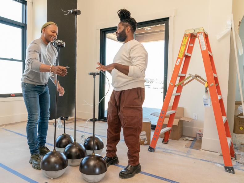
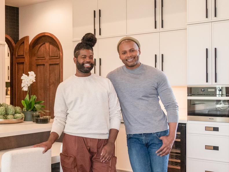
The team: Michel and Anthony
Designer Michel Smith Boyd (right) and couturier Anthony Elle (left) from Luxe for Less elevate cost-conscious creativity to an art form. On Rock the Block’s fourth season of competition, this makes them the duo to watch. “I think the other teams might underestimate us,” Michel said when he arrived. “Luxury for us means knowing how to spend the money and how to create an experience. I’m a designer by trade, and I specialize in luxury, and I can’t wait to deliver that to Rock the Block.” Anthony is also confident his skill set will keep them ahead of the curve: “As the DIY maker with a background in couture design, I’ve got us covered — and that keeps our budget in check.”
see more: Rock the Block
From the Runway to the Hallway
The scenic town of Berthoud, Colorado, has never seen competition on this scale. Teams will compete to make the most of identical homes with an initial appraisal value of $1.9 million, and they’ve got budgets of $250,000 apiece to make the magic happen. Michel and Anthony have that magic well in hand: “We’re fashion boys, so [we know] if it’s happening on the runway today it will trickle down to interiors in the next year. So mountain modern is what we’re doing in this home, and together we’re unstoppable,” Michel said. “Nobody else is going to bring as much sexy to their house as us. You know, Page [Turner] and Mitch [Glew], they’re cute. The island renovators [Bryan and Sarah Baeumler]? They’re cute. And the farmhouse people [Jonathan Knight and Kristina Crestin] are lovely. But sexy? That’s us.”
The Kitchen, Before
The first order of business in the kitchen: much-needed innovation for the lackluster island. Inspired by Michel’s own kitchen, they planned to create a dual purpose, bi-level island installation with a waterfall edge that featured a counter-height prep area and chairs at table height. They budgeted $65,000 of their budget for the first week of renovations: “We’re going to make that 65 look like 100, and I stand by that,” Michel said.
The Kitchen, After
Michel and Anthony spent $8,260 on herringbone hardwood floors with rich natural graining, then complemented that warm tone with durable porcelain for the island and countertops that rang in at $4,500 less than they would have spent on marble. “It’s just a beautiful blend between the wood finish as well as the porcelain,” Anthony noted. Along the kitchen’s rear wall, in turn, they made a graphic statement by transitioning from the porcelain backsplash to crisp black tile that frames the range hood beautifully.
Next-Level Design
With the money they saved using porcelain in lieu of marble, Michel and Anthony were able to splurge on a 60-inch Ilve range. “If you’re gon’ get a range,” Anthony said, “get a range.” That choice and their sleek, sculptural island design delighted judges (and Season 3 competitors) Dave and Jenny Marrs. “Your kitchen has so many textures ... It was such a tactile experience and in such a good way,” Jenny said.
The Dining Room, Before
Like their fellow competitors, Anthony and Michel knew success in the dining room hinged on making the most of its spectacular view of the Rocky Mountains: “It looks like a painting,” Anthony said. They planned a monochromatic, minimalistic palette that would let the landscape speak for itself and decided to forgo window treatments that might interrupt appreciative viewers.
The Dining Room, After
Anthony and Michel chose a gorgeously grained dining suite with contemporary curves and a warm tone that harmonized with their hardwood floors. Alabaster in their sconces and pendant infuse the space with buttery light.
All in the Details
Anthony and Michel devoted $7,580 of their budget to a downright spectacular suite of arched doors crafted by a local carpenter and installed between the kitchen, pantry and mudroom. “There’s no way you can go past these doors and not go 'oh my god,'" Michel said. Dave reveled in the gorgeous carpentry: “A round door is so hard to do well,” he marveled. “And oh my god, look at that profile — you guys nailed it! Statement pieces like this door — they add value.” Looks like Michel was proven right.
Spectacular Storage
Michel maximized functionality in the pantry by carrying rich, stained shelving up to the ceiling and installing a library ladder for accessibility (and visual impact, of course). “You’re designing for a specific buyer — for a family this really wouldn’t work well — but it feels luxurious [and] I think it’s just beautiful,” Jenny said. “It’s a very hard home to leave,” Dave agreed.
See the Winning Design: See Inside Jonathan Knight and Kristina Crestin's 'Rock the Block' Season 4 House
The Entryway, Before
Space planning is Michel’s forte, and he brought every bit of his expertise to bear in designing an introduction to this home. “We want to paint this entire space with one beautiful fashion stroke,” he explained. “What we did in [the] dining [room] and kitchen will continue over in the living[room] and the foyer. We want to create a narrative from the second you walk into that front door all the way through the house, and it doesn’t have to cost a lot of money. You’ve just got to know where to place that money.”
The Entryway, After
Michel and Anthony’s crisp, contemporary color story begins at the front door and flows through the foyer space, where architectural black railing and darker flooring give way to the herringbone hardwood they installed throughout the main areas of the first floor. Touchable textiles like the olive-green velvet on the sofa and the armchair’s pale, plush faux fur draw visitors into the living room.
A Powder Room With Perks
Knowing luxury can be synonymous with space, Michel and Anthony pushed the powder room wall back three feet into the garage — a strategic move the judges appreciated. They committed $2,640 of their budget to the dramatic wallpaper they chose for the space, then compensated for the spend by tackling its installation. “Usually we hire someone to hang the wallpaper. However, a little elbow grease can save us a ton of money,” Michel noted. “And that’s how we’re able to deliver a luxury look that’s far better than any of the other teams,” Anthony said.
The Living Room, Before
“So in this living room, I just feel like we should have some texture on top, too,” Anthony noted. “Are we going to do that little … beam thing?” “That would be expected,” Michel replied. “Maybe we can do something else from Colorado. It’s called beetle kill wood, it comes in tongue-and-groove [pieces] so it’ll fit together, and we can go all the way across [the ceiling].”
The Living Room, After
By using a dramatically dark stain on their beetle kill ceiling planks (which rang in at just $4,160), Michel and Anthony got what they call “that super chic look without paying chichi prices. “We love dark colors. They’re masculine and modern. It’s a real look-for-less moment,” Michel said. A combination of recessed lighting and a contemporary chandelier pop against that deep tone, and the high-contrast moment of the upper portion of the fireplace meeting the ceiling emphasizes the space’s awe-inspiring architecture even more.
Mountain-Modern Masterpiece
The commitment of $13,230 to this monumental linear fireplace with graphic, symmetrical veining was a power move Michel didn’t blink before making. “The showstopper in our living room will be this linear fireplace covered in porcelain,” he said. As in the kitchen, his choice of porcelain rang in at less than a similar treatment in marble and delivered a jaw-dropping moment that infuses the first floor with elegance. A pair of mirrors atop the mantel reflect the high-contrast beetle kill ceiling.
The Main Attraction
Michel and Anthony replaced the living room’s French doors with accordion doors that fold back to present the Rockies as a living art installation (and facilitate indoor-outdoor living, of course). The swivel chairs before that panorama are no accident: “You can have a conversation with people inside or with the people outside, “Michel explained.
The Judges Weigh In
No Demo Reno star Jenn Todryk came to Colorado with Good Bones phenom (and battle-tested Season 1 Rock the Block competitor) Mina Starsiak Hawk to turn a critical eye on the second week’s spaces. “This is a vibe,” Mina noted. “This is sexy bachelor man vibes, that’s what I get.” “You know [who] you’re talking to?” Michel replied. “Two sexy bachelor man vibes!”
Michel and Anthony’s investments in the ceiling and fireplace paid off. “I loved that when you walked in you felt like you were in this crisp modern space, you got the view, you instantly looked up because of the [ceiling],” Jenn said. “It was dark. It was bold. It was a really good choice. I love how y’all thought about decor placement and how there was the symmetrical fireplace and the mantel — I loved that, I think it was very well thought out.”
SEE THE WINNING DESIGN: See Inside Page Turner and Mitch Glew’s ‘Rock the Block’ House
The Main Bedroom, Before
After two weeks without a win, Michel and Anthony knew they had to make a power move to clinch victory — and so they did. “Can I tell you fresh out the gate the first thing I’m clocking? Same views, but it doesn’t feel as open,” Anthony noted when surveying the principal bedroom. “What if we took the French doors from last week that were in the living room and we brought them in here?” Michel asked. “That would open up the view even more. And maybe a back deck we could extend across the length of the main bedroom.”
“A wraparound deck is definitely a splurge. However, it’s gonna be worth it when it comes to adding value to our main bedroom,” Anthony said.
The Main Bedroom, After
Behold Michel's masterpiece in paint: “In the bedroom I was originally going to paint a mountainous kind of landscape, but with [host] Ty [Pennington]’s design surprise challenge and us getting these saddle blankets” — a characteristic-of-Colorado material they needed to highlight in their home — “it would have felt like a dude ranch if we had mountains on the wall and plaid on the bed,” he said. With the hand-painted ombre effect he chose instead, “those two tones will be a much better backdrop, and since I’m painting the walls myself, we’re also saving on labor.” Michel carried the treatment across the ceiling to enhance the room’s intimate feel.
“I think it was a moment for us to pivot together,” Anthony said. “The blankets are coming together beautifully; we selected three different colorways, and they still have this level of drape to them, which I love.”
Views You Can Use
Once Michel and Anthony committed $11,500 of their budget to the deck extension, the bedroom’s Cinderella story was underway. “Dude, that deck went up fast!” Michel marveled. “Literally, one day we didn’t see it and the next it was just there,” Anthony agreed. “It’s exactly what we needed for this view!” “How do you own this house with these views and not have the opportunity to step out?” Michel asked.
The Main Bath, Before
“I am underwhelmed,” Anthony "Demolition Man" Elle noted. “You already know my favorite thing to do.” Michel did indeed: “Blow out the wall! I love that. Maybe we can expand the bathroom into the closet, but we can also expand the closet into the laundry room [and] do some custom cabinets all the way up to the ceiling.” They also planned to move the bathroom entrance and create a wet room in lieu of a traditional shower.
The Main Bath, After
Glow-up, anyone? Michel and Anthony’s star material makes another appearance in the bath suite — this time, to the tune of $18,500 — but its effect is undeniable. “When it comes to our main bathroom, that porcelain might as well be currency because it is good. It’s worth every dollar, man, it’s so good,” Michel said. “And using porcelain like we did in the kitchen gets a gorgeous, marble-like look at almost half the price.”
“It did consume half our budget, but I think it was well worth it,” Anthony said. “It is luxe.”
Fashionable Functionality
Spare porcelain from the bath suite makes a countertop cameo here in the glamorous walk-in closet, where a stacked washer and dryer offer the luxury of hassle-free laundry. Graphic, masculine wallpaper gleams in the light from a sculptural chandelier, while custom cabinetry adds sleek storage.
The Main Suite Faces the Judges
Twin sisters, Unsellable Houses hosts and Season 3 Rock the Block main suite winners Lyndsay Lamb and Leslie Davis came to Colorado to evaluate Anthony and Michel’s work — and, to put it mildly, they liked what they saw. “Holy moly, look at this,” Leslie exclaimed. “I love everything!” The porcelain went over very well: “Our floors are the same as our walls — I’m going to have to find a negative somewhere else, because it’s not in here.” “I love the floors. I’ve gotta touch ‘em,” Lyndsay said.
The Judges Declare Michel and Anthony the Winners
Needless to say, the win was theirs. “We frickin’ love your main bedroom and bathroom,” Leslie said. Lyndsay agreed: “The closet, your color choices, the wallpaper behind it, the functionality!” The ostensible risk of the addition paid off as well. “The other thing that you guys did that nobody else did, adding French doors and building a deck off the back — that was very, very smart, and I think it was a good value add for this home,” Lyndsay said.
Victory at last! “We were into this week,” Michel said. “Like, seriously into it. We were just designing like we had something to prove, basically. [Anthony’s] skill set showed up. Mine showed up, and the marriage was beautiful.”
VOTE: Pick Your Favorite Before-and-After Makeover From Rock the Block Season 3
The Lower-Level Sitting Room, Before
With a whopping, 1,500 square feet of area to design, Michel and Anthony’s week four assignment — their home’s entire lower level — represented Rock the Block’s biggest-ever challenge, quite literally. They seized opportunity to riff on their existing design and make themselves comfortable: “This is a fun space,” Michel said. “Upstairs is business, but downstairs I want to really just relax — so the relaxed version of the same [homeowner] may be, like, a different color. Maybe all the walls are gray, so immediately it feels a little bit cozier.”
The Lower-Level Sitting Room, After
Rich, caramel-colored paint spans the ceiling and establishes both a palette and the mood for this entertaining space. “I love hosting parties,” Michel explained. “I’m the house that everybody comes to, and so I love designing for that.” He knew that was all about “having everything at your fingertips [so that] everything you can think of that you might need to host well is there.” This central space at the foot of the stairs features a linear fireplace (which claimed $7,790 of their budget) framed with dark stacked stone and overlooking a conversation area featuring a cool, curvaceous sectional, chairs and coffee table.
On-Trend Treatment
Michel chose the long wall beside the ground level’s glass exterior doors to install one of his most compelling arguments to date for the power of design. These stunning panels have the look of tambour, a decorative treatment composed of closely spaced wood slats mounted on a flexible surface. “I am in love with tambour. It’s a super-contemporary and super-popular way to design right now,” he said. “The great debate on the block is: Does interior design add value? And my answer is: Duh. It definitely does! It’s hard to quantify it, but it’s a feeling, it’s intrinsic and if your buyer walks through your home and doesn’t feel anything, then you didn’t do your job.”
The Second Kitchen, Before
An essential component of hosting? Kitchen access, of course. “Having [a] second kitchen on the lower level [that] can service guests and the backyard is going to cost us a lot of money, but it’s guaranteed to bring us big bucks on the appraisal,” Michel noted. To that end, he envisioned outfitting the exterior wall with an accordion window that granted access to revelers on the patio: “It would almost feel like a pickup window, you know what I mean?”
The Second Kitchen, After
Anthony and Michel devoted $10,460 to creating a full ground-floor kitchen that felt every bit as luxurious as the one upstairs. Here, pale porcelain on the countertops and island features veining that echoes the tones on the walls and ceiling, and sleek, contemporary hardware ornaments the cabinets. The “seamless moment” they envisioned with the accordion windows required a bit of an edit because electrical codes required them to raise the sill 6” from the interior countertop — but the overall indoor-outdoor functionality remains.
Installation Art
Michel’s tambour moment was just the beginning of the ground-floor’s one-of-a-kind treatments. He and Anthony also installed a whopping 240 wine bottles on this backlit interior wall. “This is going to be the best wine rack you’ve ever seen in your life,” Anthony promised. “Our wine wall is an original idea,” Michel agreed. “Just to walk down and see that, it immediately says luxury. Hopefully our judges will love it.”
The Speakeasy, Before
Michel and Anthony aimed for an equally indulgent moment in the ground floor’s third major space. They spared no expense in planning a private "club" to impress prospective buyers. “The vibe we’re going for in our entire lower level is ‘afterparty,’ which is why the speakeasy is perfect, even though it may be a giant risk,” Anthony explained. “This space is going to be covered in design, from arches to a raised platform, but even that’s not all,” Michel said. “We have $3,000 to spend from our main suite win last week, and we’re splurging it all on wallpaper.”
The Speakeasy, After
Rich umber ceiling paint carries into gilded, geometric cork wallpaper in this spectacular space, where Michel installed a second, pebbled wallpaper in the arched, backlit bar to create the look of hammered bronze. Tufted floor cushions and a graceful sofa on the raised bar area echo the tones of the liquors decanted in crystal on a floating shelf, and a pair of deep green swiveling armchairs offer jewel-toned contrast below. Visitors access the speakeasy by pressing the framed canvas on the “wall” at the end of a short hallway and opening a hidden door. “What happens in our lower level stays in our lower level,” Michel said.
The Judges Pay a Visit
Anthony and Michel presented their work to Rock the Block royalty: Windy City Rehab’s Alison Victoria made her record-setting fourth appearance on the show to cast an appraising eye on contestants’ lower levels. Both she and fellow judge Veronica Valencia (host of HGTV’s Revealed, which will debut later this year) were ready to take up residence. “Sexy, sexy, sexy,” Alison said. “Just the vibe and the colors and the surprise — that was my absolute favorite part of the space. It was so well done, I just wanted to hang out there.” Veronica concurred: “I have two kids and I felt like I could move right in,” she said. “It made me want to get a fancy high chair or playpen!”
SEE THE WINNING DESIGN: See Inside Jonathan Knight and Kristina Crestin's 'Rock the Block' Season 4 House