22+ Trending Home Staging Tips From a Luxury Stager
These jaw-dropping, trend-conscious before-and-afters demonstrate how drastically a few strategic tweaks can affect a home’s appeal to buyers. Elevate your own staging game (and pick up styling tips) with designer Leia T. Ward’s boss-level moves.

Related To:

Photo By: Andrea Carson Photography
Photo By: LTW Design
Photo By: Dan Milstein
Photo By: LTW Design
Photo By: Dan Milstein
Photo By: LTW Design
Photo By: Andrea Carson Photography
Photo By: LTW Design
Photo By: Austin Eterno
Photo By: LTW Design
Photo By: Austin Eterno
Photo By: LTW Design
Photo By: Austin Eterno
Photo By: LTW Design
Photo By: Austin Eterno
Photo By: LTW Design
Photo By: Andrea Carson Photography
Photo By: LTW Design
Photo By: Andrea Carson Photography
Entice Home Buyers With Spaces That Feel Beautiful and Versatile
As the founder and principal designer of LTW Design — an award-winning staging design firm with celebrity clients like Bruce Willis and the New York Knicks’ RJ Barrett — Leia T. Ward knows her way around luxury properties. She also knows that making those properties irresistible to design-conscious visitors with generous budgets is all about emphasizing both their elemental appeal and how they can adapt to new occupants and trends.
"Many critics of modern spaces that claim minimalist spaces are cold may be surprised to learn about warm minimalism," Leia says. "While our brand aesthetic leans more minimalist, every project has warmth to it and we achieve this by weaving and layering textures throughout the rooms to create depth."
Consider how she’s deployed her minimalistic-yet-cozy aesthetic to polish up these big-ticket homes — and take note of her techniques for when it’s time to make your place look like a million (or 20 million) bucks.
Before: It’s OK to Acknowledge a Design Scheme Has Reached Its Past Due Date
This space (and its quirky corner cabinet) centered on enteraining has an era-specific look that’s less appealing to today's home buyer. “The family room was the main entertaining area for the former owner — a famous fashion model named Basha Szymanska,” Leia says. “She threw extravagant and glamorous parties for New York’s elite there back in the '70s and '80s. The high-gloss pink walls and ceiling were ‘it’ back in the day, but we needed to transform the space so that it speaks to the modern-day buyer while keeping its ‘entertaining room’ feel intact.”
After: Repainting Every Room Is Worth the Investment When it Comes to Selling Your Home
Leia knew the room’s intricate mantel — and the gorgeous hardwood beneath its busy carpet — would have major contemporary appeal. Once she had a sense of what she’d be keeping, she forged ahead on a major makeover that freshened up the entertainment area and created cohesion between it and the rest of the home. “We left the floors and fireplace as is and were able to use [Basha’s] live tree; however, we had the entire house painted [all 13,000 square feet of it!]. We felt this was definitely going to yield a high ROI and it did. Isn’t it amazing what just paint, furniture, a neutral color palette and new floor plan can do?!”
Before: Ornate and Busy Accessories Can Overwhelm Your Room
An intricate cabinet bursting with keepsakes, an overloaded mantel and a space-gobbling chandelier were smothering this dining area. Its storage wasn’t functional, and all those unnecessary details detracted from natural advantages like the massive footprint, the French door and the handsome mantel itself.
After: Keep Accessories and Visual Distractions to a Minimum to Play Up Your Home’s Advantages
Leia’s team “removed everything, had [the space] painted, changed the light fixture and brought in our furniture.” Breathing room itself is the wow factor here, and Leia chose furnishings that emphasized it. “The tall French door has a dramatic effect and we went for that vibe with the chandelier,” she explains. “We used a bronze and crystal modern glam feature that really gave a little excitement to the room without stealing the show.”
Before: This Home Study Is a Redundant Space and Needed a Design Makeover
This dim and somewhat haphazard room suffered from a crisis of purpose. “The study needed to be defined because it was just off a large office and we didn’t want it to feel like redundant space,” Leia explains. Moreover, recessed lighting and contrasting molding around the tray ceiling paired with an intricate pendant were oppressing rather than elevating the arrangement below them.
After: An On-Trend Mix of Black and White Paint and Modern Design Elevates This Study
The bold hue (Sherwin-Williams Tricorn Black) Leia selected for the walls, molding and built-in shelves “really separate [the study] and give it its own identity,” she says. A curvaceous white chaise and cowhide area rug counterbalance all those dark right angles, and whisking away the dated window treatments admits light and coaxes the eye upward. “All of these interior marketing strategies we implemented transformed the room from a small, awkward second office to a stand-alone desirable sun-filled study where buyers can envision themselves enjoying solitude while reading a book by the fire, looking out at the stunning grounds.”
Before: When Your Home Is a Blank Canvas, Embrace Minimalism in Staging
Leia prepared this home by highlighting its strengths with a delicate hand. “Designing the staging for this property was incredible because the home has an open floor plan, high ceilings and enormous windows throughout which provided so much natural light — which we love! The home was just built and had all of the modern luxuries and amenities you could dream of in a home,” she explains. “While most projects present some challenge during the process, this home did not.”
After: Choose Furnishings that Reference Your Home’s Setting on the Coast or in the Mountains
A property in the Hamptons should feel like an extension of the Atlantic coast, and that’s just the aesthetic Leia cultivated here. “We chose a monochromatic low-profile modular sofa to create a laid-back, luxe vibe that was both casual and chic. The home is just minutes from the beach so we wanted to incorporate soft and natural textures such as linen, wool and cashmere,” she says.
As for the sophisticated arrangement on the oversized coffee table, “it’s important to create varying heights and shapes and to lay items out from one end to the other to bring the eye across the whole table,” Leia explains. “I thought it was key to use curved vases to contrast/juxtapose the very sharp straight lines of the rectangular coffee table. And of course, repeating the color palette in the furnishings keeps everything consistent and pulled together to give that layered look.”
Before: How to Turn a Plain Basement Into a Cozy Hangout
Leia sought to highlight this cavernous ground-level space as both a place to entertain guests and a cozy spot for family to get casually comfortable. So-called "basement" rooms like this one [Leia and team prefer to call them "lower-level"] can easily devolve into catch-all, forgettable areas; it’s important to give them a few exclamation points.
After: Bright White Paint and Curated Bookshelves Made This Basement Space Design Forward
Wide, weathered wooden planks and a coat of bright white paint set the stage for what’s now an artistic, kid-friendly sitting area. “We chose these clean-lined white sofas and used a performance fabric that is easily cleanable,” Leia says. “[The clients] wanted some color so we decided to bring in navy in the custom linen and velvet pillows, the two navy velvet swivels chairs and a custom piece of artwork we had made specifically for this project.” She pulled together this stylish wall of books and curios with pieces her homeowners had on hand. “The bookshelves were filled with books they had collected over the years and wanted to keep,” she says. “We arranged them by color and they became part of the design and added the perfect pops of color.”
Before: A Dated Bathroom Suite Can Stunt Your Home Sale Price
If you opened the door to this spa-like arrangement in a hotel, you’d likely be delighted: it’s spotless, spacious and luxurious. Visitors at an open house, on the other hand, would think about the features and fixtures they’d want to rip out — and their interest (and your selling price) could plummet. “Renovating the bath was very important because it allows the sellers to ask a higher price for the house,” Leia says.
After: Bright White Paint and Minimal or no Window Treatments Create a Timeless Bathroom
Replacing the patchwork of pastels on the bath suite’s walls with a single, sun-loving paint choice was utterly transformative. “Bright white, and a lack of window treatments really made this bathroom feel larger,” Leia notes. A shapely standing tub, elegant herringbone marble flooring and crisp paneling replaced lackluster installations, but the vanity — with a liberal dose of that new white paint — was allowed back in.
Before: Paint Custom Dark Woodwork White to Broaden the Appeal of a Home Office
The warm coffered ceiling, paneling and flooring in this space were spectacular, but they weren’t to everyone’s taste. “The office was made of this beautiful Brazilian wood that was expensive when it was installed years ago, however, it just doesn’t translate to the modern-day buyer,” Leia says. “It’s definitely painful for clients when I tell them that painting their gorgeous wood white is on our to-do list but after I explain why, they are on board and most of all trust us. It’s not worth losing tens of thousands of dollars on an offer because the seller didn’t want to paint the wood white, and unfortunately that is a reality of what would happen because buyers often can't envision the space differently than what they see in front of them.”
After: A Clean, Monochromatic Black Floor and White Walls Make This Home Office On-Trend
The office looks every bit as opulent as it did before Leia’s transformation, and it’s now open-house-ready with a simple desk, chair and lamp. “Once we can remove the emotion out of the process and treat the home as a product we need to market, clients get it and are fully on board because they see we are on their team and we have the same goal… to get the highest asking price as fast as we can,” Leia says.
Before: Update a Dark, Stuffy Formal Dining Room With More Neutral Colors and Furnishings
Though gathering for meals has timeless appeal, formal spaces like this one are slowly going extinct in many homes and markets. “When we first saw this room it felt dark and very traditional,” Leia recalls. “[W]e knew the buyer for this beautiful spacious home would most likely be a young family and we needed it to appeal to that younger demographic.”
After: Lighter and Brighter Finishes Help This Dining Room Feel Fresh
This transformation is one of Leia’s all-time favorites. “A natural oak round dining table provided texture and warmth with the white walls and dining chairs we used,” she explains. “The starting point for this project was the walls. We worked from the shell inwards, so [we made over the] walls, flooring, cabinets, lighting and hardware first, then we came in and focused on floor plans, flow and furnishings.”
Before: Living Room Molding + Walls Painted Different Shades Can Feel Dated
In the absence of large-scale decorative elements to make them feel cohesive, the beige walls, cream molding and white ceiling in this sitting room are a bit haphazard. The fireplace’s veined stone and the unframed canvas leaning against the wall behind one of the sofas, in turn, are stranded in space without accessories to echo them.
After: Match Molding to Walls for a Stunning, More Contemporary Living Room
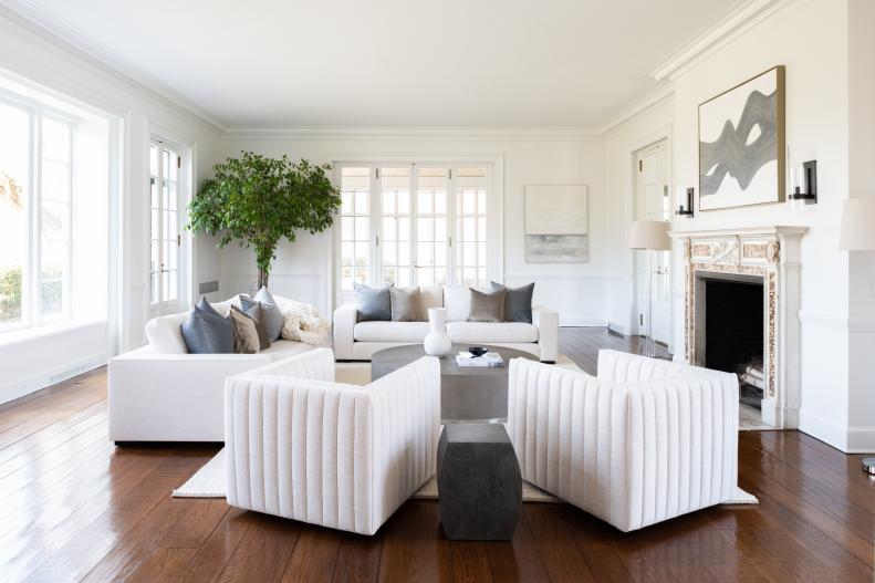
What a difference a paint makes. “We decided to paint the molding and fireplace surround to match the walls to create a seamless feel,” Leia says. “We didn’t want the eye to stop anywhere. For this project, we used our tried and true Chantilly Lace by Benjamin Moore. It is a clean white without any yellow, gray or blue undertones. She swapped out the too-busy fireplace surround, in turn, for a seamless piece of black slate.
Before: Make the Most of a Living Room's Built-Ins by Styling Them Carefully
Between blue-backed shelving hugging the windows, an upholstered seat surrounding the fireplace and a massive swath of undefined floor space, this room manages to feel busy and empty all at once. The older home it occupies has traditional features like lower ceilings, many rooms (as opposed to an open floor plan) and sloped floors — all characteristics that make it a challenging property for buyers comparing it to new builds.
After: Modernize a Living Room by Pulling Furniture off the Walls to Create Minimalism With Warmth
“Styling built-ins is an art and I always tend to lean on the less is more side. I never pack the shelves with accessories because I feel it’s too busy and the eye doesn’t have the opportunity to rest,” Leia says. “For these built-ins, the intention was to create an open and airy feeling; to achieve this, we pulled bolder pieces from our inventory.”
The Robert Dutesco photograph above the fireplace turns the home’s history into a selling point. “The wild horses make the statement I was looking for, to tie in the obvious fact of the property being an equestrian estate but with a modern twist,” Leia explains. “His artwork is so chic and could be on a wall in a Tribeca loft, so I felt like it would reach those non-riders who may just love horses.”
Before: Balance Dark Floors and Low Ceilings With a Few Designer Tricks
The original, wide plank flooring and exposed beams in this long, low room are priceless in terms of character — but beside walls with yellow undertones, they make the space feel smaller than it is. Leia’s task was to reframe those soulful details for a new generation of occupants.
After: Cozy, Curvaceous Furniture and White Paint Modernize This Living Room's Original Details
“I designed a staging plan with pieces that were modern and textured such as curved boucle chairs and a curved sofa with modern, clean lines. This creates a move-in-ready feel,” Leia explains. Once again, Benjamin Moore’s Chantilly Lace brightens the walls and shelving, and pale, abstract canvases contribute texture without adding weight. “By keeping the warm wood floors, highlighting the beams on the ceiling, using textured furniture, warm woods and accessories like pampas grass for movement, we created a sense of a warm minimalist space,” she says.