Next Up

18 Color Palettes Inspired by National Parks

Not only do the national parks inspire our sense of adventure, they stimulate our design senses with fresh colors that could only come from Mother Nature. From vibrant to earthy, coastal to alpine, these palettes created by HGTV editors and inspired by national parks will help you bring "America's Best Idea" back home. 

1 / 18

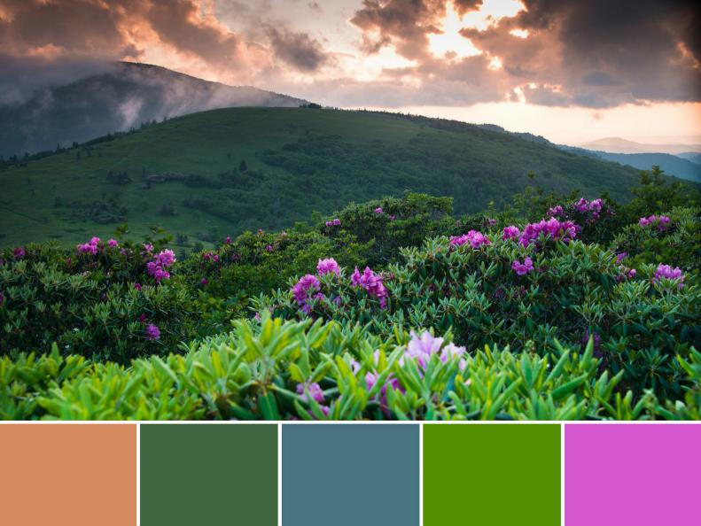
Smoky Mountains National Park Palette

Set against the dusky blue of the Appalachian Mountains, the rolling hills and rocky cliffsides of Great Smoky Mountains National Park spring to life each June with the blooming of the native Catawba rhododendrons. Found only at elevations greater than 3,500 feet, the large shrubs, loaded with clusters of purple-pink blooms, are a special treat for visitors to the park’s highest peaks, particularly above Chimney Tops Trailhead, Alum Cave Trail and along the Blue Ridge Parkway. To add a pop of their cheery fuchsia hue to your home, try Benjamin Moore Hot Lips (2077-30). For a dose of earthy green, mix a bit of Balsam (567) or Basil Green (2029-10) into your color palette. If blue is your color of choice, take a cue from the mountains’ smoky shade: Schooner (AF-520) works beautifully as a backdrop while the punchy peach of Sausalito Sunset (074) would be best as a small accent. (All colors by Benjamin Moore.)
More photos after this Ad

2 / 18

Rocky Mountain National Park Palette

At Rocky Mountain National Park, the landscape is so huge that visitors find themselves intrigued by the small things, especially wildflowers in spring and summer. Here, pops of yellow, purple and green in the foreground provide a contrast with the snow-capped gray stone cliffs as the backdrop. Colors inspired by the landscape include: (L to R) Behr Gallery White (PPU12-12), Benjamin Moore Sun Kissed Yellow (2022-20), Behr Sagebrush Green (Sc-138, stain), Benjamin Moore Seduction (1399), Benjamin Moore Polo Blue (2062-10). You can also bring in the brighter colors via fabric and accessories, while iron furniture would be a great resource for the almost-black hue.

More photos after this Ad

3 / 18

Acadia National Park Palette

A road trip to Acadia National Park in Maine is a dream come true. You'll have a spiritual moment watching the sun break though the clouds on these cliffs. Cool colors naturally dominate this palette, and the cliffs are actually composed of granite. Sounds like a kitchen makeover is in order! Colors (L to R): Valspar Pantone Tannin (PN11060), Behr Flannel Gray (N520-3), California Paints Blueberry Muffin (DE-5851), Cloverdale Paint Sky Watch (7362), Sherwin-Williams Espalier (SW 6734).

More photos after this Ad

4 / 18
Photo: Mallory Colliflower Ziglar. From: Mallory Ziglar.

Joshua Tree National Park Palette

For a place that's so dry and rocky, it's amazing how colorful Joshua Tree National Park is. The iconic Suess-like Joshua Trees themselves offer rich shades of gray, brown and green. On a clear day, the blue hues of the sky vary across the landscape. And let's not forget about the sunsets! To get this look at home, set the stage with neutral walls (Sherwin-Williams Peach Blossom, SW 6624). Layer in color and texture with jute, burlap or linen fabrics. Accessories in shades of light blues (Bluebell, SW 6793) and greens (Leap Frog, SW 6431) pop against a deep green accent wall (Evergreens, SW 6447).

More photos after this Ad