14 Fashion-Forward Color Schemes to Try
Are your home's interiors looking a little drab? Shake things up with one of these unexpected — but oh-so-chic — color palettes.
Keep in mind: Price and stock could change after publish date, and we may make money from these affiliate links.
May 28, 2015
Related To:

Meet the Boomershines
When designing the interior of their three-story 1920s Mediterranean-style home in Atlanta, designers Cinda and Mark Boomershine experimented with color, one room at a time. In their dining room Cinda and Mark opted for high-energy hues such as robin's-egg blue, teal and Caribbean blue.

Beige + Black + White
Beige has long been a favorite for builders and homeowners alike for its ability to warm up a space. To add more flair to the color, Cinda paired it with black and white. Although the room is mainly neutral, the contrast between the neutrals adds graphic impact and energy.
Seafoam + Camel + Chocolate
Chocolate brown and baby blue have been a classic pairing for decades. Originally made popular in the '50s, Cinda and Mark decided to put their own spin on the palette by pairing chocolate brown and seafoam green with camel. Camel's neutral appeal strikes the perfect balance between the dark brown and languid green.
Olive Green + Charcoal + Celadon
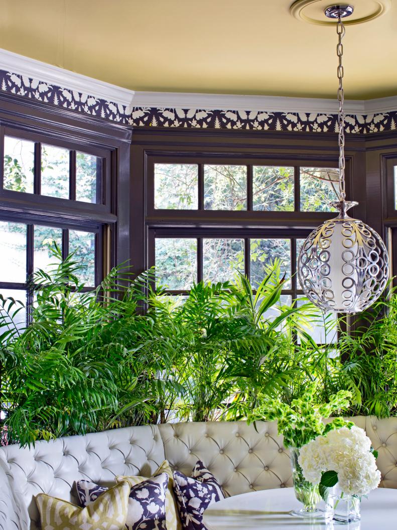
You may not think of using green and dark gray together but this sunny corner is proof that the pairing works. The window casing in Cinda and Mark's breakfast nook is painted a dark shade of charcoal, while the ceiling is a punchy shade of celadon. A custom cream banquette brightens up the corner while adding a cozy spot for enjoying a morning cup of coffee.
Mauve + White + Gold
For a fresh spin on a popular '80s color, Cinda and Mark decided to use mauve on the back of their library built-ins. Rather than sticking with the flesh-toned mauves, they opted for a shade with raspberry undertones and accented it with white and gold.
Mediterranean Blue + Robin's-Egg Blue + Black
The most jaw-dropping room in Cinda and Mark's house is their high-energy dining room. Just off the main entrance, the Mediterranean-blue walls with robin's-egg blue millwork make the room feel much less formal. For contrast, they furnished the space with black dining chairs and a stunning gold chandelier.
Gray + Black + Hot Pink
Gray is the new neutral, so Mark painted the library's wood-paneled walls in a soft driftwood gray. He and Cinda then filled the room with black furniture and added small, concentrated accents of hot pink. Although pink is often a feminine color, the inclusion of gray and black gives it a more gender-neutral appeal.
Yellow + Brown + Robin's-Egg Blue + Navy
You may think yellow, brown and two shades of blue can't work together, but the clever paint treatment in Mark and Cinda's rear entry is proof positive that they can. By separating the vivid shades with wide bands of white, they prevented the look from becoming overly busy or muddied.
Sand + Seafoam
The first-floor common area of the couple's home is covered in a textural grass cloth in sandy shades. To strike a cool balance against the warm, earthy tones, the couple hung artwork in watery shades of blue and green.
Coral + Green + Blue
Coral is a bold hue that's very flexible — some shades come across as orange, while others appear pink or even red. Layering different shades of coral allows you to really expand your palette by mixing in several accent colors. In Cinda and Mark's eating nook, a tropical fabric featuring the varying shades of coral contrasts beautifully with soft blues and greens.
Olive + Lime + Teal
Typically designers go with either muddy, earthy tones or vibrant, bold hues when working with green. Cinda and Mark decided to combine the two in their sitting area. The olive-green walls have brown undertones and are paired with a painting featuring shades of lime and teal. The olive-green wall serves as a neutral backdrop to the painting's brighter hues.
Yellow + Honey
Honey and yellow tones are the most popular color choices for traditional-style homes. Cinda and Mark's family room features these sunny shades, but they put a spin on it with modern art. The bold, high-contrast art helps break up the otherwise neutral tone-on-tone aesthetic.
Pink + Gold + Black and White
Cinda's home office is a feminine shade of champagne pink with black and white accents and pops of gold. For this pairing to work, the pink had to be just right. Black and white are high contrast, so the subtle champagne shade creates a neutral backdrop and doesn't compete for attention. Metallic gold accents add a touch of glitz and sophistication.
Pink + Red + Black
Cinda added high-energy appeal to her home office with pops of red against the pale pink walls and black furniture. Just a few splashes of red in a pink and black space keeps it from feeling too feminine.
Lilac + Blue + Camel
Lilac is normally used in nurseries, but Cinda and Mark gave it a grown-up, sophisticated look by pairing it with camel and blue in their guest bedroom. Only the walls are lilac, so the couple can easily change the color once they grow tired of it.