Color Theory 101: Analogous, Complementary and the 60-30-10 Rule
Interior designers and color experts share tips for harnessing the transformative power of paint to create interiors that are balanced, sophisticated and livable.
Keep in mind: Price and stock could change after publish date, and we may make money from these affiliate links.
November 25, 2014

Photo By: Olympic Paint
Photo By: Jeff Andrews
The Power of Palettes
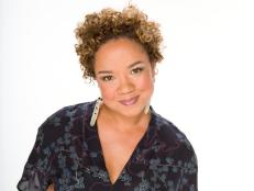
We all know that color has the power to transform an interior. But how do you use it? A fresh coat of paint is the easiest way to make a change at home but choosing a color palette can be daunting and, at times, confusing. That's where color theory comes in. Interior designers Jeff Andrews, Maria Killam and Misty Walker of Olympic Paint provide insights into the science of color theory and how you can use it to create colorful spaces that make you feel right at home. Image courtesy of Olympic Paint
Complementary Colors
Complementary colors are any two hues that sit opposite each other on the color wheel. For instance, red and green, yellow and purple and blue and orange are all complementary colors. When creating a complementary palette, look beyond the primary colors. Designer Jeff Andrews recommends using natural shades like sage green, dark olive and mustard yellow for a sophisticated update. Image courtesy of Jeff Andrews
Analogous Colors
Analogous colors sit next to each other on the color wheel. This room featuring a bright orange fireplace and yellow walls is a perfect example. These neighboring colors create a striking contrast when used side by side in an interior. Image courtesy of Maria Killam, photographer: Anna Beaudry
Using the 60-30-10 Rule
Three isn't a crowd when it comes to choosing colors. According to designer Maria Killam, "Three is a really good rule for formulating your color palette. More than three colors can feel folksy and too busy." Color tip: After choosing three shades, break them down into the 60-30-10 rule for a cohesive look — 60 percent dominant color, 30 percent secondary color and 10 percent accent color. Image courtesy of Maria Killam, photographer: Anna Beaudry
Contrast Warm and Cool Hues
When choosing colors for your space, you may also want to consider contrasting the warm and cool hues on the color spectrum. "Warm colors are yellows to red violets on the color wheel while the cooler colors are blues to greens," says Misty Walker of Olympic Paint. Color tip: Olympic's Turquoise Mist is a relaxing cool shade, perfect for a bathroom. Image courtesy of Olympic Paint
Use Colors You Love
"A lot of times my use of color is fabric driven. I'll pull a room's color palette out of a pillow, and then look to paint suppliers like Benjamin Moore or Farrow & Ball. Farrow & Ball has a great overall palette and Benjamin Moore has colors perfect for classic combinations," says designer Jeff Andrews. Color tip: Any accessory in your home can be a starting point for your color palette. Start with a keepsake pillow or a favorite painting. Image courtesy of Jeff Andrews