Next Up

Top Interior Designers Share Their Go-To Colors

September 05, 2016

We asked 11 design pros to reveal the can't-miss shades that make their spaces shine.

Price and stock could change after publish date, and we may make money off these affiliate links. Learn more.
1 / 16
Photo: Stacy Zarin-Goldberg. From: Breeze Giannasio.

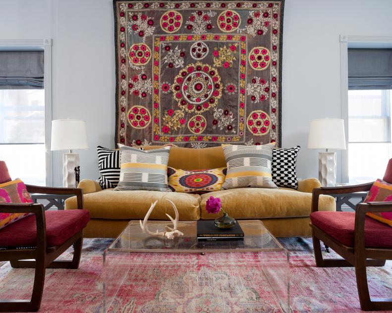
Soft Gray: The Perfect Backdrop

“A soft gray creates a rich, immersive backdrop that can be taken in a clean monochromatic direction or as a visual foil for more vibrant advancing colors,” says Breeze Giannasio of BGDB Interior Design. “It's the ultimate wing man in the color spectrum!” In this living room, the designer let a gorgeous tapestry and colorful furnishings take center stage against soft gray walls.

More photos after this Ad

2 / 16
Photo: Braun + Adams. From: Braun + Adams.

Pink: Playful Accent

“Not always the obvious choice, we often find ourselves throwing bright pinks in as an accent in otherwise neutral rooms and love the instant life it brings,” says designer Kristina Braun of Braun + Adams. “It can be paired with blues, neutrals and grays equally well to add a playful element, or try throwing in some orange to make it even more cheerful. And the key with pink is that a little goes a long way, so it doesn’t take much to make a big impact!”

More photos after this Ad

3 / 16
Photo: Heather Hawkins. From: Abbe Fenimore.

Fuchsia: Grown-Up Pink

“Pink is one of my favorite colors to incorporate in projects, and I love the full range of the color,” says designer Abbe Fenimore of Studio Ten 25. “Fuchsia, blush and neon top my favorite hues of pink, and each has its place in design. I love the bold fuchsia version of the color most, but have to keep my use of it in check so that it doesn’t take over the room." Use it in small doses — in throw pillows or in artwork — for big impact.

More photos after this Ad

4 / 16
Photo: Stacy Zarin Goldberg. From: Breeze Giannasio.

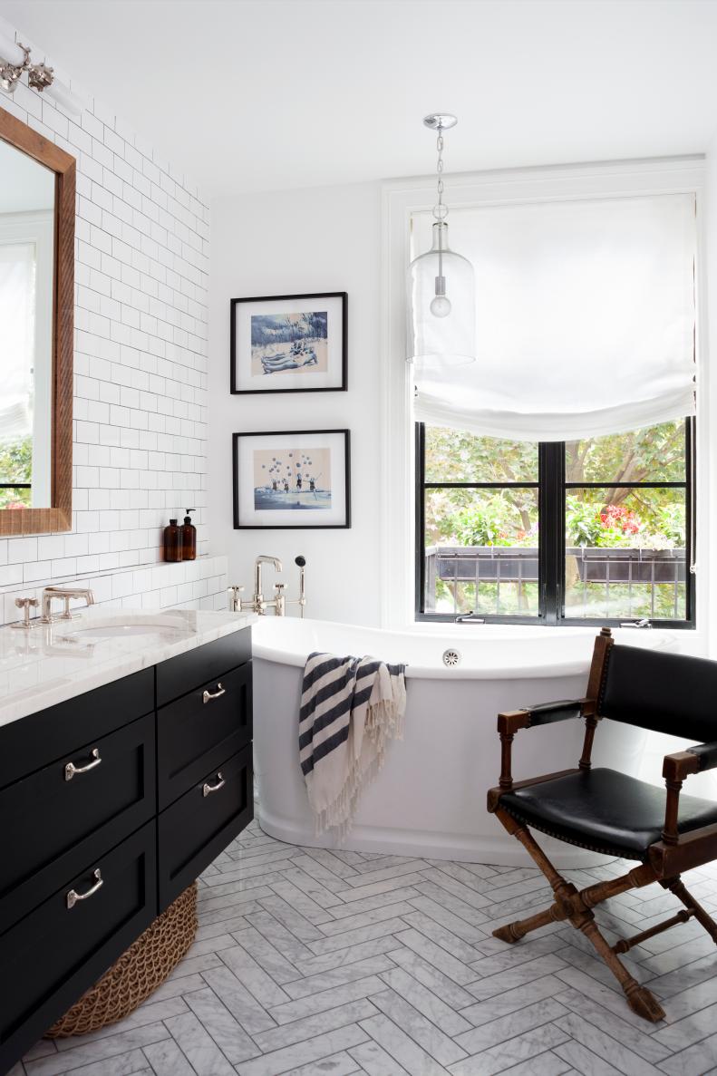
Bright White: Fresh and Clean

“There is something so effortless about an airy, white environment,” says Giannasio. “A designer must bring her A game to pull white off successfully though — texture and materiality become so important to create dimensionality lest the room fall flat.  When white works though, there is nothing shy about it.” Here, a subway tile backsplash and herringbone-pattern tile floor add tons of movement and interest to a bright white bathroom.

More photos after this Ad