Next Up

Has Gray Had Its Day? Designers Dish

March 14, 2018

We know you're dying to know because we were, too. Is gray totally yay, kind-of nay or altogether passé?

Price and stock could change after publish date, and we may make money off these affiliate links. Learn more.
1 / 15
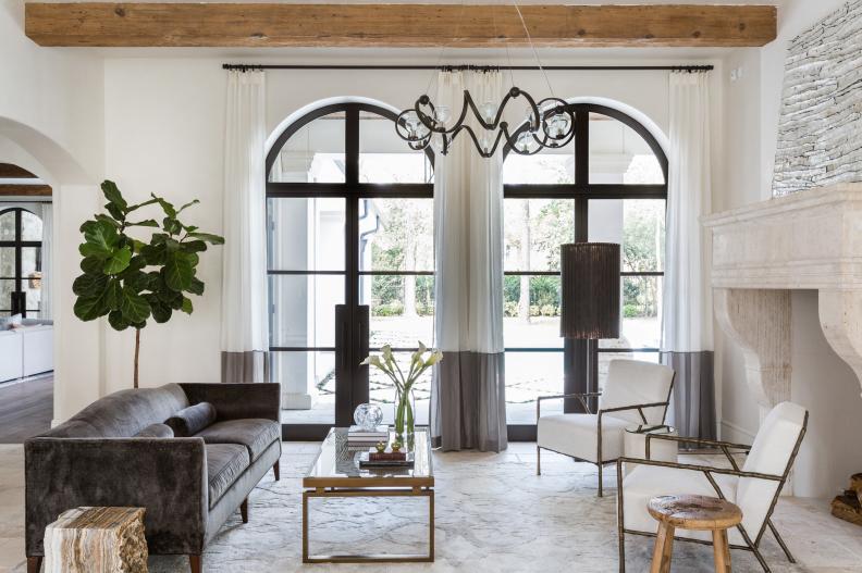
Photo: Julie Soefer. From: Marie Flanigan Interiors.

Go Under-board

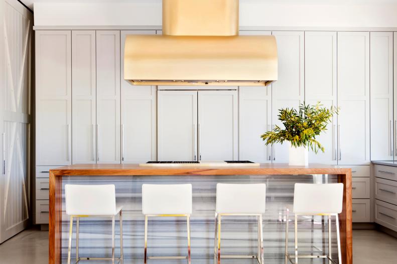
"Neutral hues boast a timeless quality that transcends trend, but the days of monochromatic gray interiors appear to be dwindling," says interior designer Marie Flanigan. "Although we’re seeing less full-on gray spaces, people continue to be drawn to the thoughtful use of the hue. It serves as a calming accent and can be layered in through varied textures, like velvet, linen and sateen, to enhance depth and interest in any space." The lesson here? A little goes a long way.

More photos after this Ad

2 / 15
Photo: Julie Soefer. From: Marie Flanigan Interiors.

Bright + White

If the all-gray color craze is fading, which neutral is taking gray’s place? Marie has an answer for that, too. "As far as hot neutrals are concerned, we’re noticing a shift back to white, and it’s a shift we absolutely adore! Bright and refreshing, white has a classic appeal that offers the eye a respite, expertly balancing out any stronger colors and textures found within a space," she says.

More photos after this Ad

3 / 15
Photo: Amy Bartlam. From: Jenn Feldman Designs .

California’s Complement

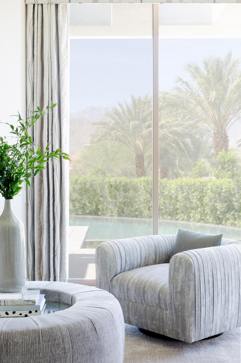
Interior designer Jenn Feldman deems gray an expert in harmony, and for this reason, she plans to keep it around — especially in her California designs. "California is graced with blue skies and green trees 365 days a year; therefore, gray is an amazing color to use in design in our California projects because it balances the saturation of the colors coming from outside so well," she explains. "When the tones are too icy or too red, gray can be a very moody color, so we gravitate to the 'greige' category quite a bit, making sure there's a beige undertone to complement the colors reflected by the warmer climates."

More photos after this Ad

4 / 15
Photo: Mia Baxter Smail. From: Sarah Wittenbraker.

Show-Stopping Stone

While interior designer Sarah Wittenbraker may be leaning toward warmer grays and taupes nowadays, she still has a soft spot for classic gray when it comes to stone. "My favorite use of gray is in natural stone and marble," she says. "In fabric and paint, gray is still reigning over, say, chocolate brown, but I think the tone is leaning warmer, more into the taupe arena. I’m loving touches of warm taupey-gray mixed with rich, saturated greens and blues much more than the standard, crisp gray-and-white combo that has been popular this past decade. Colors are getting a bit muddier and moodier, and I’m loving the drama!"

More photos after this Ad