Plum Jam
This warm, rich hue practically made us drool. Glam up any space by pairing this juicy purple with gold or add vibrant, unexpected color to a modern kitchen — however you use it, it's bound to look good enough to eat!
More photos after this Ad
Carnival Red
Bright red may strike you as more of a fall color, but trust us — it works for summer, especially when paired with deep blue, crisp white or light gray.
More photos after this Ad
Caribbean Blue
This tropical hue will instantly transport you to the beach. Try it as a bold accent against neutral palettes or use a softer shade to fill your walls with color that will stand the test of time.
More photos after this Ad
Wedding Mint
From retro glassware to bridesmaid dresses to delicate French macarons, this color is everywhere. Unlike classic mint, Wedding Mint is softer with gray undertones; think of the soft green of succulent petals or a vintage jadeite platter.
More photos after this Ad
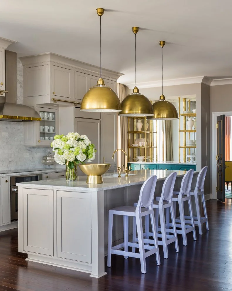
Weathered Brass
Check your feelings on '80s polished brass — we're talking about the lovely, brushed version that's currently having a moment in the design world. Just look at how the brass accents steal the show in this transitional kitchen.
More photos after this Ad
Blue Paisley
"In winter everyone wants a little Caribbean waters in their life! At least I DO," says blog reader Donna. We agree!
More photos after this Ad
Lavender
Though lavender is typically thought of as a spring color, it has lots to offer year-round, like this unexpected ombre wall installation.
More photos after this Ad
Photo: Emily J. Followill ©
8 / 55
Pumpkin Spice
A warm orange hue with a hint of creamy beige will refresh every room.
More photos after this Ad
Earl Grey
Earl Grey is the design equivalent of a cozy blanket: A dose of this color lends warmth to everything from headboards to walls to bedding. A neutral with an edge, this purple-grey color plays well with fall hues, like rich burgundy, soft orange, blush pink and deep lavender.
More photos after this Ad
Watercolor
The watercolor technique has been bubbling up through the design world for several seasons, in both more structured ombre-inspired wall treatments and totally organic designs. These dreamy, drippy patterns would be an unexpected (but totally amazing) element in a traditional beach house, or a natural in a colorful, bohemian bedroom. Not ready for walls? Try a bright, swirled bedspread instead.
More photos after this Ad
Photo: Design House 2013
11 / 55
Stripes
Stripes are practically synonymous with summer: Think crisp, preppy rooms and nautically-inspired decor. The wonder of stripes is their versatility. Depending on the color combinations, they can be everything from playful to classically preppy.
More photos after this Ad
Burnt Coral
Modern burnt coral takes the classic peachy pink shade and turns up the color value a few notches — think something a little more cinnabar or vermillion. This darker, orange-red coral is au courant and looks great with other spring and summer colors.
More photos after this Ad
Indigo
After three months of pastel hues — Grapefruit in February, Orchid in March and Magnolia in April — our color team was ready for something new ... and blue! Fixer Upper's Joanna Gaines says, "Maybe I'm biased to the indigo because it's the color that is currently blooming in my garden!"
More photos after this Ad
Magnolia
This dusty pink inspired by the tree of the same name's light pink blossoms captures both the burgeoning pastel trend and spring's essence.
More photos after this Ad
Photo: Diana Parriah ©
15 / 55
Orchid
A vivid purple with pink undertones, this statement-making hue is Pantone's 2014 Color of the Year. We love how just a touch of this vibrant purple can completely invigorate a space.
More photos after this Ad
Grapefruit
We love how this color bridges the gap between winter and spring. "I like that it's a winter fruit, but the color feels fresh and springy," says HGTV.com stylist Marianne, who pitched the winning hue.
More photos after this Ad
Lemon Zest
This sunny yellow hue won our hearts with its mood-lifting qualities. Slightly more subtle than Pantone's spring 2014 yellow choice, Freesia, it's still bright enough to bring life to post-holiday interiors. Take down the tinsel and bring on the lemony accents!
More photos after this Ad
Copper
This color can be warm and homey during the winter without the chill that its silver and gold cousins sometimes carry.
More photos after this Ad
Photo: Design by Danielle Colding
19 / 55
Paprika
This bold red-orange hue is a richer version of spring coral. Paint a wall, add a pillow — both a little or a lot will warm up your space.
More photos after this Ad
Eggplant
While the dark, plummy hue of Italian eggplant lends itself well to late fall decor and tabletops, we’re loving the brighter hue that long, skinny Japanese eggplant varieties bring to the table. See how the vibrant color pops on this upholstered desk chair?
More photos after this Ad
Apple Green
It was fall's favorite fruit and the back-to-school season that our prompted us to choose this hue. Forget classic red apples — we're all about modern green.
More photos after this Ad
Watermelon
This almost-neon color is the ideal hue to add some personality to a dorm room or first apartment. The ultra-summery shade can easily transition into fall when paired with soft gray, dark green or mustard yellow.
More photos after this Ad
Peach
When you think "peach decor," your mind might wander back to the peach-and-teal spaces that were so prevalent in the '80s. But it can look wholly modern when used as an accent color or alongside today's trendy colors, like rich emerald green.
More photos after this Ad
Paradise Blue
This blue-green hue brings to mind the best parts of summer, like sticking your toes in the sand and walking across delightfully-weathered boardwalks.
More photos after this Ad
From:
Sarah's House
25 / 55
Whisper Gray
This soft, silvery gray is the perfect hue to help ease into warmer weather. It's the perfect foil to more saturated shades.
More photos after this Ad
Raspberry
Fuchsia's more delicate cousin, this deliciously fresh hue makes a juicy spring accent. Try raspberry-hued flowers for a small touch, or go big with patterned floor-to-ceiling drapes. Photo courtesy of Romo.
More photos after this Ad
Carrot
Reminiscent of the nectarine hue in Pantone's spring forecast, this versatile, fresh color can add brightness everywhere from an appetite-creating dining room wall to a floral-and-citrus centerpiece.
More photos after this Ad
Robin's Egg Blue
This color won the team over with its classic-cool tone and its ability to pass easily from vintage to traditional to modern with a deftness that not many colors can manage.
More photos after this Ad
Photo: Design by Emily Henderson.
From:
Emily Henderson and Secrets From a Stylist
29 / 55
Gold
Fight the winter doldrums that January brings with trendy gold accents, like this vintage bar cart and gold floral wallpaper.
More photos after this Ad
Chestnut Brown
This rich brown with its red undertones feels just right in November, when we're bundling up for winter months ahead. This cozy, cozy color warms everything from hair to sweaters to armchairs.
More photos after this Ad
Bright Red
This high-gloss red is at once trendy and classic, and is reminiscent of a fall-perfect candy apple.
More photos after this Ad
Emerald Green
This moody, deep green with a hint of blue undertones makes an amazing impact when used in decorating, so it's no surprise that color authority Pantone named this hue its 2013 color of the year. Though it's trendy, the jewel tone also brings a timeless look when paired with metallics and other rich colors.
More photos after this Ad
Photo: Design by Buckingham Interiors and Design, LLC
33 / 55
White
Bright white is cool and crisp and feels effortlessly classic and perfectly modern all at once. Whether you add accents or create an all-white space, this icy shade creates cool respite from mid-summer heat.
More photos after this Ad
Driftwood Gray
Picture the weather-beaten, sun-warmed gray of boardwalks and beach houses. This warm gray pairs well with bright, summery hues, but it looks equally chic set off by neutrals.
More photos after this Ad
Neon
We love how a coat of any trendy neon hue can breathe new life into a room.
More photos after this Ad
Coral
Coral is so beachy (literally) that we can't help but think of warm, sunny weather whenever we see it. Pair it with deeper palettes of gray or bronze to take your summer accent color right into the cooler months.
More photos after this Ad
Copper
This isn't your grandma's verdigris — this modern, super-shiny copper glows. This trendy metallic makes an impact when paired with crisp white, natural wood and pops of jewel tones or pastels.
More photos after this Ad
Mint Green
Both frosty and fresh, mint is an ideal hue for those months in between winter and spring. This sweet hue evokes the romance of yesteryear, especially when paired with other pastels. Or try it in place of traditional neutral hues, like Coddington Design did in this contemporary bathroom.
More photos after this Ad
Pink Champagne
No longer relegated to baby nurseries, champagne pink is fast-becoming a new neutral. Especially rich when paired with black, camel or metallic, the bubbly shade can add a refined, feminine touch to any room in the house.
See more of this home transformation in HGTV Magazine.
More photos after this Ad
Electric Grape
Glossy, saturated grape is masculine and just a touch royal. It lends itself well to textures, from velvet to satin, and depending on how you style it, it can be sophisticated or edgy. The only thing it can't ever be, is ignored.
More photos after this Ad
Marigold
Marigold is reminiscent of bicolored mums and goldenrod and pairs just as well with juicy jewel tones as it does with rich slate grays. Its rich, orange undertones add instant warmth to a space.
More photos after this Ad
From:
Secrets From a Stylist and Secrets From a Stylist
42 / 55
Teal
Teal is a great "ease into fall" color, bridging the gap between bold, sun-infused summer colors and moody, dark winter hues. It pairs perfectly with aubergine, harvest gold, coffee and other autumnal shades.
More photos after this Ad
Chrome Yellow
This glossy, intense yellow is the perfect color stands up to August's scorching sun and is just as appropriate as cooler fall temperatures hit. This happy color steals the spotlight in this contemporary kitchen design.
More photos after this Ad
Lime Green
You know how a hint of lime makes everything – from salsa to a cocktail – just a bit better? The color can have the same effect on a room. Just look how it freshens this white bookcase!
More photos after this Ad
Cerise
This juicy, saturated pink is at once both searing hot and exhilaratingly cool. Sound like an oxymoron? Add a cerise accent pillow in your living room and you'll see what we mean.
More photos after this Ad
Regatta Blue
This stress-reducing blue hue is pure, hopeful and energizing. It's rich enough to stand up to other saturated colors, but easy enough on the eyes to fill all four walls.
More photos after this Ad
Violet
The vibrant, royal shade of violet looks especially beautiful alongside other purples, grays, greens or even its color-wheel opposite, orange.
More photos after this Ad
Aqua
It's no wonder that this watery, always-a-favorite hue was the hands-down winner when we let the readers choose our Color of the Month. It's a favorite for kitchens and baths, like this easy-on-the-eyes master suite.
More photos after this Ad
Tangerine
Tangerine is an ideal late-winter shade because of its unparalleled ability to brighten a room. Simultaneously masculine and feminine, this underused hue looks divine with gray and alongside cool, deep blues and greens.
More photos after this Ad
More photos after this Ad
Navy
Navy is a good color friend, pairing well with just about everything. It's neutral and timeless enough that you can outfit a main piece, like this upholstered chair, in the deep blue shade. Photo courtesy of Thibaut.
More photos after this Ad
Plum
This festive, rich hue is perfect for the holiday season, pairing well with metallics. It also surprises, looking edgy and sophisticated when paired with a red or a blue that matches its intensity.
More photos after this Ad
Peacock Blue
This color is at once trendy and classic, so why not go big? Upholster a chair or sofa with it and trust it’ll look fresh for years to come. For an easy color fix, add peacock blue pillows on a bed done in trendy, neutral gray.
More photos after this Ad
Persimmon
Persimmon captures the excitement we feel at the first glimpse of orange, red and gold leaves. The hue blends well with cool grays, or stands strong alongside black and crisp white.
More photos after this Ad
Chartreuse
Our inaugural hue can go from young to sophisticated with a spin of the color wheel. We love its glowing, acid nature paired with aqua, chocolate and all tones of pink. But don't go overboard: With chartreuse, less is usually more.