


Decorating Ideas for Rooms With the Blues

"Blue is a perennial favorite and shifts its cast, value and/or chroma according to prevailing fashion and its timing on the color cycle," says Catherine B. Stein, color and trend forecaster for home furnishings manufacturers and president of THE COLOR COUNCIL. "Right now, blue is coming off a turquoise high and preparing itself for a full indigo immersion," she says.
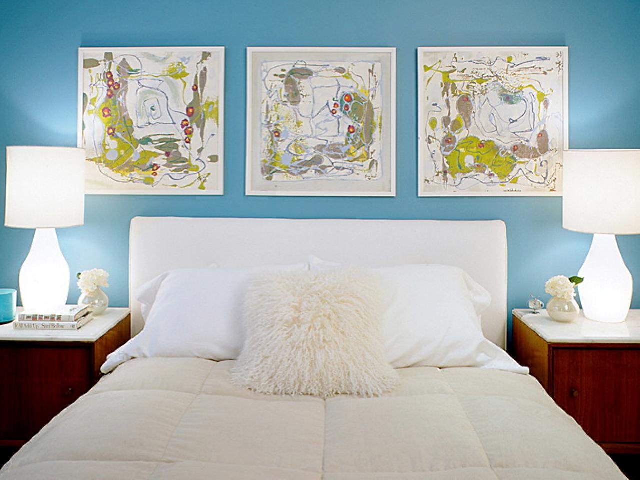
Whatever shade of blue you choose, Stein says, the mood it evokes will depend largely on what colors you select for accents. Blues with green, she says, are healthy, life affirming and ecological; blues with yellow are harmonious, making them perfect for a relaxing country bedroom.
And don't overlook earth tones and neutrals with blue, either. These subtle shades can add sophistication and freshness to many blues. "Lately, we've been doing a fair bit of sky blue with chocolate brown and white," says Ed Ku, of Coffinier Ku Design, Ltd. "This combination feels modern and fresh, with the blue giving a lightness to the chocolate so that it stays rich and interesting without being too dense.
"We also love the mix of different blues with oranges," Ku says. "The orange really wakes up the blue and brings out a complementary intensity."
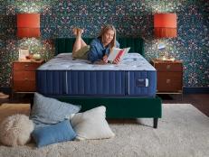
While designer Andrew Suvalsky is also a fan of blue and orange combinations, he says, "My inclination is to bring in one earth tone or neutral color to make the look more modern. Without an earth tone, anything from cream to beige to brown, blue color combinations will feel more traditional." Suvalsky's room, shown above, is an example of making blue modern.
"Whatever blue you choose," Suvalsky says, "commit to it 100 percent. There are myriad beautiful shades of blues. All are valid choices, but just use them specifically and meaningfully."

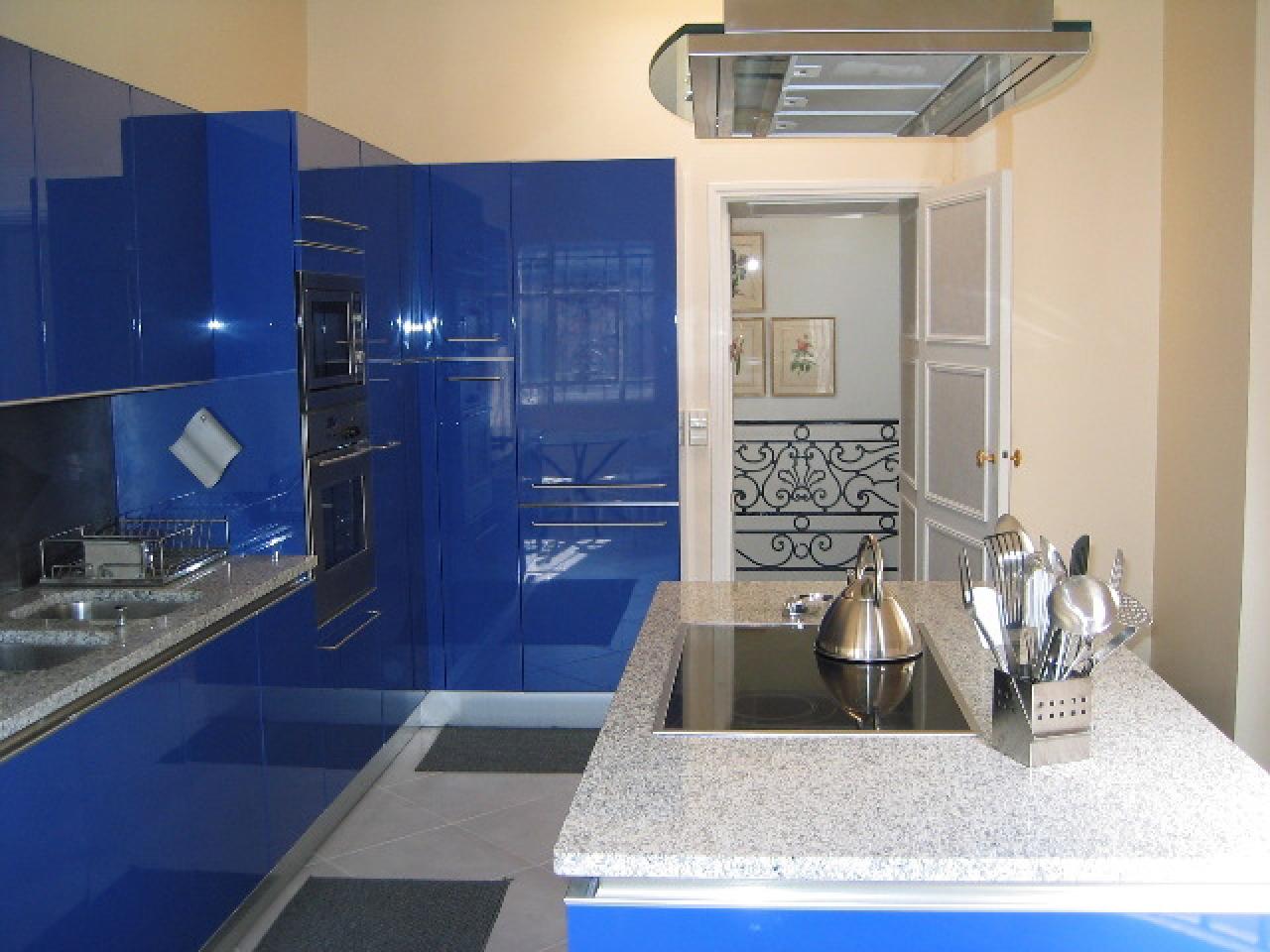
"The rest of the apartment is decorated in a style that is more traditionally French, with classic silhouettes, finishes and wall upholstery in shades of yellow, cream and white," says Ed Ku, of Coffinier Ku Design, Ltd. "But it was very important to the client, who owns a luxury-food export company, that their kitchen was very modern and up-to-date – just like their business."
The kitchen's sleek, color-saturated cabinets are by Snaidero, with a Brilliant Blue finish in high-gloss lacquer. The contrast provided by soft cream walls helps to electrify the already bold shade. The effect, Ku acknowledges, is not for everyone, and should not be decided on a whim.
"Before we began any work," Ku says, "we did a 3-D rendering of the kitchen and also got a large sample of the actual cabinet front. The rendering and the sample were crucial and we would not have proceeded without those tools to help the client feel comfortable.
"We loved that our client was ready and willing to commit to using this beautiful, strong blue," Ku says. "But if you're not sure that you will absolutely love such a strong statement, skip the bright blue cabinets and try painting the walls of the kitchen in a royal or cobalt blue – if you get tired of it, it's an easy fix."

"The inky, deep blue wall covering is heightened by the white moldings, cabinetry and countertop," says Drake, author of Jamie Drake's New American Glamour. "This contrast creates a bold tension that is crisp, fresh and dramatic."
To keep the blue and white palette from looking chilly, Drake added polished brass faucets and fittings that he designed for THG, matte brass sconces and white china accessories with gold rope details from his Labrazel product line. Finally, to liven things up further, he added abstract paintings by James Lecce.
"I love his work," Drake says of the bold artist. "It's sensual, pop and psychedelic with incredible shiny surfaces and great depth."
"Bathrooms and powder rooms are the perfect place to experiment with color," says Drake. "We tend not to spend a lot of time in these rooms, and if you decide you really don't like something, it can be changed very easily. So if you find a color you love – even if it's a bit bolder than you're used to – I say, go for it!"

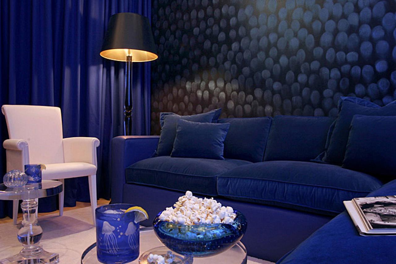
"That's because the blues are very rich and deep," says Benjamin Noriega-Ortiz, whose firm designed the space for a London-based theater producer and restaurant owner. "And velvet always says 'urban.' No one would ever do a blue velvet bedspread on the beach!"
In addition to the velvet, the room is swathed in layers of other blue fabrics – the same deep, gorgeous shade in subtly different textures. White lamps and night tables make the blue look even more intense. "They light up the space, physically and figuratively," says Noriega-Ortiz, author of Emotional Rooms.
And while blue is technically a cool color, this room doesn't look icy in the slightest. "It's the khaki walls and oak floor," Noriega-Ortiz says. "They really warm up the space."

When the resident of that gorgeous blue bedroom decided to downsize, he changed his address, but not his favorite color. Turning to designer Andrew Suvalsky, an alumnus of Benjamin Noriega-Ortiz's firm and now head of his own design firm, the client again requested blue, blue and more blue. Suvalsky delivered, beautifully.
"The challenge," he says, "was to develop a design that used this color in grand, meaningful gestures without sacrificing a warm, comfortable feeling."
To maintain the balance, fresh and warm cream tones and lighter shades of blue were integrated into each of the main living spaces to soften the intensity of the cobalt. The living room, for example (not pictured), is cream with bright blue upholstered furniture. But in the media room, the deepest shade is found on the wall finish: celestial bursts of shimmering glass dust applied over a blue-black enamel.
"If you want to go for a similar, warm ambiance," Suvalsky says, "remember that blue hues vary wildly, not just in terms of shade and depth, but in terms of what undertones are present. In this case, there's a hint of green undertone, which has yellow – a warm color – in it."


