


10 Tips for Picking Paint Colors

Why do we find one place appealing and are uneasy in another? Why are we attracted to one product over another? Color—whether architectural or in products—accounts for 60 percent of our response to an object or a place.
The "buzz" about color is usually called "color psychology." But the effects of color are subtle and significant; physical and psychological. Color use is not something that results in a definitive equation between "color and our moods," as is a currently popular expression. Wherever we go we respond to color, but the importance of color is often underestimated. Color use is important to us personally in our homes and in the places where we work.
Popular Videos: Picking Paint Colors

Start Small
If you're not sure where to begin with color, experiment in a powder room or bathroom, a small hall or area between rooms, or an accent wall. If you're doing your own painting, pick an area that's quick to do so you can see your results sooner, and be happy with it or change it. Look at the process as an adventure.

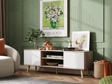
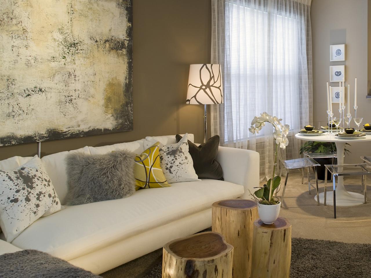
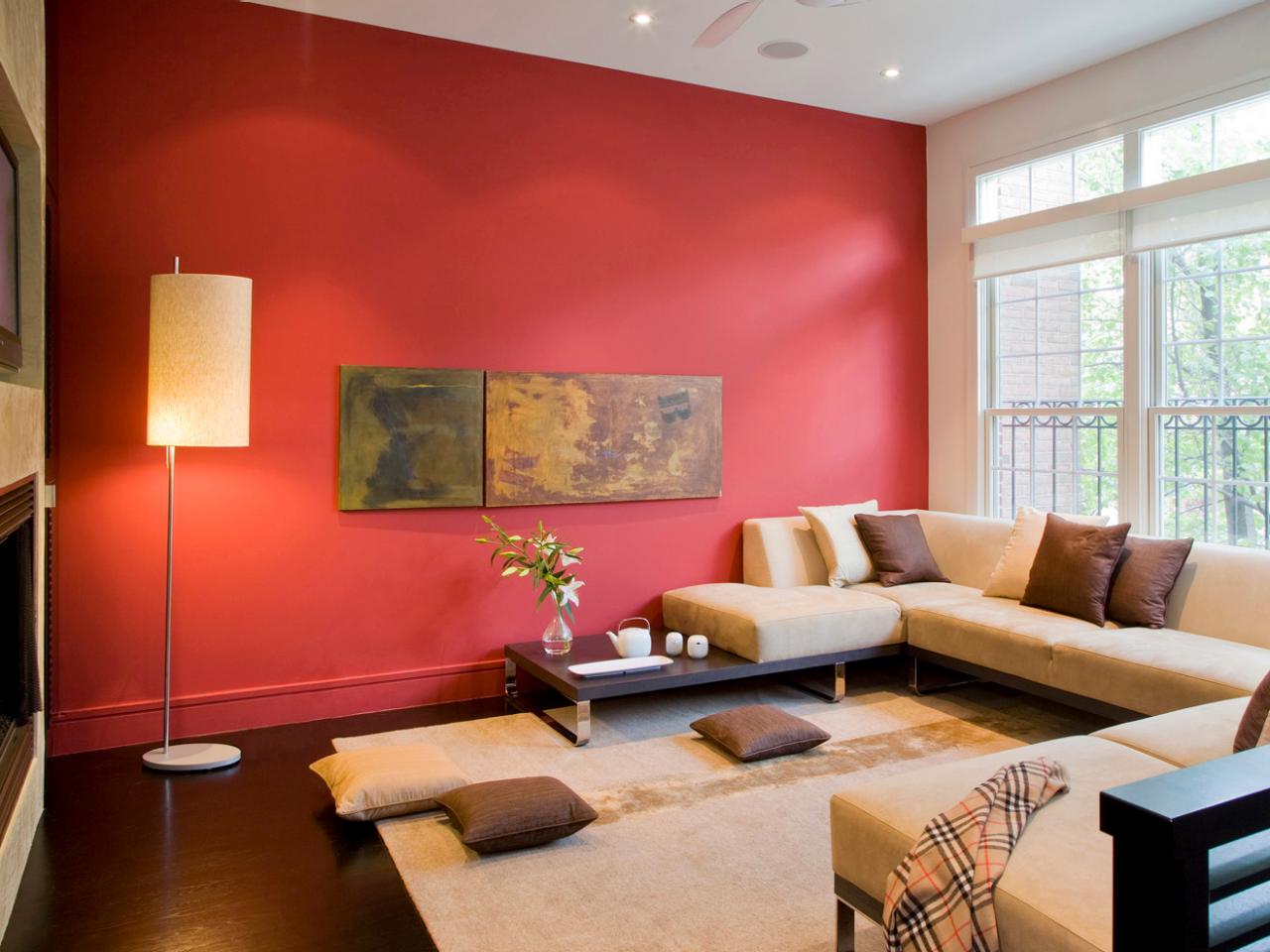
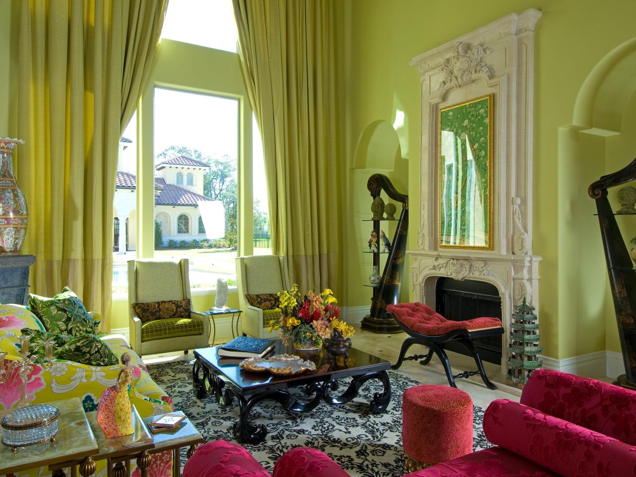
55 Colors HGTV Editors Love 55 Photos
See how these colorful rooms embrace some of our favorite hues.
To get started, select a favorite color drawn from artwork, a rug, dishes and an accessory or furniture piece as a main color or accent.

Think About Your Mood
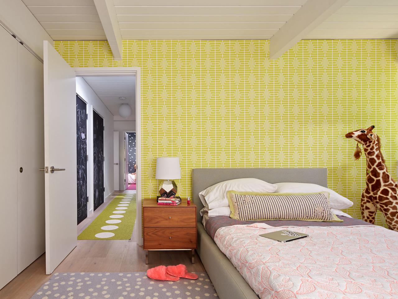
When selecting a color, consider the mood of a room. In a bedroom do you want the feeling to be restful and soothing or dramatic and intimate? Soft, cool colors and neutrals usually create a quieter feeling while stronger colors are for drama.
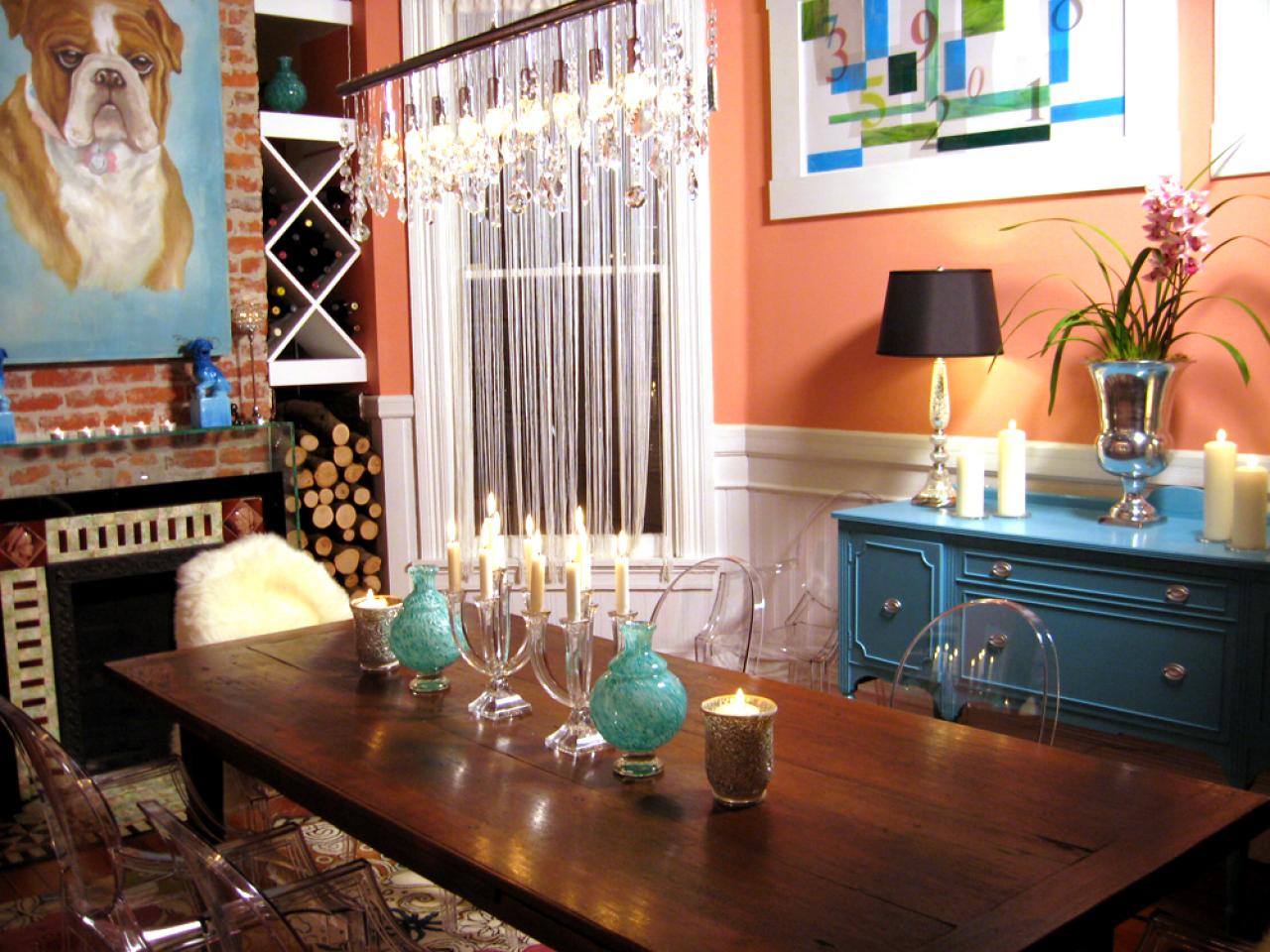
Do you want a dining area to feel sociable and stimulating or appear formal and quiet? Warmer, contrasting and somewhat brighter colors add to a sociable atmosphere; deeper blue-greens and neutrals will give a more formal ambiance.
Do you want kid's rooms to create an active and exciting energy or an orderly and restful feeling? Be careful not to overstimulate your children with intensely bright hues. You may not know it, but some brighter colors can lead to unrest and irritability.
Pay Attention to Lighting
The reason why paint stores have light boxes for you to test paint chips:
- Natural daylight shows the truest color;
- Incandescent lighting brings out warm tones and yellows;
- Fluorescent lighting casts a sharp blue tone.
So, a strong color might be too bright and overpowering when used on all walls or next to a large window, but it might be effective when used as an accent wall with indirect light.


Learn the Color Terms
It helps to understand the terminology used to describe color.
- Hue is what we call a color. Red is the hue; blue is the hue.
- The value of the hue is how light or dark it is.
- Saturation refers to how dominant the hue is. As we go from red to pink, the red hue becomes less dominant.
- Intensity is the brilliance of the color. The pure colors such as red are more intense than the combined colors such as yellow-green. A stronger intense color usually has a more dominant hue.
If you want a more active space, consider introducing stronger, more intense color. Even if you want a light-colored room, choose colors that are slightly more saturated than off-white or light pastel. Very light color can feel bright and stark when it appears on all surfaces in a room. However, two or more medium-light, closely related pastel colors can create a luminous effect when used in the same room.


Test Your Color Choice
Boost your confidence by testing colors on poster board or large areas of a wall. Don't be afraid to go beyond your comfort zone: Consider strong, vivid colors or soft, deep neutrals like chocolate brown or olive green as main or accent colors. Or add drama with a stronger color on the ceiling. Tinted ceilings can dramatically change the whole look of a room.

Add Depth With Decorative Finishes
Transform flat, dull walls into interesting and personal spaces with subtle or dramatic visual texture and broken color. Burnished mineral/metal finishes and layered colored glazes add depth. Some examples of softly reflective metals are mica, copper, pewter, bronze and, of course, antiqued silver and gold.

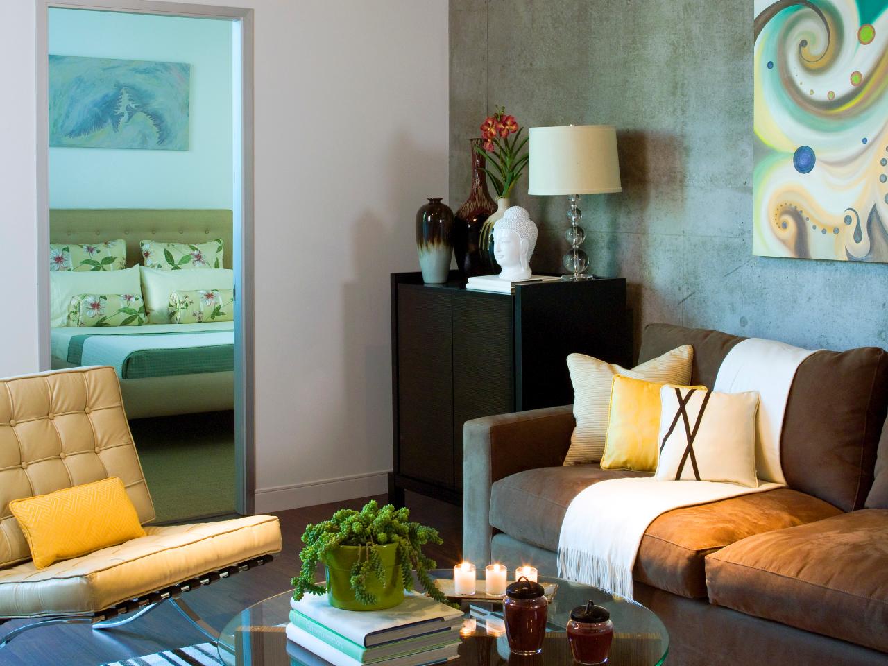
Walk Into Another Room
Consider walls as planes of color, and see how they interact when viewing one next to the other in adjacent rooms. Approach it like a composition: You're in one room, but you're going to see a piece of another room through it. So as you're choosing colors, consider how they will flow from room to room to create your picture.

Bruce Damonte
Design by Alison Damonte Design
Follow the Color Wheel
A small color wheel is a great reference tool for modifying and intensifying two or more colors. For example, red and green, which are complementary (opposite) colors, are most intense when used together. You may be surprised at how many combinations function beautifully together, and you may even become attracted to entirely new color palettes. The color wheel also illustrates the visual temperature of a color. Draw a line from the yellow-green mark on the color wheel all the way down to the red-violet; you'll see that all the colors on the left are warm and the colors on the right are cool.

Color Rules for Small Spaces
Number one color rule for a small space? There are no rules! Mixing colors can help bring a personal touch to your space.

Play Up Monochromatic Schemes
Think one color is boring? Create bold or subtle variations within one color group with contrasting paint finishes. For example, use closely related colors, or try a single color in different finishes, for walls and trim in one space.
For an accent color, select a warmer (more toward reds) or cooler (more toward blues) color to complement your main color group. For a quieter ambience, make sure your colors are not extremely bright. White or an off-white tint can be a striking accent when used as trim with a monochromatic color group.

Choose Different Paint Finishes
A single color used on walls and trim takes on new significance when applied in different finishes. For example, wall and trim colors can remain the same hue, but use an eggshell (matte and less reflective) finish on walls and a satin or semigloss on trim. The color will appear slightly different on each surface. It's a good way to create a cohesive look in rooms with many windows and doors, and relatively little wall area.


