Next Up

10 Spring Color Palettes to Inspire Your Decor

May 26, 2015

Spring is all about nature-inspired hues, from grass green to lavender. Let the season's hottest color palettes inspire your home's decor.

Price and stock could change after publish date, and we may make money off these affiliate links. Learn more.
1 / 10
Photo: Flynnside Out Productions. From: Brian Patrick Flynn.

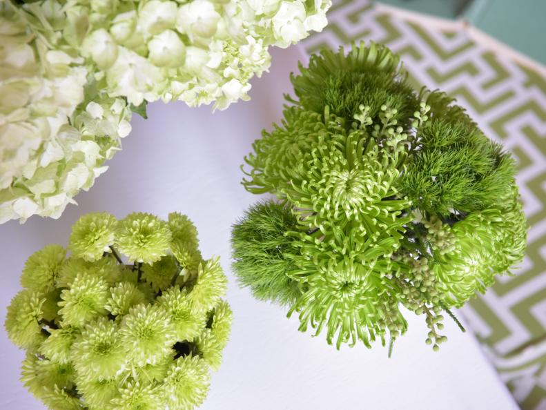
Acid Green + White

Acid green and white is a super-clean and super-saturated combination that's just as fit for spring as it is the rest of the year. Acid greens are characterized by intense yellow undertones that require strong use of neutrals for toning down. Creams and beiges tend to make the green seem a little muddy, but the stark contrast of ultra-white helps the values of acid green read more clearly.

More photos after this Ad

2 / 10
Photo: Flynnside Out Productions. From: Brian Patrick Flynn.

Lavender, Violet + Green

If youre looking for a lilac vibe but with a more layered look, consider using lavender mixed with green and violet. The softness of the lavender makes it read more like a neutral. When lavender is paired with the royal richness of violet, their blue undertones spring to life. Adding green to the mix creates a classic springtime touch.

More photos after this Ad

3 / 10
Photo: Flynnside Out Productions. From: Brian Patrick Flynn.

Spring Green + Gold

Spring green and gold strike the perfect balance of glamour and whimsy. Often paired with deeper shades of green, like emerald or olive, gold takes on a fresh approach when paired with celery tones.

More photos after this Ad

4 / 10
Photo: Flynnside Out Productions. From: Brian Patrick Flynn.

Sherbet Tones

Ever thought of using ice-cream hues for decorating inspiration? The timeless combination of mint green, sherbet orange and white is certain to never go out of style. For best results, choose a shade of mint that falls into the seafoam family to ensure the color reads more green than blue or aqua.

More photos after this Ad