Next Up

11 Common Color Mistakes and How to Avoid Them

May 15, 2020

From painting to accessorizing, finding the right palette for your space can be daunting. Steer clear of these common dilemmas.

Price and stock could change after publish date, and we may make money off these affiliate links. Learn more.
1 / 11
Photo: Olympic Paint

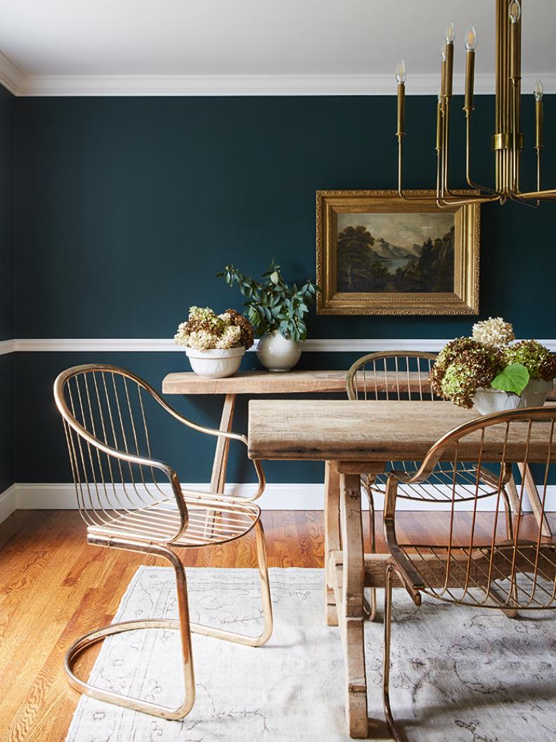
Don't Overlook the Basics

Understanding the color wheel and how different schemes work together is helpful when picking out a room's palette. "Warm colors are yellows to red violets on the color wheel, while the cooler colors are blues to greens," Olympic Paint’s Misty Walker says. When choosing colors for your space, Misty recommends contrasting warm and cool hues.

see more photos

More photos after this Ad

2 / 11
Photo: Vanessa Lentine. From: Pure Salt Interiors.

Don't Forget the 60-30-10 Rule

Three is the magic number here. You don't want to overwhelm your space. According to designer Maria Killam, "Three is a really good rule for formulating a room’s palette. More than three colors in a space can feel folksy and too busy." Here’s how it works: after choosing your shades, break them down for a cohesive look — 60 percent dominant color, 30 percent secondary color and 10 percent accent color.

More photos after this Ad

3 / 11
Photo: Reid Rolls

Don’t Skip Swatching New Paint Hues

Before you reno a whole room, make sure your chosen paint color dries the same shade you think it’s going to — or else the room's entire palette will be off. HGTV’s Leanne Ford learned the hard way. “I’d picked a dark blue blackish color, and I painted all four walls and the ceiling without putting a single swatch anywhere … It pretty much dried purple, so I had to start that job all over again,” she told HGTV Magazine in 2019.

Paint color pictured: Night Watch, PPG

More photos after this Ad

4 / 11
Photo: David Tsay. From: HGTV Magazine.

Don't Ignore Lighting

Speaking of paint, always consider the way windows and light fixtures will affect wall color. Certain hues may look different depending on lighting. In fact, HGTV's Christina Anstead suggests putting a few coats of the color you’re considering onto a poster board. “Move the board around the room at different times of day and at night to see how they look in different light,” she said in an interview with HGTV Magazine in June 2020.

see more photos

More photos after this Ad