


Midcentury Home in Maryland Updated for New Owners
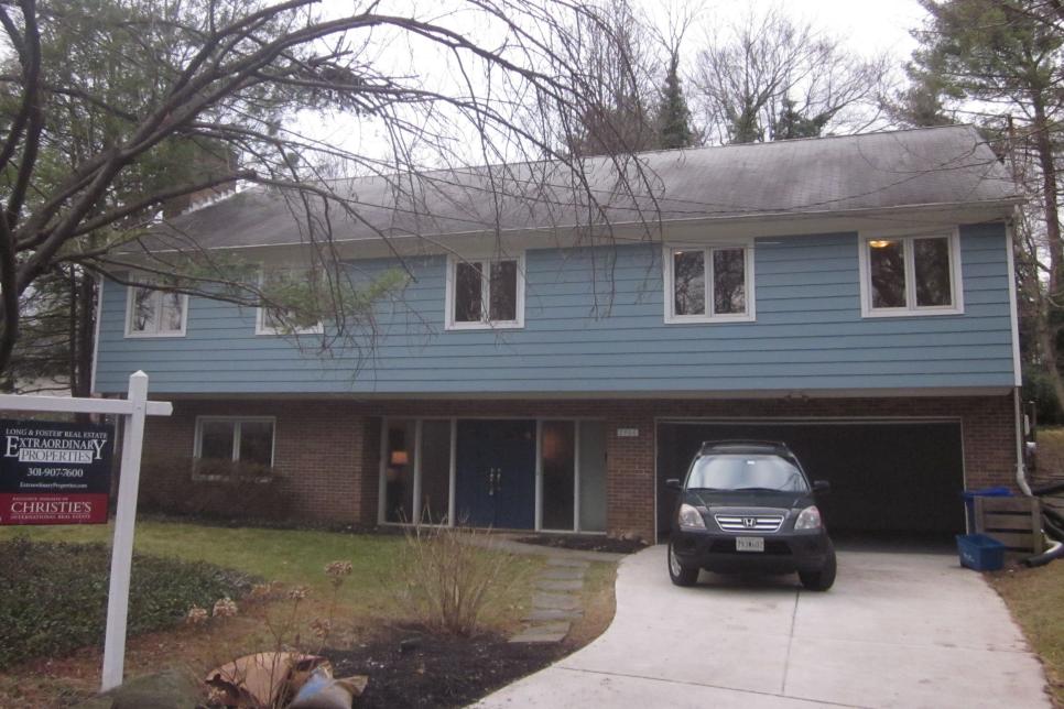
When a couple with a love of midcentury modern style purchased a new home in Kensington, Md., they knew they wanted to maintain elements of its character. Working with Louis Balodemas, they kept the main frame of the home but added a fresh dose of color and a more modern layout.

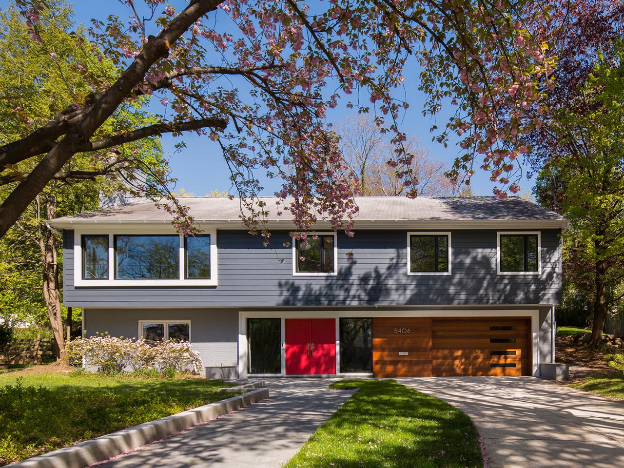
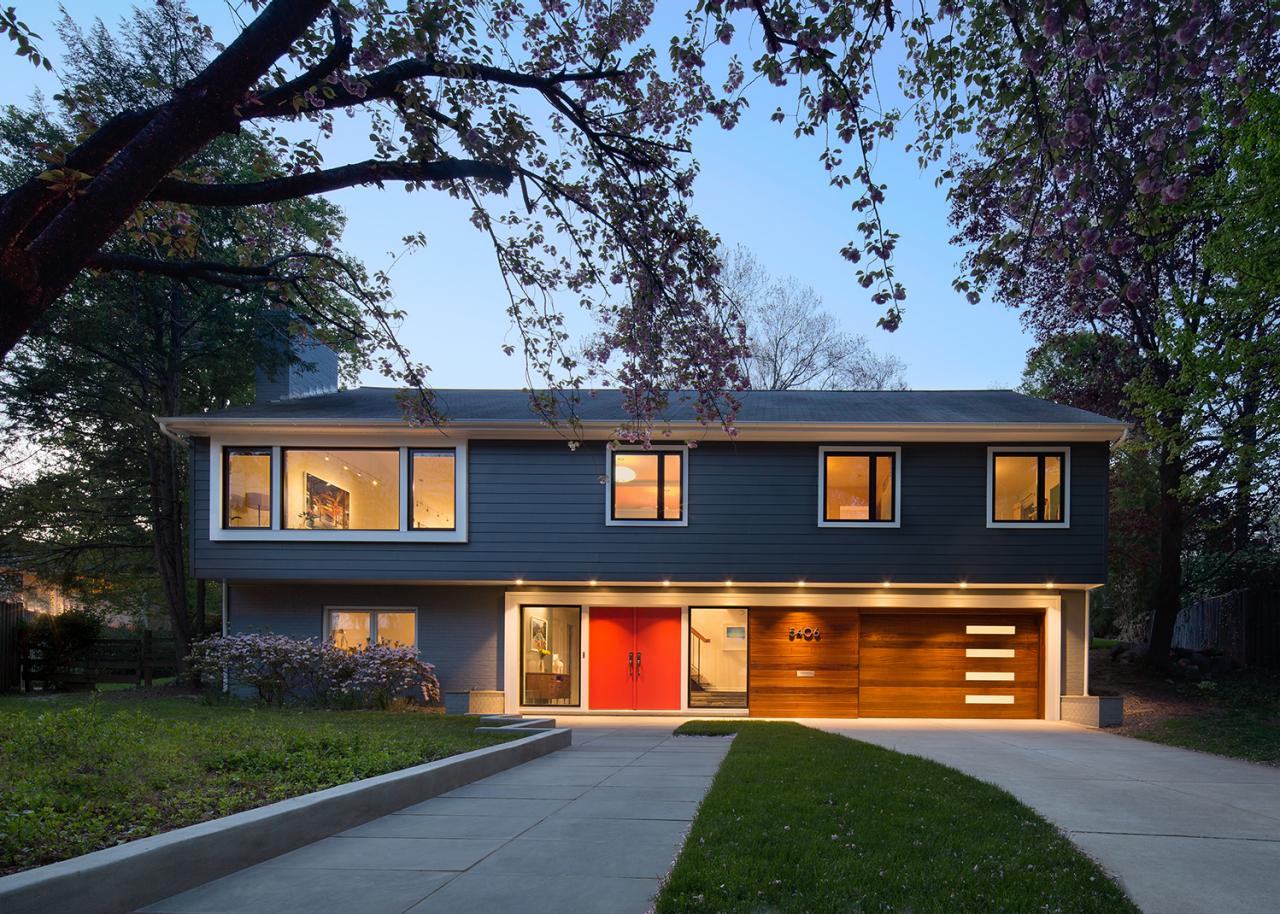
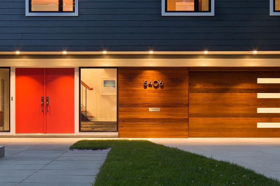
Midcentury Modern Home With Curb Appeal
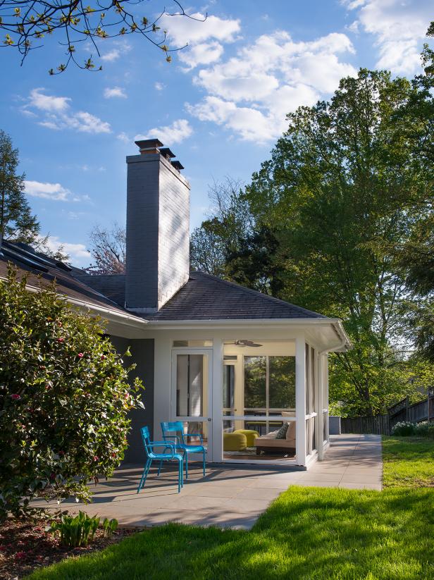
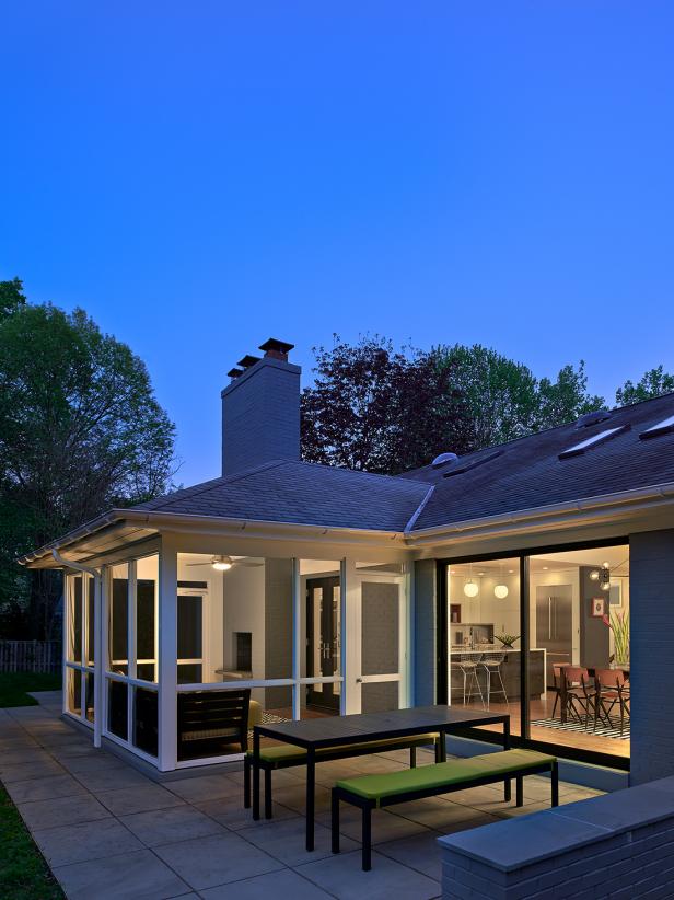
The home’s curb appeal was updated by installing a new entry door and sidelights; new windows, including an enlarged opening for the second-floor living room; new fiber cement siding for the upper level; and a new garage door. A new walkway was added to the street instead of having to come up the driveway. Heavy trim around the entry, garage door and new living room windows helped balance the façade.
Photo by: Anice Hoachlander/ Hoachlander Davis Photography
Anice Hoachlander/ Hoachlander Davis Photography
Q: What inspired the style and design of this midcentury modern home?
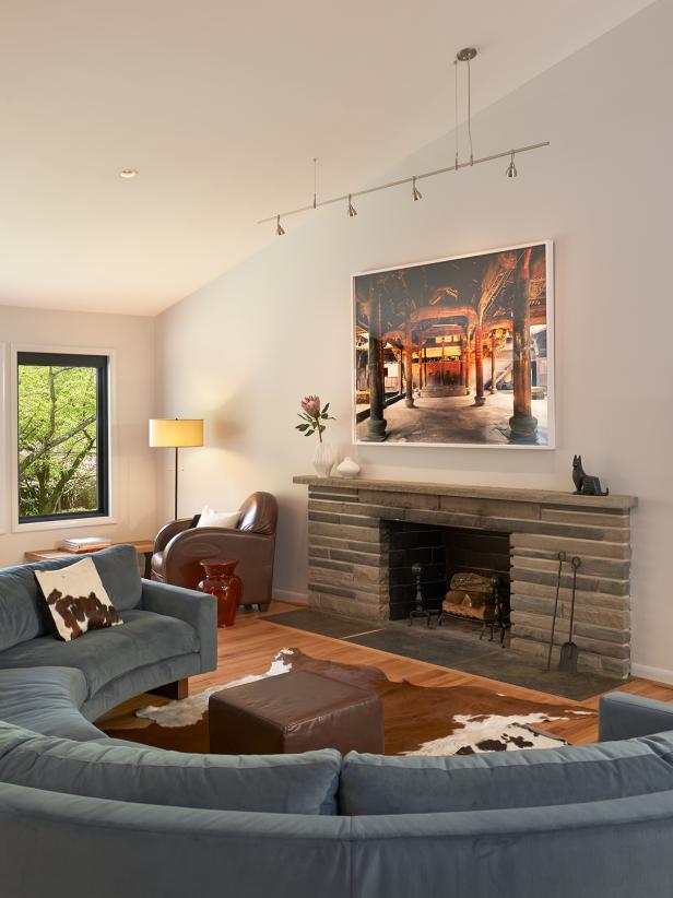
A: The homeowners, Dave and Dianne, were midcentury modern fans. In fact, they already had the furniture and their new items picked out. The curved sofa in the living room was a key element for the design, while Dianne drove the color palette, making selections and asking for my thumbs-up or thumbs-down. She has a very good eye.
Q: What were the main items on your client’s wish list for the remodeling/redesign of their home?
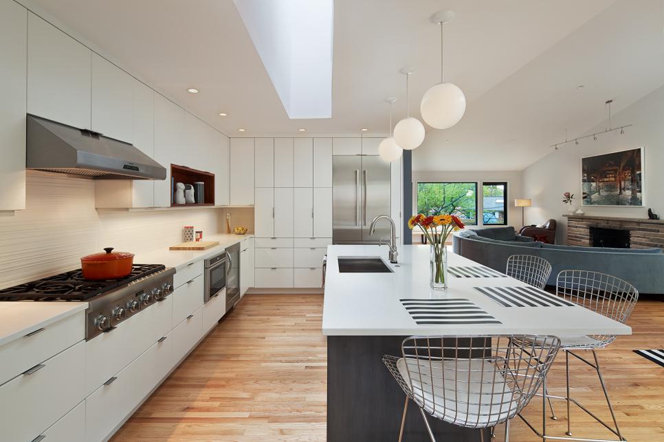
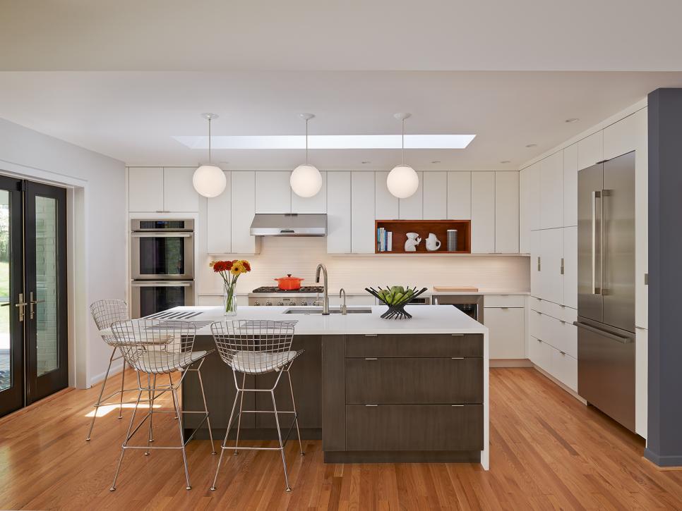
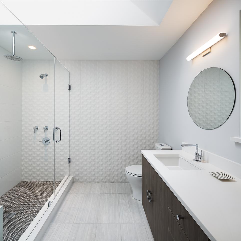
A: As a whole, they wanted a new kitchen, a flowing floor plan from the living room to the dining room and kitchen, more natural light, better views to the outside and all new bathrooms.
Q: How did you make the home more functional for your client?

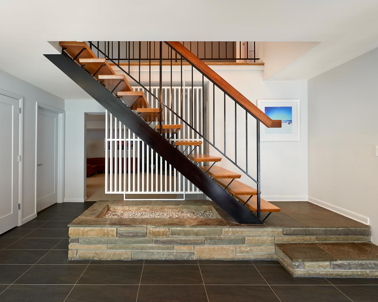
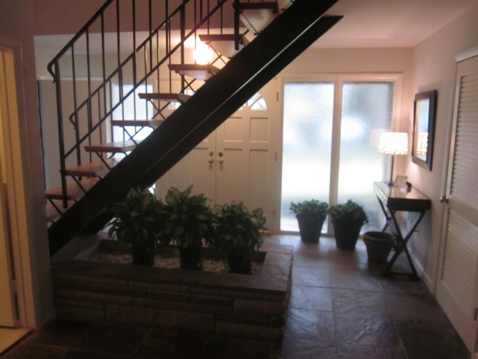
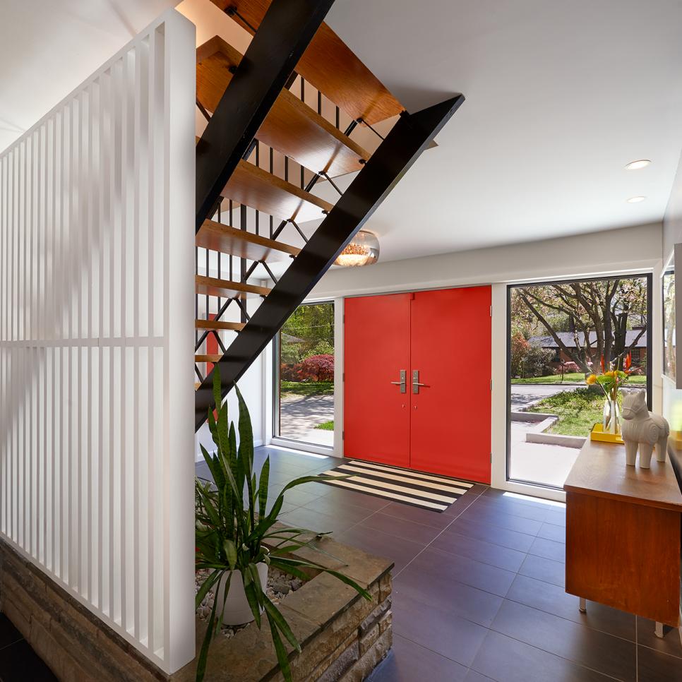
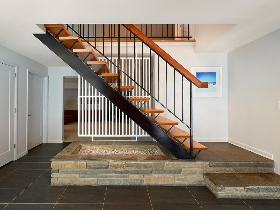
The 'Brady Bunch' Staircase
The staircase leading into the foyer is an example of midcentury craftsmanship. Dark grey tile was added to accent the staircase's style. The original treads and railing were left, and the handrail was replaced with the wood cap that the client requested for a more authentic finish.
Photo by: Anice Hoachlander/ Hoachlander Davis Photography
Anice Hoachlander/ Hoachlander Davis Photography
A: The original layout, including the upper level living area, worked well for our clients, so we didn't alter it significantly. Instead, we focused on things like creating better access to the outside, increasing the size of the foyer, making it comfortable to enter, and remodeling the bathrooms and closets. Our clients really loved the "Brady Bunch" staircase, so we revived this by adding a new top rail cap.
Q: What was your biggest obstacle in the remodeling process and how did you address it?

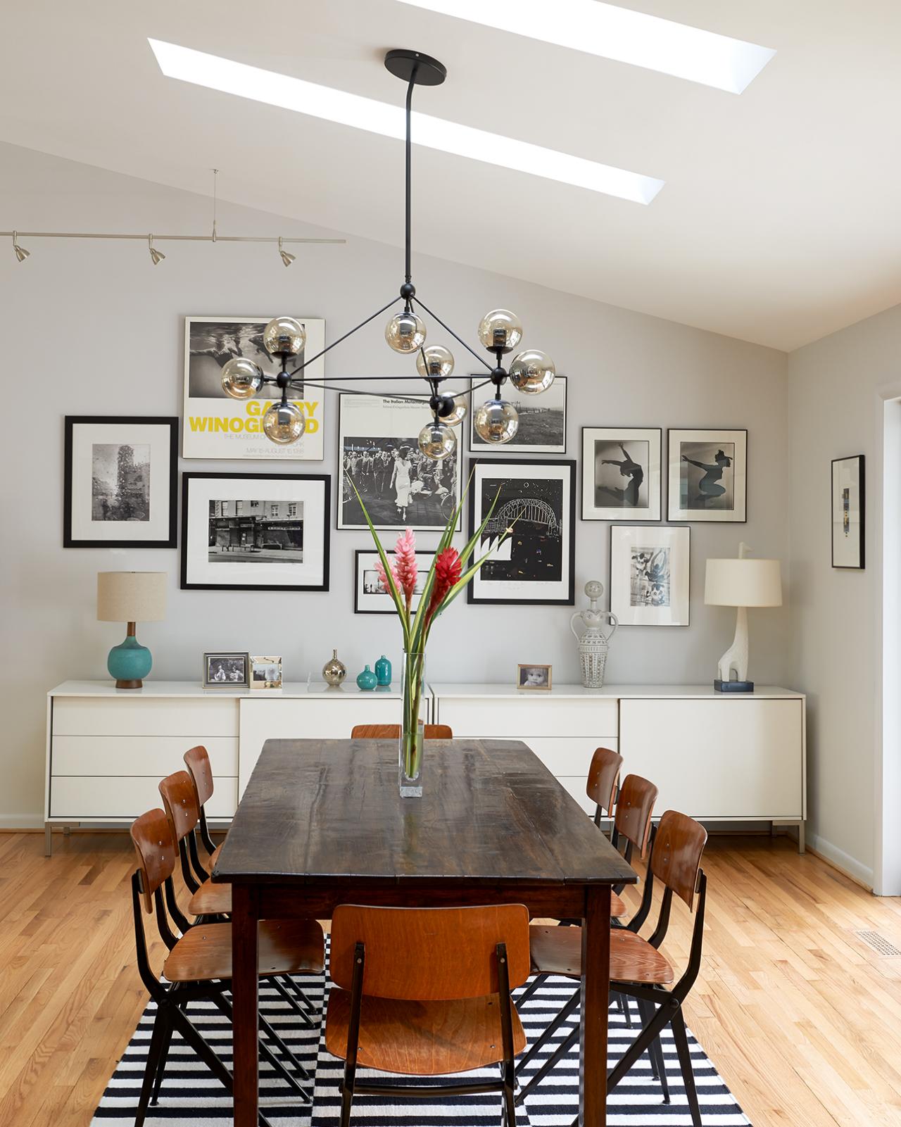
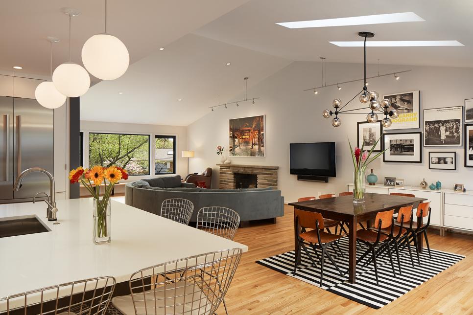
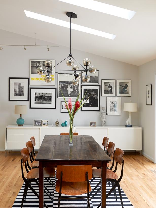
Chic, Midcentury Dining Room With Gallery Wall
A black and white striped rug grounds the wood dining table and chairs in this midcentury style dining room. A long, white buffet provides essential storage for dinnerware, utensils and anything you might need for entertaining.
Photo by: Anice Hoachlander/ Hoachlander Davis Photography
Anice Hoachlander/ Hoachlander Davis Photography
A: Our biggest challenge was working within the existing footprint and framework of the house while making enough changes to achieve the aesthetic our clients wanted.
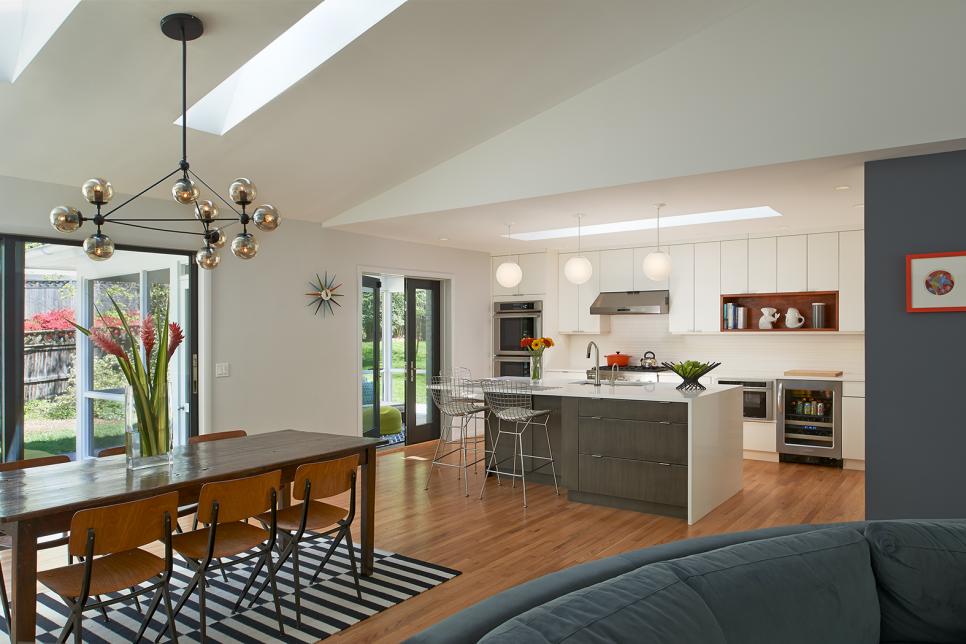
After discovering scissor trusses with sloped bottom chords in the attic, we found that we'd be able to take away the walls and flat ceilings and create a big open space with a cathedral-style ceiling.
Q: How did you make transitions from room to room without losing the individuality of each space?
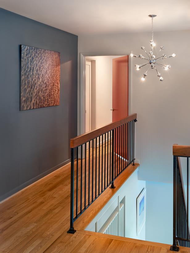
A: With an open plan, it made sense for the walls of the living room, dining room and kitchen to be the same color, with accent only at the top of the stairs. Each of the bedrooms and bathrooms received a different color treatment, separated by doors and frames, but we kept all of the interior window frames black to help tie things together. And of course, the hardwood floors help by running through the main spaces as well.
Q: Which room was your favorite to design?

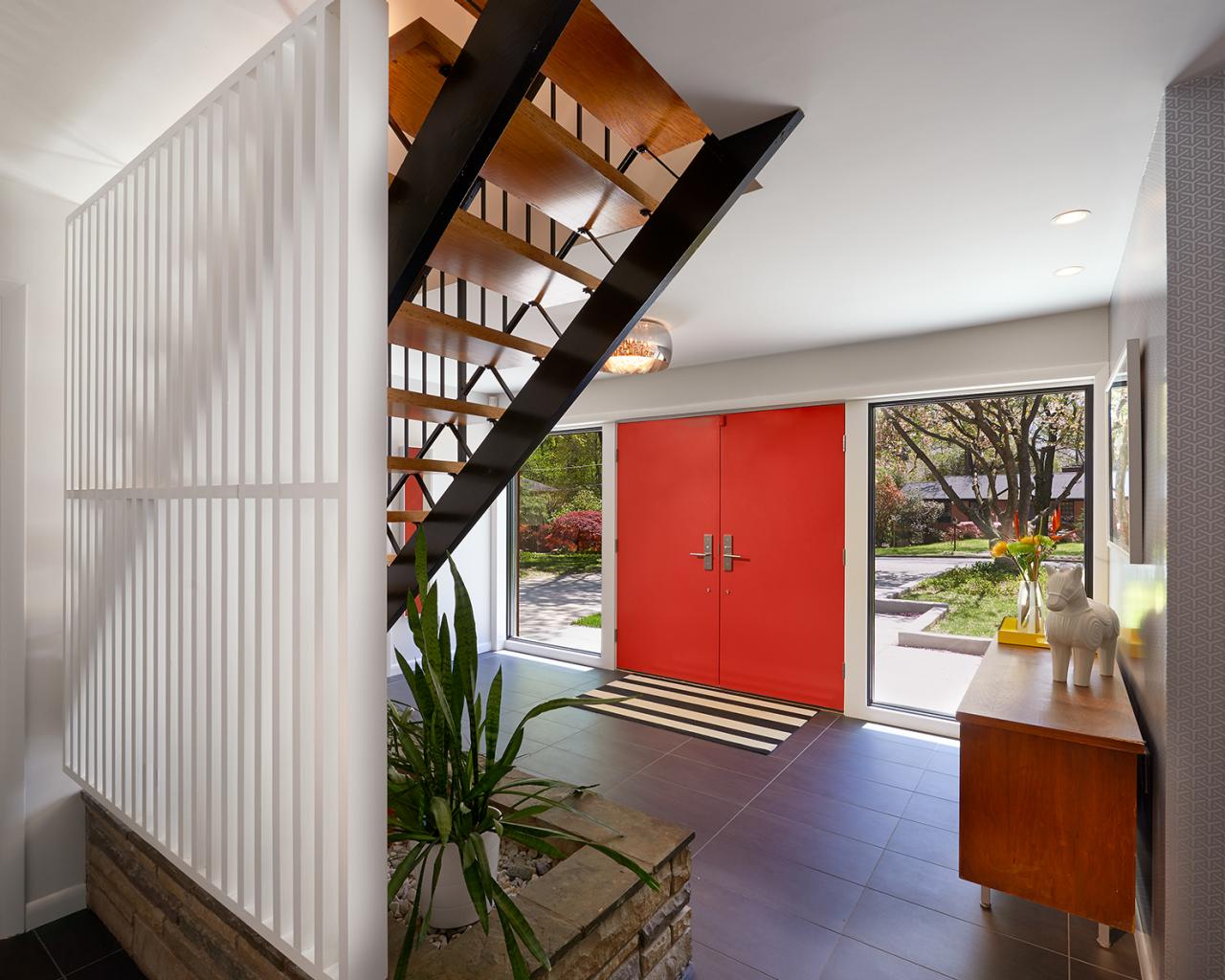
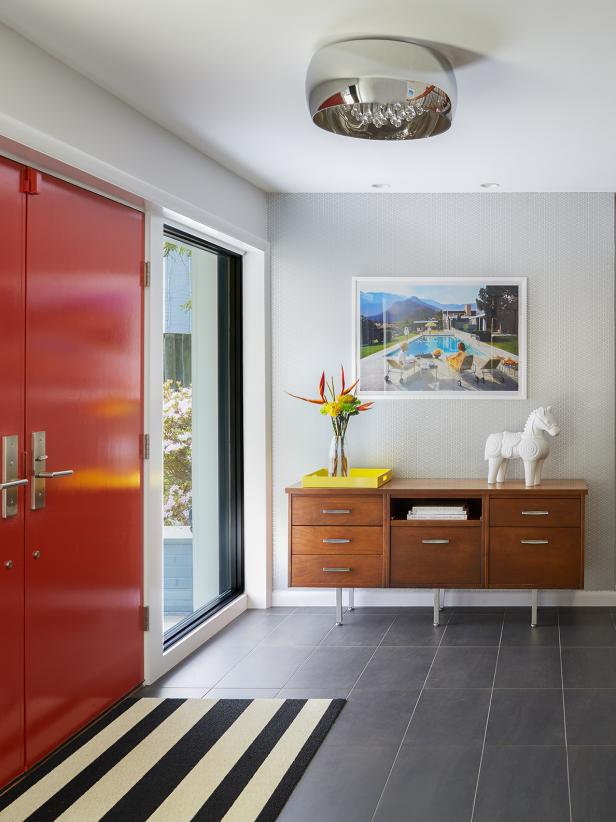
Bright, Updated Entryway
The designers left the staircase and fieldstone planter in their original condition, but added a painted wood screen to separate the stairs from the lower-level family room and bedroom, the latter of which is now used as an office. Pushing out the entry door gave the foyer a bit more breathing room, and new porcelain tile flooring updated the look.
Photo by: Anice Hoachlander/ Hoachlander Davis Photography
Anice Hoachlander/ Hoachlander Davis Photography
A: My favorite space is the new foyer. It's probably the most dynamic spot in the home because it works with the existing staircase to enhance that sense of arrival.
We actually did the most work here by increasing the size, adding the screenwall, changing the handrail, picking new floor and adding new doors.
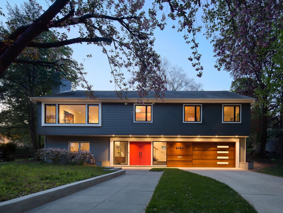
Q: How did you select the new single sapele-wood garage door?

Renovated, Midcentury Modern Home
The home’s curb appeal was updated by installing a new entry door and sidelights; new windows, including an enlarged opening for the second-floor living room; new fiber cement siding for the upper level; and a new garage door. The designers focused on increasing transparency and accentuating the horizontal character of the simple form.
Photo by: Anice Hoachlander/ Hoachlander Davis Photography
Anice Hoachlander/ Hoachlander Davis Photography
A: The sapele was recommended by our supplier. The old double-garage door overwhelmed the front of the house. We made the new garage one-and-a-half cars wide, so there's room to access bikes and tools.
The overhang of the second floor gave us the opportunity to do the stained wood with less worry about weatherings. So, by tying the wood across the front, we unified it with the main entrance and reduced the impact of the garage door.
Q: What's the best thing about this house, in your opinion?
A: The best thing about the home is how transformed it feels with such minor alterations. That's why my favorite feature is the front facade; it looks so different now.


