


30 Bright, Bold and Colorful Kitchens
When it comes to choosing kitchen colors, you can't go wrong with classic white or traditional wood tones. But if playing it safe isn't your style, consider one of these saturated shades.
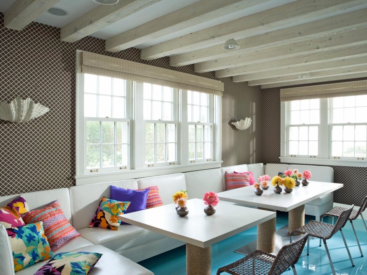
Turquoise: Inspired by the Sea
An epoxy floor in a custom shade of turquoise alludes to the ocean not far from this beach house kitchen by DD Allen. (If you love the idea but live inland, how about grass-green epoxy to evoke an open field?) Throw pillows in bright shades add punch to the space.
Tags:
Photo By: Photography by Peter Margonelli
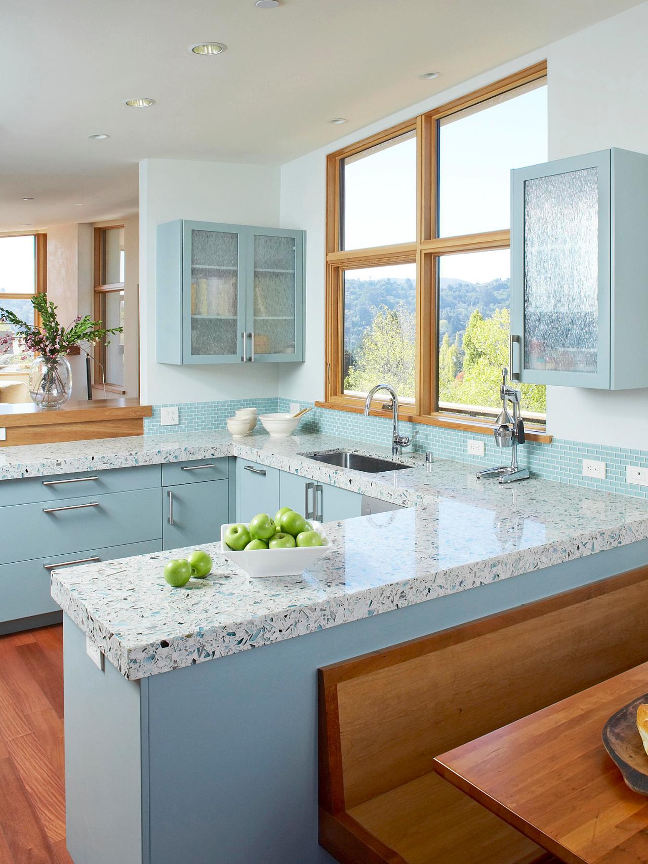
Turquoise: Custom Color
The Icestone terazzo countertops in this kitchen by Massucco Warner Miller are made from recycled glass bottles that give the surface a sea-glass-like sheen. The cabinets were painted a pale turquoise to match. When attempting to match kitchen materials, remember that paint can always be tinted to coordinate with your countertop, cabinets or fabrics, so choose the paint last.
Photo By: Photography by David Fenton
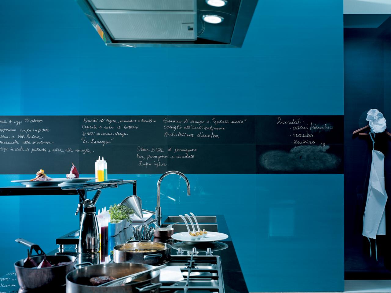
Turquoise: Chalkboard Contrast
These super-glossy blue wall tiles from the Italian company Fap Ceramiche add color and sheen to a modern kitchen. "A dose of your favorite color can personalize a kitchen and make it a refuge," says architect Susan Doban, who frequently recommends vivid hues in her projects. A strip of chalkboard paint adds contrast — and a practical way to share information and favorite recipes.
Photo By: Photography by Fap Ceramiche
Blue: Fit for Bachelor
Designers Tim Scott and Erica Westeroth, CKD, NCIDQ, took their inspiration for this Canadian bachelor's kitchen from the colors and shapes of Havana, where he has a vacation place. "The blue mosaic tile represents the dancing waves of the ocean," says Westeroth. "The convex curved wall was wrapped in cabinets of beautiful English Sycamore veneer, emulating the lush soil and the sugary white marble floors shimmer like the sandy beach."
Photo By: Photography by Donna Griffith
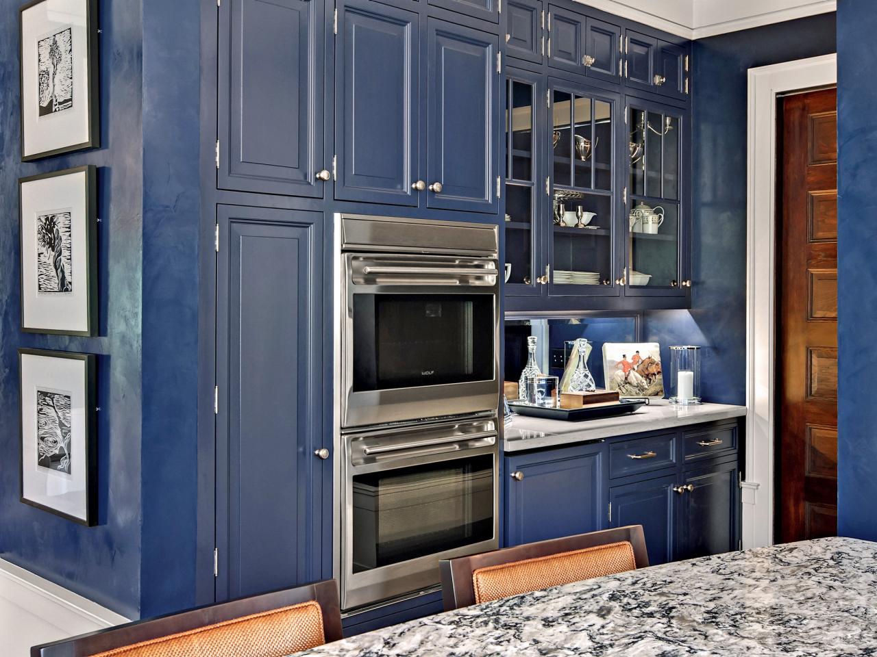
Blue: Inspired by Menswear
The classic menswear combination of navy, white and tobacco inspired the palette for this kitchen by architect/homeowner John Laren and interior designer Karen Soojian, ASID. "Bold contrast is a major design element for the space, as seen in the combination of both white (not shown) and navy cabinets," says Soojian. "This is softened by the introduction of the warm color of the cork floor and the walnut-toned center island."
Photo By: Photography by Mark Ehlen
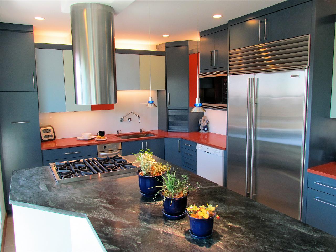
Blue: Modern Two-Tone
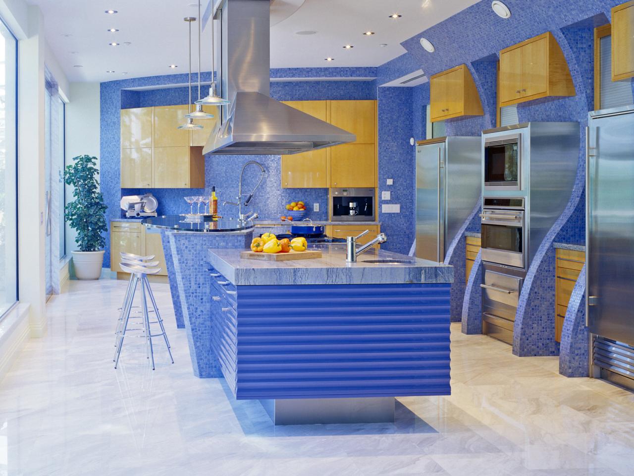
The initial inspiration for this blue and red kitchen came from the red of the Icestone countertops, which were matched to a stock glass color from the cabinetry company. All told, the designers at Gaia Kitchen & Bath used three different color glass inserts, two different color cabinets and two different countertop materials.
Tags:
Photo By: Photo Courtesy of Gaia Kitchen & Bath
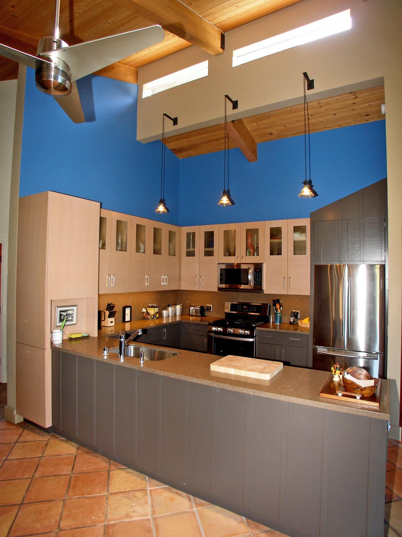
Blue: Natural Color Cues
This open-plan kitchen by designer Mark Dutka in his own home near the Northern California coast was designed to reflect the colors of the local sky, sand and forests. "The lower cabinets are painted a deep gray-brown (Benjamin Moore "Midsummer Night" 2134-20) to represent the local forest soil, and the upper cabinets are tinted rift oak, as a nod to the surrounding forest. Walls in Benjamin Moore Chicago Blues represent the ubiquitous Pacific Ocean," Dutka explains, "and the incredible blue skies residents are treated to on sunny days."
Photo By: Photography by Mark Dutka
Green: Calming and Comfortable
Neither bright nor pastel; not pale or neon, the soft blue-green of this backsplash tile in a kitchen by Ryan Christenson of Remodel Works Bath and Kitchen is unusual enough to catch the eye, but subtle enough to live with comfortably for years.
Photo By: Photography by Padilla Bowen Photography
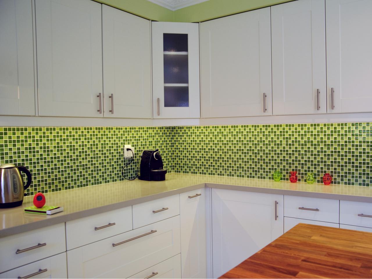
Green: Bright + Budget-Friendly
Color is a great way to add life to an inexpensive kitchen. The cabinets in this room by TS Kitchen Projects are from Ikea, and the ceramic tile was under $10 per square foot. Thanks to its bright green hues, the backsplash acts as a focal point for the room, making the space memorably playful.
Photo By: Photo Courtesy of TS Kitchen Projects
Green: Leafy Hues + Garden Views
Cool slate grays anchor this kitchen by Susan Diana Harris, ASID, while brighter greens steal the show both indoors and out. The walls are painted Behr's Fresh Grass (color #426), and the ceiling is Benjamin Moore's Pale Vista (2029-60). The windows (not shown) were left unobstructed to allow for views of the leafy garden outside. If your own kitchen is graced with garden views, remember that your choice of plantings will affect the color experience when you are indoors.
Photo By: Photography by Scott Hargis
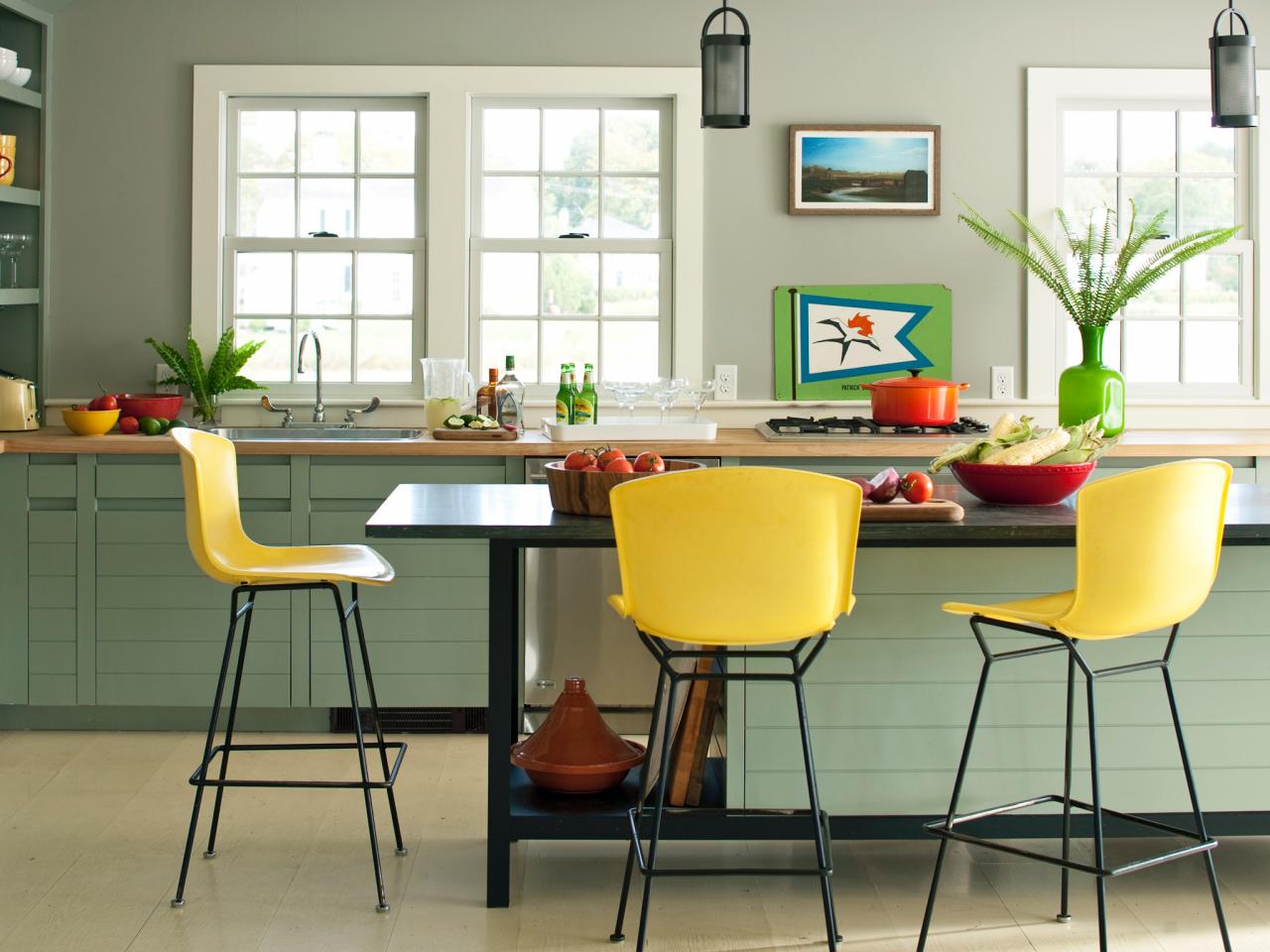
Yellow: Happy Hue
In this sunny kitchen by DD Allen, seafoam green cabinets are a soft backdrop to bright yellow stools from Wyeth in New York City. "Another way to change up color in a kitchen," says Allen, "is to use director's chair stools, and easily change out the canvas covers, which you can get in many different colors and patterns."
Photo By: John Bessler
Yellow: Inspired by Antique China
Designer Elizabeth Swartz, ASID, drew color inspiration for her own kitchen (that gorgeous yellow paint is California Paint's CAL #7263M, Sunspot) from Stangl Pottery's Fruit Pattern. "My aunt had this for her everyday china when I was a kid," says Swartz, "and I have great memories of wonderful family dinners with loads of cousins. I found a piece in an antique shop, started collecting it and built my kitchen color scheme around it." What favorite family objects make you happy? Look to them for a kitchen color that will keep you smiling.
Tags:
Photo By: Photography by Alec Marshall
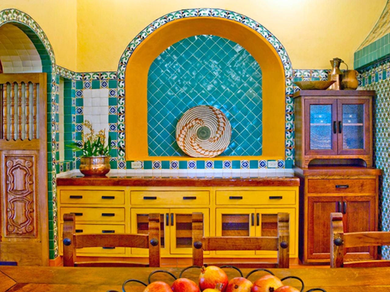
Yellow: Mexican-Inspired
Sarah Leedy-Dooley, ASID, NKBA, used bright yellow walls and an intricate arrangement of hand-painted Mexican Talavera tiles in this kitchen on a large Texas ranch. When choosing strong colors, be sure to check them in situ before buying, so you can see how they appear in the room at various times of the day as the light shifts.
Photo By: Photography by Lara Swimmer
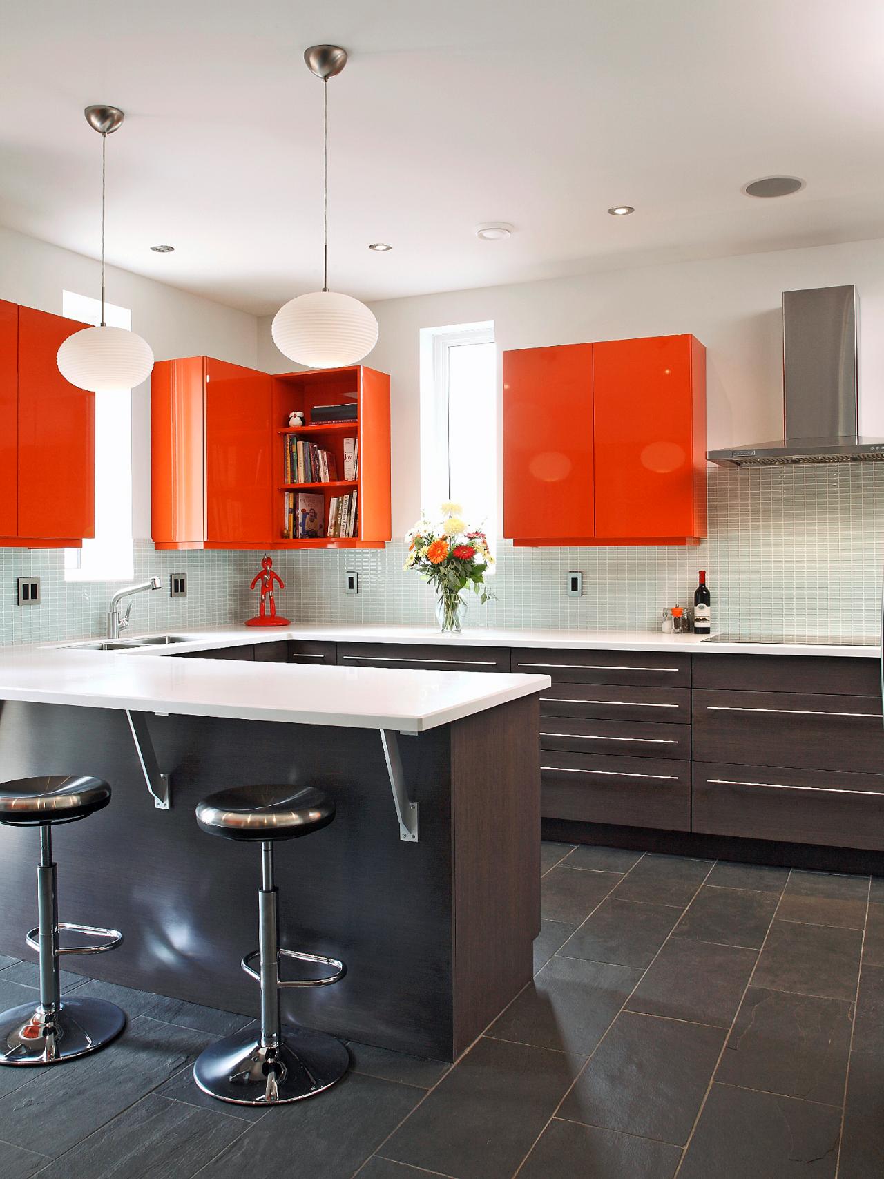
Orange: Color Pick-Me-Up
"I think that color in a kitchen has a hugely positive, psychological impact and makes people happy," says Designer Robin Siegerman, Author of Renovation BOOTCAMP®: Kitchen — Design and Remodel Your Kitchen...Without Losing Your Wallet, Your Mind or Your Spouse. And as for this particular shade? "Orange is shown to stimulate optimism," she says, "bringing spontaneity and a positive outlook to life. It's a great color to use during tough economic times, keeping us motivated and helping us to look on the bright side of life."
Tags:
Photo By: Photography by Robin Stubbert
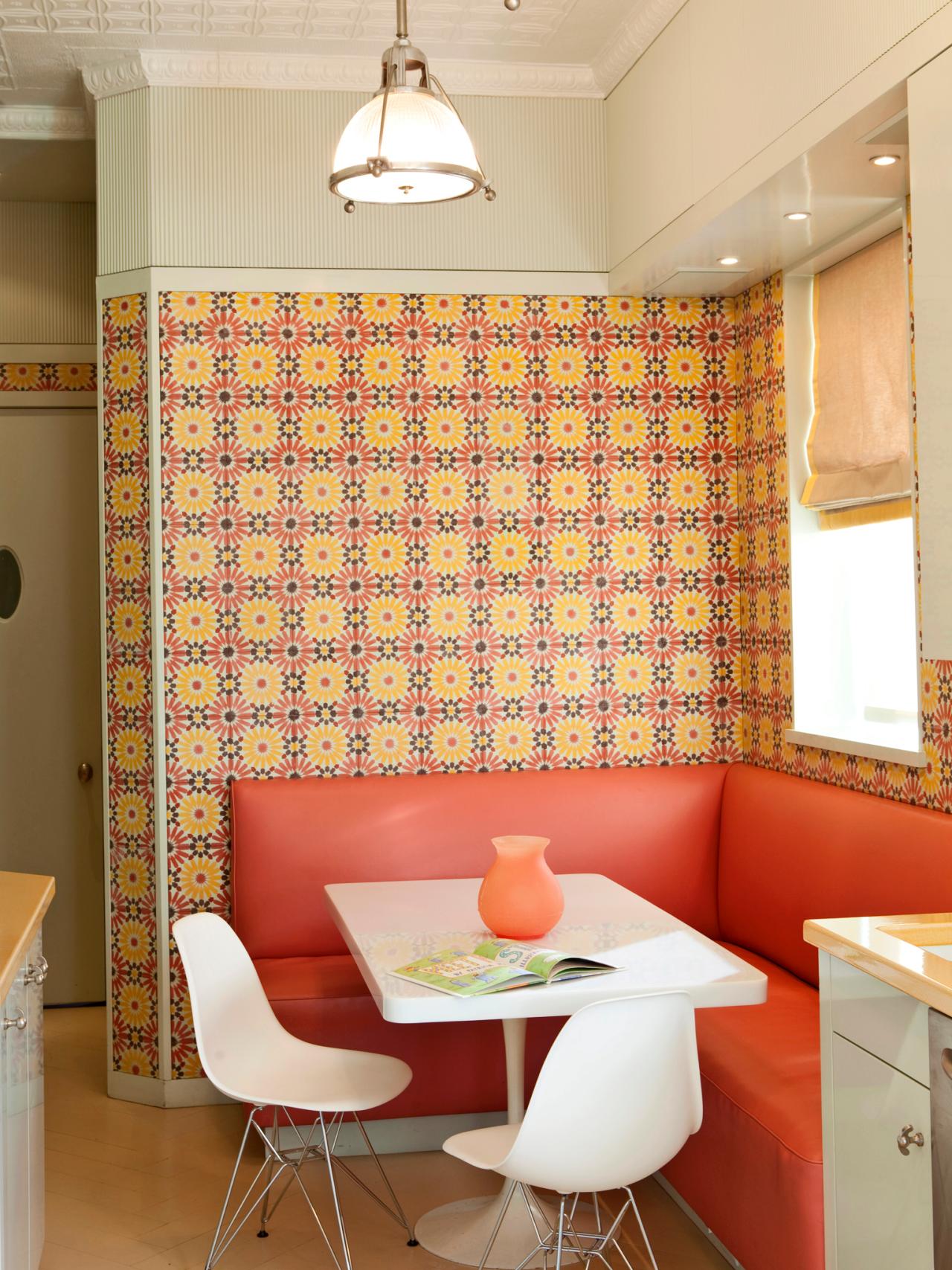
Orange: Bold Banquette
Designer DD Allen's client wanted a rosy breakfast nook and she got it, thanks to the colorful tile and coral banquette. White Eames chairs and a neutral floor and ceiling keep the color from overwhelming the space.
Photo By: Photography by Enrique Cubillo at 85 Photo Productions
Orange: Saturated Shade
The least expensive — and least permanent — way to color up a kitchen is with paint. Designer Angela Bonfante chose this pumpkin hue for a tight space with an eye on budget. Against a shade this rich, the chain-store throw pillows look like high-end custom work.
Photo By: Photography by Lauryn Byrdy
Orange: Natural Inspiration
The metal sculptor who owns this Oregon kitchen chose a palette of golds, reds and greys as a nod to the local landscape. "The curved accent walls are the color of Sumac leaves — or maybe someone's lipstick," says designer Rhonda Knoche, CMKBD, CAPS "The yellows, oranges and reds were grounded with gray and black, so the color scheme didn't summon circus music, which can happen with these bright colors."
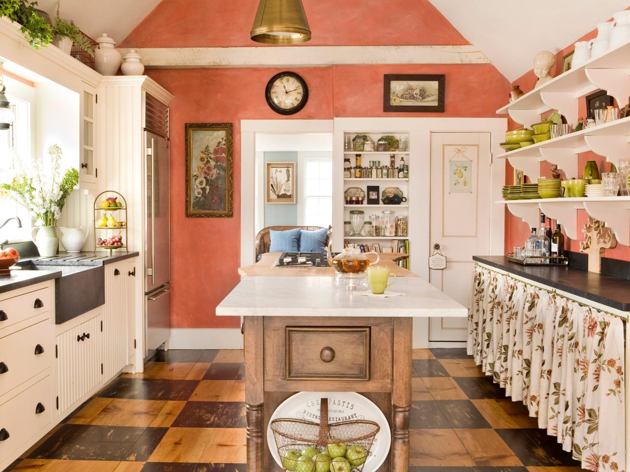
Pink: Sunny Salmon
Designer Judy O'Neil Labins chose custom-colored milk paint with a flat, chalky surface for this vintage-style kitchen. "Salmon is a great color," says Labins, "and most people can wear it in a flattering way." Trying to decide on a color for your own kitchen? Consider the shades you most like to wear. They're probably the ones you most enjoy looking at, and will help you look your best when you're working your hardest at the stove.
Tags:
Photo By: Photography by Eric Roth
Pink: Art Deco Pizzazz
In this kitchen, co-designed by Patricia Caulfield and Marc Goodwin, anigre veneer cabinets were stained with a pink dye. A honed black granite countertop ties in the black appliances and the Art Deco-style custom crown molding in black. Grey marble tops part of the center island, with another elevation topped with Corian in "Strawberry Ice."
Photo By: Photography by Patricia L. Caulfield
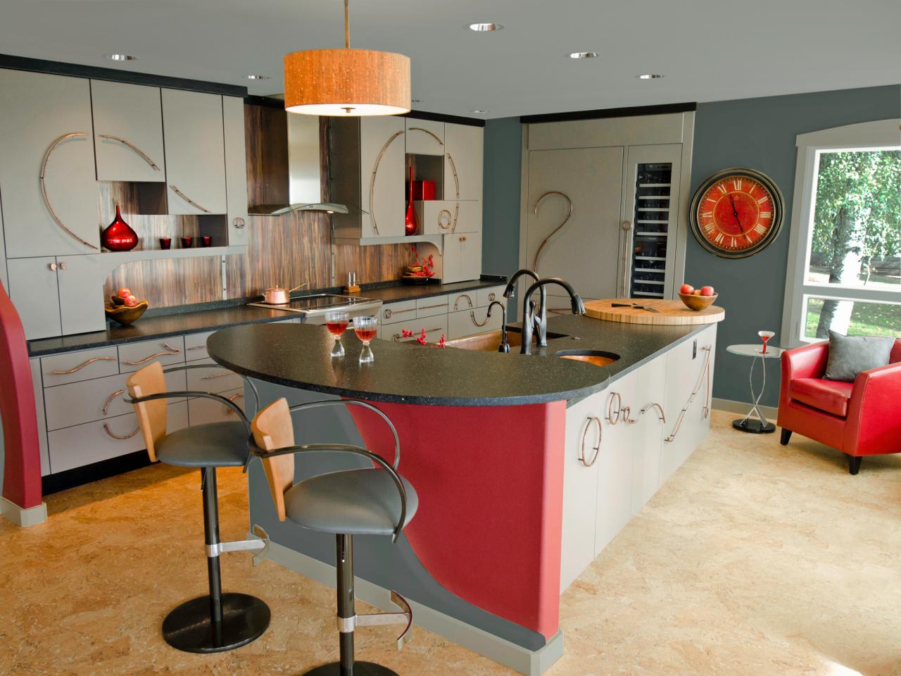
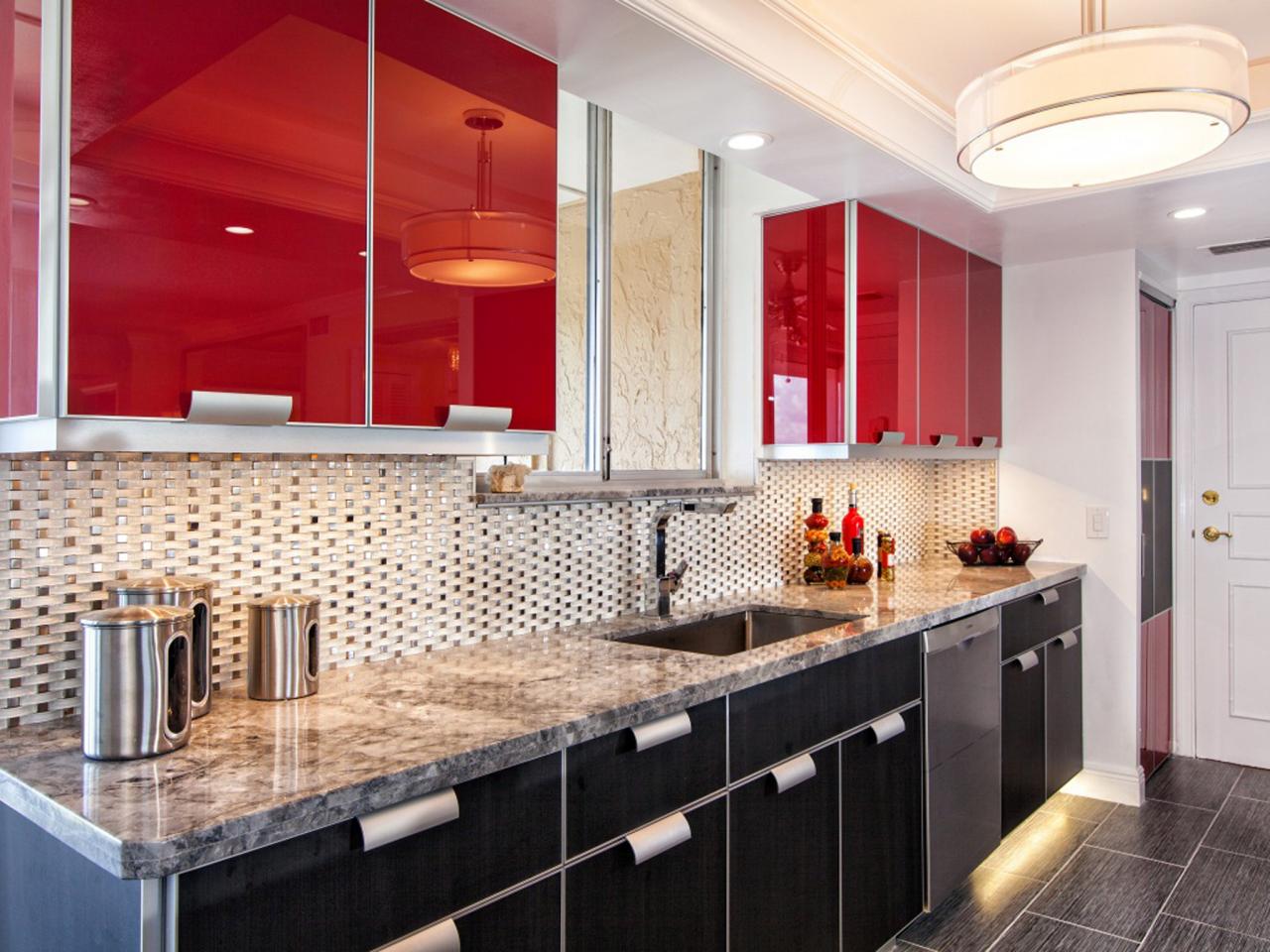
Red: Statement Cabinets
Jill Green of Sand Castle Designs used a bright, glossy red for the upper cabinets in this open kitchen. The eye-catching color turns the open galley into a design element in the apartment, while a stainless steel backsplash and black lower cabinets add to the glamour.
Photo By: Photography by Ron Rosenzweig
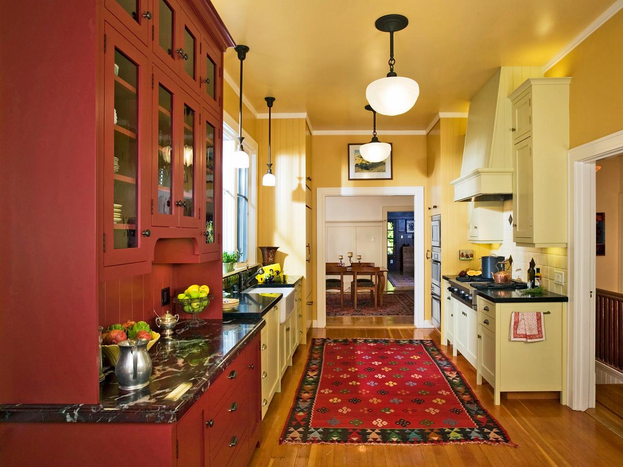
Red: A Timeless Look
A rug can add great notes of color to your kitchen — either to echo a shade already in place as with the red china cabinet in this kitchen by Sandra Bird Designs, or to brighten an otherwise neutral space. Because this particular red is matte, rather than glossy, it creates a timeless look.
Tags:
Photo By: Photography by Dennis Anderson
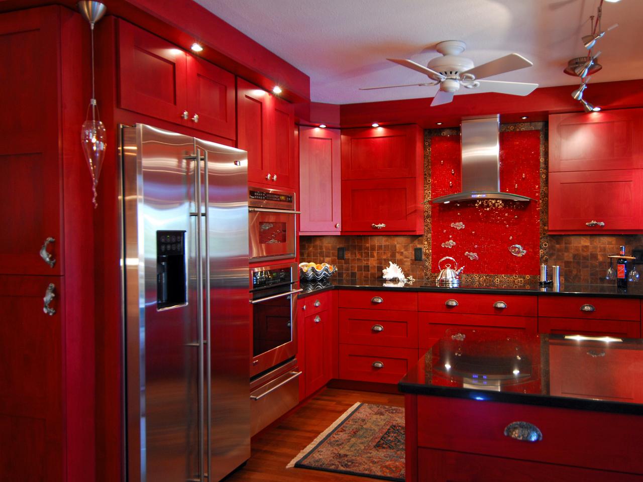
Red: Bold Lacquer Color
Not for the faint of heart, this red, red, red kitchen by John Ryba is saturated in a rich, lacquer red. The white ceiling and stainless-steel appliances help reflect light, an important consideration when you are working with a darker color.
Tags:
Photo By: Photography by John Ryba
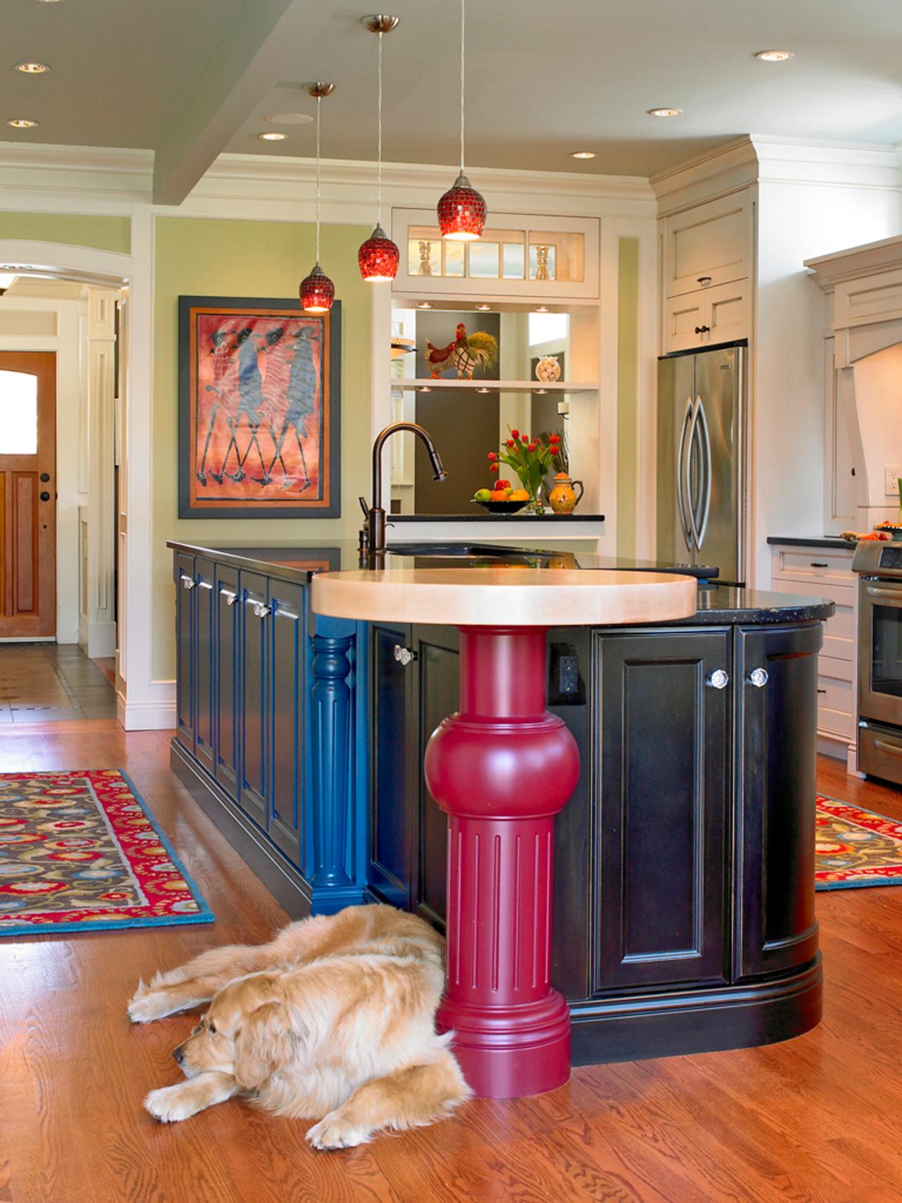
Red: All in the Details
With a color as strong as red, sometimes a few strong accents are enough. In this kitchen by Ines Hanl of The Sky is the Limit Design, a red pedestal for a counter-height table and a red runner rug add vibrancy to a more subtly colored kitchen. And don’t forget artwork as a source of color in kitchens; notice how the framed poster on the far wall rounds out the color scheme.
Photo By: Photography by Jo Ann Richards
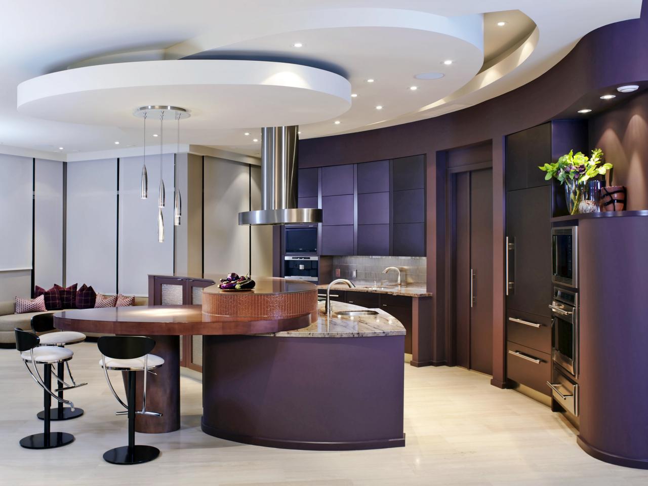
Purple: Sleek Curves + Deep Color
Purple tones in the 'Red Sunset' granite in this kitchen by XTC Design inspired the home's overall color scheme, with intense doses of aubergine on the cabinets (in a satin metallic lacquer finish), and in accent walls, pillows and art throughout the house. Designers Tim Scott and Erica Westeroth, CKD, NCIDQ, used neutral floors, upholstery and ceilings to balance the rich hue for a look that is distinctive but not overwhelming.
Photo By: Photography by Donna Griffith Photography
Purple: Naturally Pleasing Palette
A slightly paler purple distinguishes this kitchen by Jeff King, designed for homeowners who wanted a happy, colorful space. The kitchen faces south and opens onto a very colorful garden, so the color inside reflects and complements the colors outside. "Don't worry about making design decisions for resale," says the homeowner. "You will be living in the home and spending a lot of time in the kitchen, so do what truly is enjoyable to your eye."
Tags:
Photo By: Photography by Treve Johnson
Purple: Inspired by Vino
The wine lovers who own this home had several pictures of favorite Italian vineyards in spaces adjacent to the kitchen, so designer Connie Rabias-Sbarboro chose a glass/tumbled marble backsplash with lots of purple tones, and painted the walls Benjamin Moore's "Tropical Dusk," a vibrant grape shade. The rich wood cabinetry enhances the room's Tuscan feeling.
Tags:
Photo By: Photography by Javier Ramos
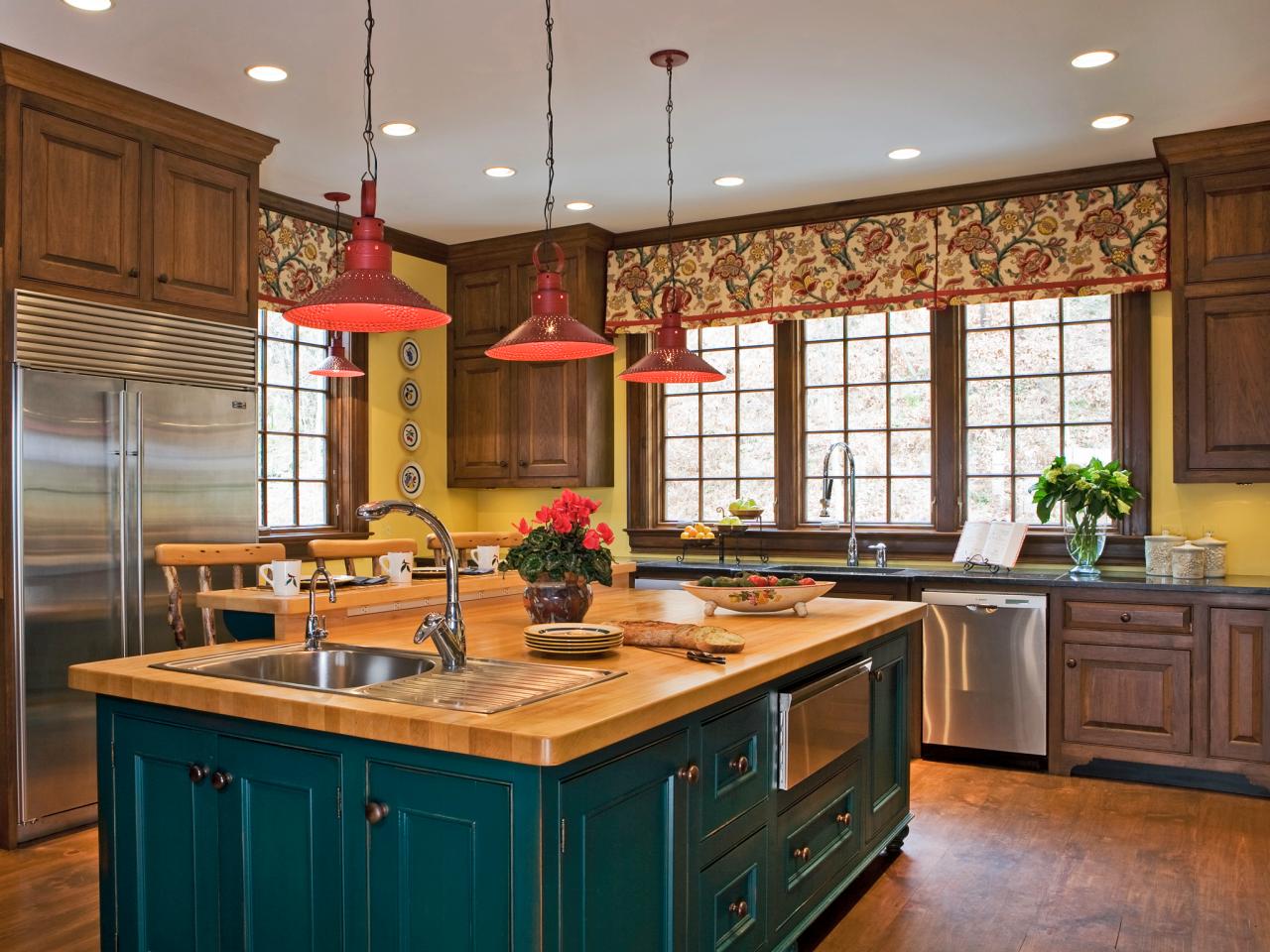
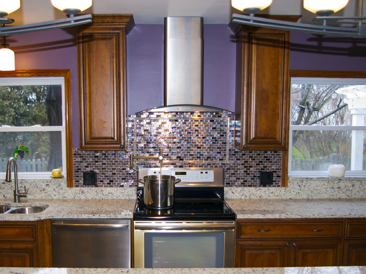
Brown: Subway Tile Backsplash
When used in the form of glossy glass tile, rather than wood or stone, brown becomes a color, too. Drury Designs used the glass tiles here to bring drama to an otherwise all-white kitchen. The tile's sheen helps reflect light to keep the space looking lively.
Photo By: Photography by Drury Designs
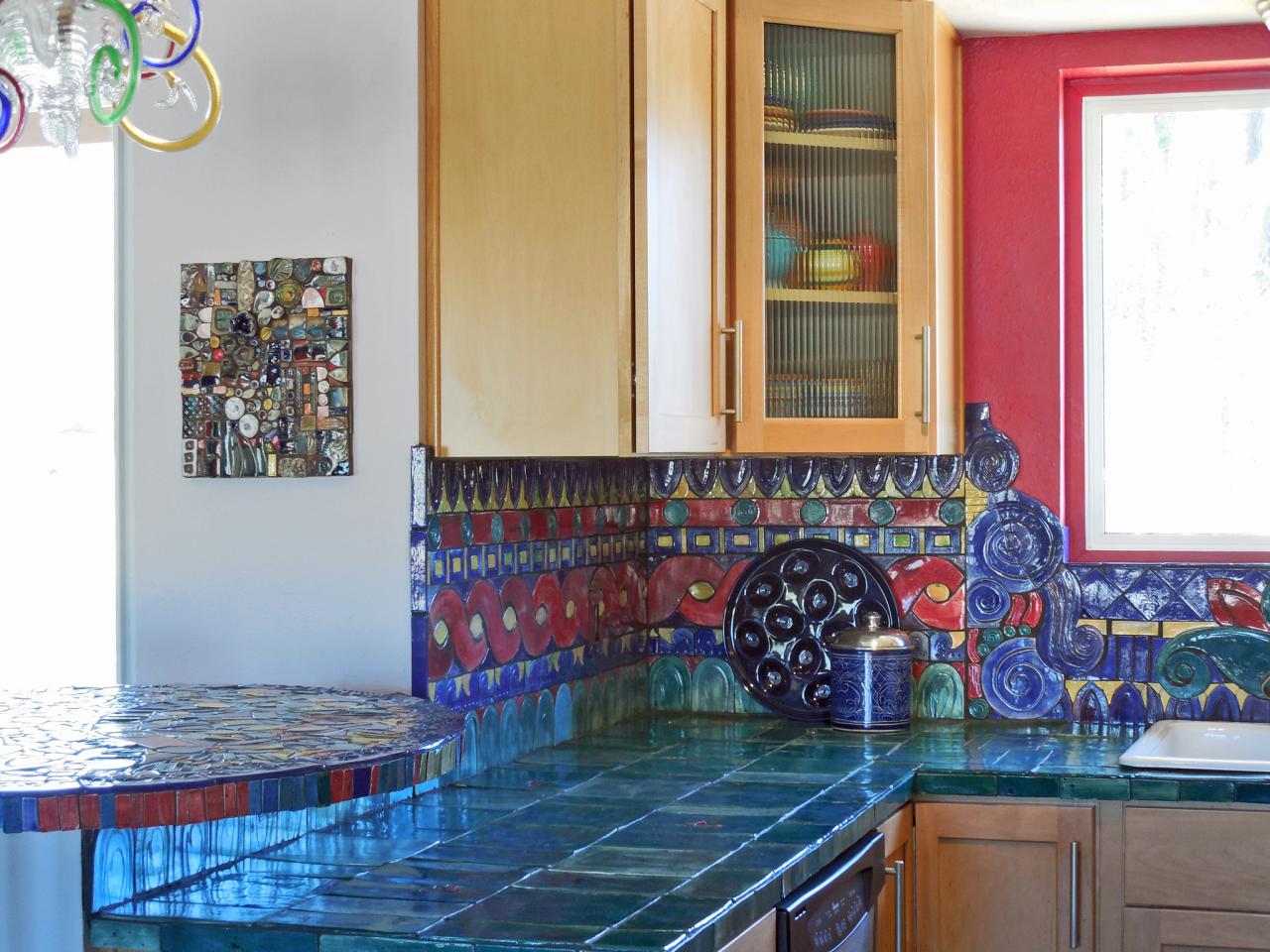
Multicolor: Intricate Handmade Tiles
Can't choose just one favorite color? Use ALL of them, as tile designer Vicki Morrow did in this kitchen, clad in ceramic pieces she designs and hand-fabricates herself. An accent wall in deep rose picks up a shade running through the backsplash and offers beautiful contrast to the deep turquoise countertop tiles.
Tags:
Photo By: Photography by Vicki Morrow
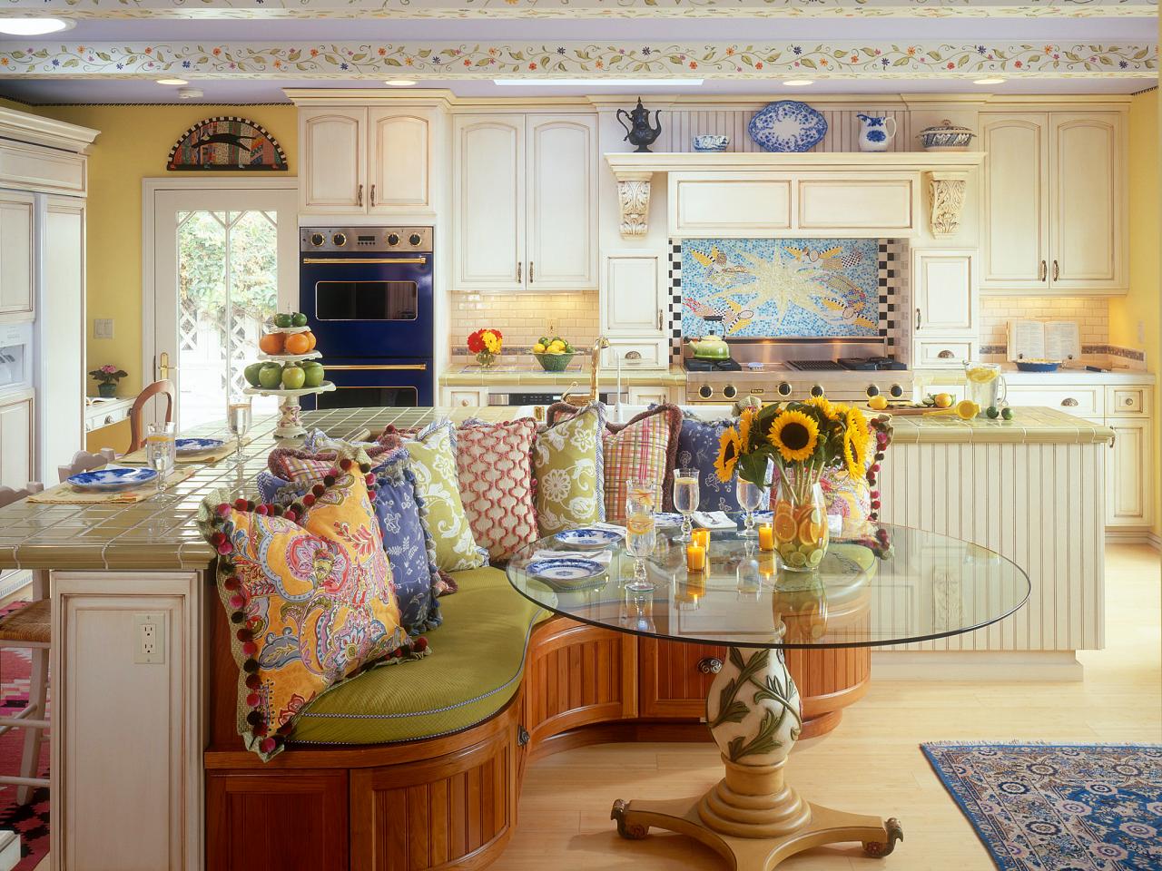
Multicolor: Patterned Pillows for a Pop of Color
Fabric is another great way to introduce a multitude of colors to a kitchen, as designer Jessica R. Caviness of Ross Thiele & Son did here. The soft shades and floral patterns are echoed in the decoratve painting on the ceiling beams.
Photo By: Photography by Gail Owens
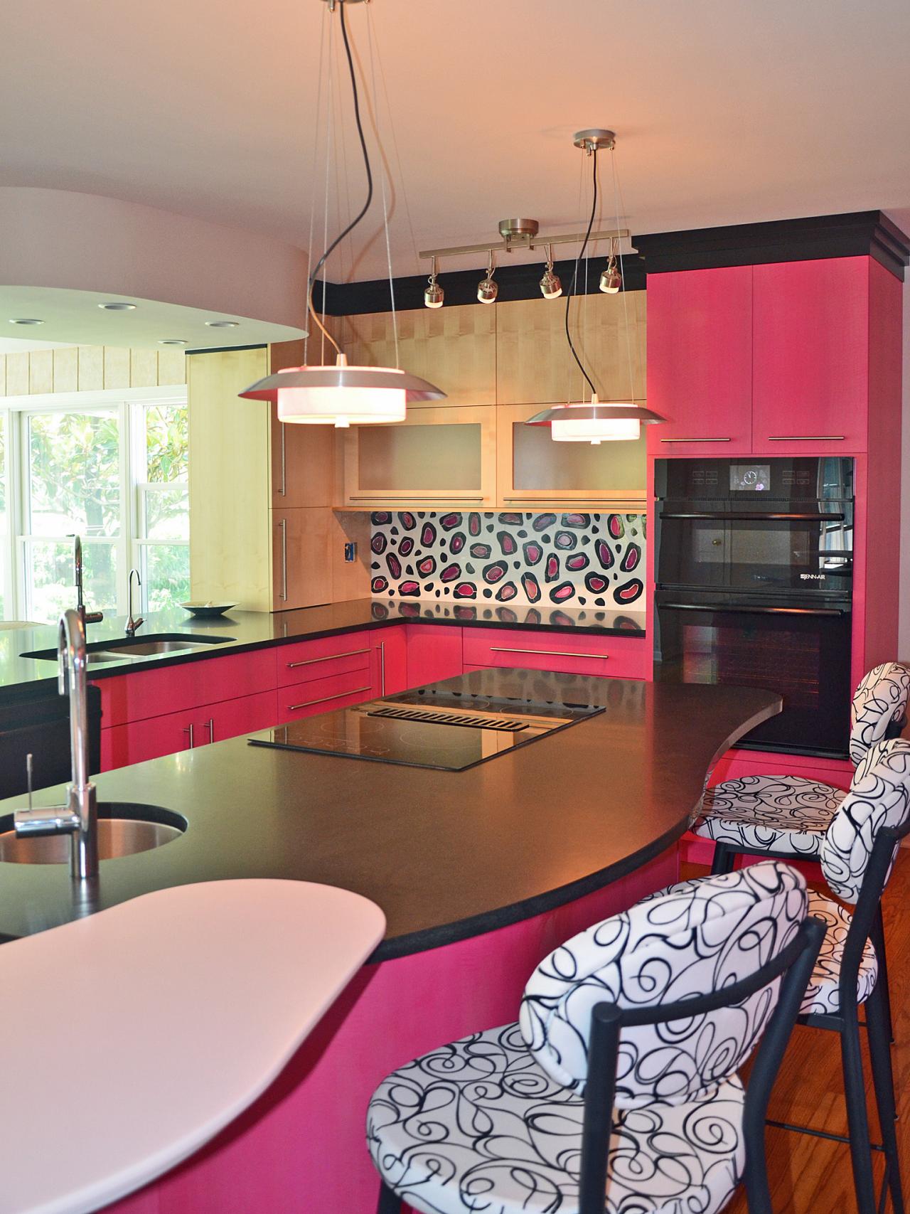
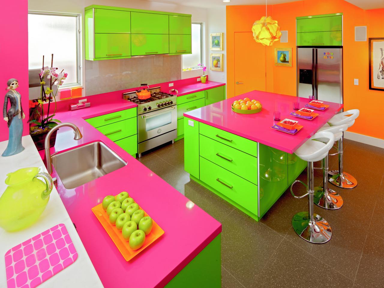
Multicolor: Whimsical Fairy Garden
Certified Kitchen Designer Elina Katsioula-Beall's client asked for a kitchen that resembled a childs fairy garden — and she got it, says Katsioula-Beale, "with bold green stems made of high-gloss laminate cabinets, opening to a vibrant fuchsia flower bed of countertops!" And the walls? Marigold orange. If this much hard-to-change color frightens you, says Katsioula-Beall, "have glass doors installed on some of your cabinets and paint their interiors a bright hue. If you hate it," she says, "that's a change that's easy — and inexpensive — to make."
Tags:
Photo By: Photography by Suki Medencevic