


A Basement With Hollywood Glamour


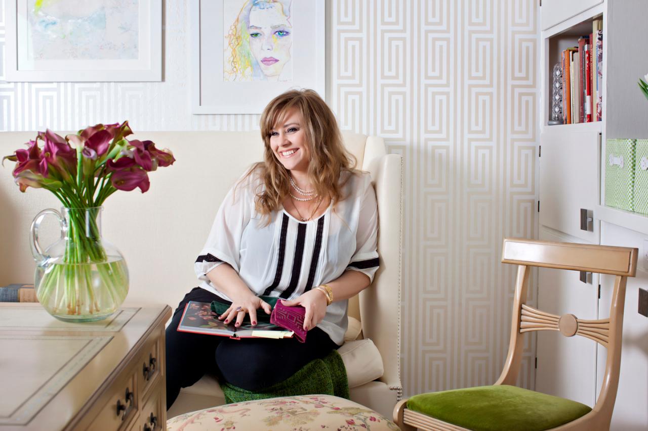
Interior designer Michelle Workman's life is busier by the minute. In the past two years, the well-respected style maker and mother of two has helmed her rapidly growing design business, had projects featured in leading shelter publications and has taken on high-profile clientele. In the midst of all this, she and her family moved from Los Angeles to the San Francisco Bay Area. "My husband's job relocated us to the Bay Area," says Michelle. "Although I fell in love with our new house's midcentury modern architecture, the game room on the bottom floor was hideous."
Determined to overhaul her new home's bottom floor, the designer devised a way to transform the dated game room into a Hollywood-inspired design studio reminiscent of the same signature style that keeps her clients coming back for more.
In its existing state, the 16x12 room didn't have much to offer visually or functionally. "I think it had always been used as a game room," Michelle explains. "The entire space was taken up by an enormous pool table. It was hard to see the space as anything but a game room due to the way it was set up. Plus, there was a gaping hole in a wall near the entrance that houses the HVAC duct, which made the room kind of creepy."
Upon moving in, Michelle was anxious to rid the space of its pool table past. Not only did she have the enormous table removed, but she also tackled a long list of tasks, including:
- Lightening the space with white paint and graphic wall covering
- Reconfiguring an existing wall of storage for her design needs
- Adding extra storage for fabrics
- Using custom window coverings to distract attention from the dated windows and sliding-glass doors
- Creating an inspiration corner packed with vertical space for tear sheets from magazines
- Updating the overhead lighting, re-covering a custom banquette
- Floating a desk in the center of the room
- Replacing the dated carpet with something light, airy and graphic
To accomplish all of this, the designer stuck to a budget of $4,000 and a timeline of three weeks, achievable mostly due to the fact that she would be repurposing furniture pieces she already owned and had in her possession.
Chic Basement Remodel
See All Photos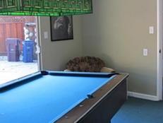
Tackling the Carpet
Once Michelle and her family were settled into their home in Lafayette, a quaint town roughly 20 miles from downtown San Francisco, she turned her focus to ridding the space of its existing carpet. "The carpet was the first to go. It was disgusting. I think the space had been flooded multiple times," says Michelle. "The only thing Hollywood about that carpet was how well it would have fit into a big budget studio-produced horror movie."
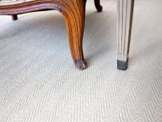
When sourcing styles for the design studio, she instantly fell in love with an off-white wool and sisal blend carpet with a graphic herringbone pattern. Although choosing the right carpet was easy, installation proved to be more of a challenge. "Once the old carpet was removed, a 6-foot-long crack down the center [of the floor] was revealed, the result of an earthquake," Michelle recalls. "This unexpected discovery could have been a financial setback, but, luckily, my installers had already included repairing any cracks in the concrete in their bid." Although the additional labor to fill the cracks did throw off the momentum of the installation, Michelle still managed to stick to her timeline.

Introducing the Wallpaper
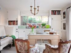
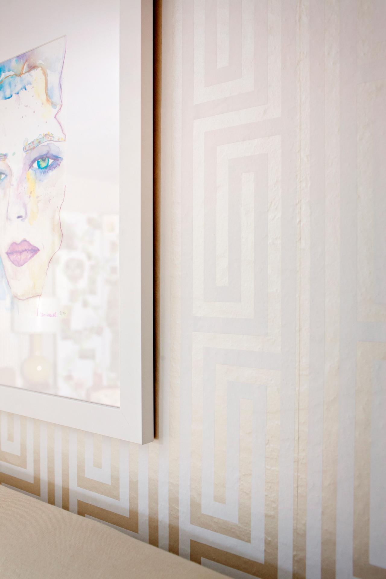
In addition to pattern on the floor, Michelle also introduced a much larger-scale pattern similar to Greek key on the walls with wallpaper. "My style is pretty Hollywood-driven, yet more livable and not at all over-the-top," she says. "While I love bold pattern with saturated color in most rooms, I personally require a light and airy space to work. Otherwise I truly can't concentrate; my creative juices just won't flow."
Something Michelle didn't anticipate was how the texture of the room's walls would affect the installation of the wallpaper. She adds: "While the drywall in the room was by no means perfectly smooth, it didn't appear to be imperfect enough to affect the way it would hang. After my wallpaper hanger, Bill Emberton, noticed the orange peel texture of the walls, he informed me that it would slightly show through the paper. The alternative was for him to first skim coat the walls, which would come with a hefty price tag. I decided to have it installed as-is, assuming the graphic pattern of the paper would overpower any imperfections in the walls behind it." Luckily, Michelle was right. The imperfections of the walls behind the paper are only noticeable from close up.
Illuminating the Space
Next on Michelle's list was updating the room's lighting. To add a personal touch to her design studio's lighting plan, Michelle repurposed a vintage fixture that previously hung in her Los Angles home furnishings store. Its midcentury modern style blended perfectly with the house's architecture, and its brass finish worked well with the gold tone of the wallpaper. "I love my gold chandelier. It's totally Hollywood," says Michelle. "And even though I'm no longer living in Hollywood, I've got a piece of it here with me in the Bay Area."
Since the junction box for the room's existing lighting was already centered in the space, Michelle simply centered her small writing desk under the chandelier and had it installed directly into the existing junction box. "When you've got the right chandelier, it's important to hang it directly in your field of vision; you should be able to look directly at it, not up into it," Michelle notes. "My rule of thumb for installing pendants is that the bottom of the fixture should sit roughly around 36 inches above the top of the table."
Putting together mood boards and presentations is an important part of what Michelle does. To ensure vertical space for pinning up fabrics, wall covering samples, tear sheets and trim, Michelle has a custom three-piece folding screen that is upholstered with white cotton and apple green satin ribbon. In addition to being functional, the screen also delineates one corner as a designated reading area where Michelle sits in her lounge chair and seeks out inspiration from pages of shelter magazines.

Organization played a big part in the design of Michelle's studio. Luckily, the existing space included custom built-ins that Michelle updated easily with a fresh coat of white paint. To give them a more polished look, she replaced the existing hardware with affordable chrome pulls from IKEA, an option that set her back only $100.
"I found similar styles in designer showrooms, which were three times the price, if not more," says Michelle. "Thanks to these shiny little guys, I was able to stick with my budget." Since the existing built-ins offered plenty of space to house all of Michelle's design books, vendor binders and swatches, she simply had to decide which cabinets and drawers would be assigned to which items.
To incorporate an element of open storage for books and magazines, Michelle simply unhinged some of the built-in doors to create an open look. The designer adds: "I wish I could take credit for inventing this idea, but I didn't! It's a great tip for anyone trying to give old built-ins a new look or purpose. Simply taking a few doors off is a great way to display favorite items, whether they're decorating or things which require quick, instant access."
With the project complete, Michelle's Bay Area design business is now in full swing. As far as anything she would have done differently, the designer says: "On gorgeous days, I would love more than anything else to be able to fully open the exterior wall and have the breeze come in. If I'd budgeted to have double French doors installed, it would be more like an office that's also slightly an outdoor room."
Although Michelle and her design business are now 300 miles north of Los Angeles, she's bringing Hollywood to the Bay Area, one space at a time.


