


Midcentury-Modern Family Dining Room

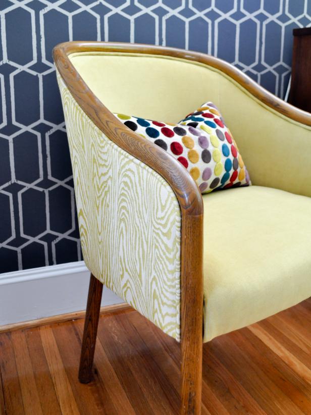
Yellow and Gray Midcentury Modern Dining Room
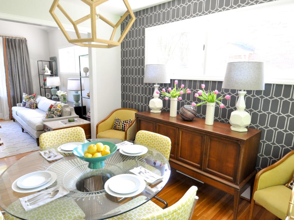
This bright dining room has a casual mix of geometric patterns, chrome accents and classic wood furniture. A glass dining table keeps a low profile, allowing the patterned chairs and graphic wallpaper to do the heavy lifting.

Given the task to turn a small space into a roomy dining room fit for seven, designer Ashley DeLapp had her work cut out for her when putting together this family space. But by using creative design techniques, like smart furniture choices, DeLapp was able to create a midcentury-modern dining room the whole family can enjoy.
What were the main items on the family’s wish list?
They wanted a period-appropriate design that fit their midcentury-style home. The clients weren’t afraid of color, and since the room was so blah with no redeeming qualities they wanted something to liven up the space. The room is sandwiched between the kitchen and living room, so they obviously were concerned with how everything flowed together.
Vibrant Midcentury-Modern Dining Room
See All Photos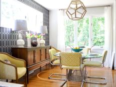


What was the single-largest issue you wanted to address for the family?
The biggest issue was the size of the room; it isn’t a large space and is the only place to dine in the entire home. My clients have a large family — five children when all are home — so I had to get the most seating possible while providing the best use of the space.
What was your biggest obstacle in this space?
The biggest obstacle was the layout of the furniture. I looked at many ways to maximize seating in this room. My initial thought was to use a banquette with a long oval table, but that wasn’t the best solution since it wouldn’t allow room for a storage piece. I ended up using the Platner table because it was round, (and beautiful and midcentury) which provided better circulation. I was then able to get a console along the only uninterrupted wall and flank it with two chairs for additional seating.
How does the end result match up with your original vision for the space?
The overall look of the room was what I envisioned. You can’t really see in the pictures, but the only dividing element between the dining room and kitchen was a breakfast bar. The only change I made was to the original barstools; they were too bulky once all the furniture was installed. I swapped them out for a smaller-scaled stool that tucked nicely away under the bar top.
What surprised you the most about this project?
I definitely learned how to work with smaller-scaled furniture to get the most functionality from the space. The best part: We didn’t have to sacrifice style or comfort.
What are the hidden gems in your plan?
I think what made this room was the layering of geometric patterns. The backdrop of the trellis wallpaper showcased the similarly angular lamps. The dodecahedron chandelier mimicked the shape of the lamps and reinforced the pattern on the wallpaper. Repetition is a classic design principle, and I think this room successfully tied many bold elements together without the room looking chaotic.


