


A Century-Old Brooklyn Home Remodel


Full of character but lacking in lighting, this narrow Brooklyn brownstone needed a spruce. Designer Ben Herzog worked closely with his client to ensure they got the changes they desired without sacrificing charm.
What was at the top of the clients' wish list?
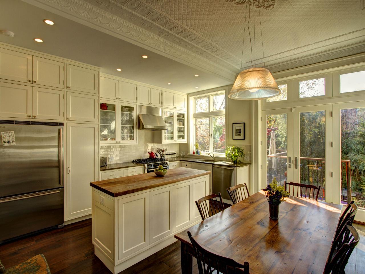
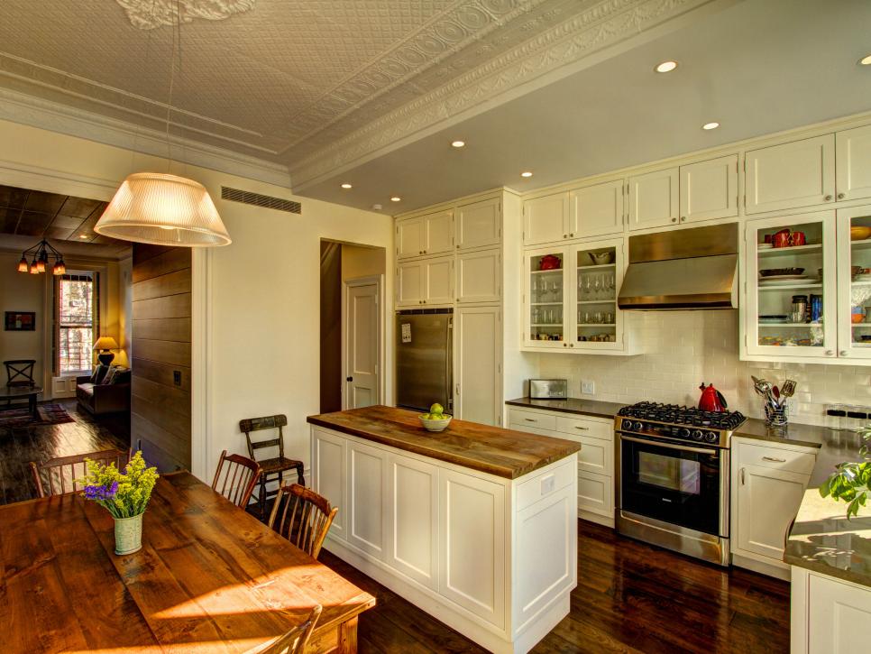
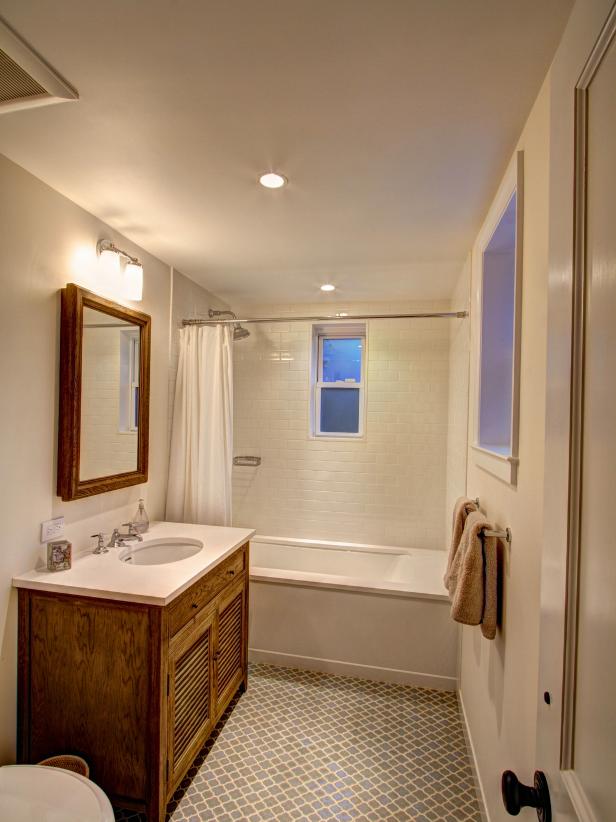
We did a full gut renovation of this 100+ years old brownstone. Besides upgrading the kitchen, bathrooms and all the electrical and plumbing, our clients really wanted to open up the house and bring in more natural light. Even though the renovation required us to demolish a lot of the house, we took care to preserve some of the beautiful details in the house, such as the original tin ceilings.
Classic Gets an Update in This Brooklyn Brownstone
See All Photos


What was the biggest issue the design addressed?
Our client’s classic Brooklyn brownstone is absolutely charming, but the reality is that this century-old house is somewhat difficult for a modern family to live in. The proportion of the house is long and narrow (only 17’ wide), and it’s dark in the middle of the house. Spatial layouts in original brownstones were traditionally more formal, and rooms were clearly delineated from one another. The house is also vertically spread over three floors, so we wanted to organize the spaces logically and efficiently. Our goal was to physically and visually open up the house and make it more suitable for our client’s modern lifestyle.
Describe an obstacle in the space.
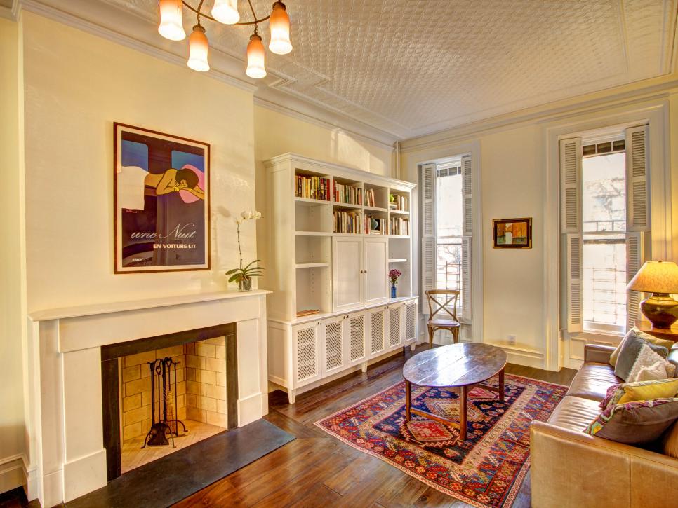
The deep and narrow proportion of this brownstone was the biggest obstacle. There are only windows on the front and back of the house. The living room on main floor was very long and narrow and quite awkward for furniture placement. Traditionally, there would have been pocket doors separating the front parlor (living room) from the back parlor. There would have also been double doors separating the front parlor from the formal entry hall as well. We removed the doors and widened the opening between the living room and entry hall to open up and connect the spaces. Widening the doorway gave a more balanced proportion to the living room and made it feel less compartmentalized.
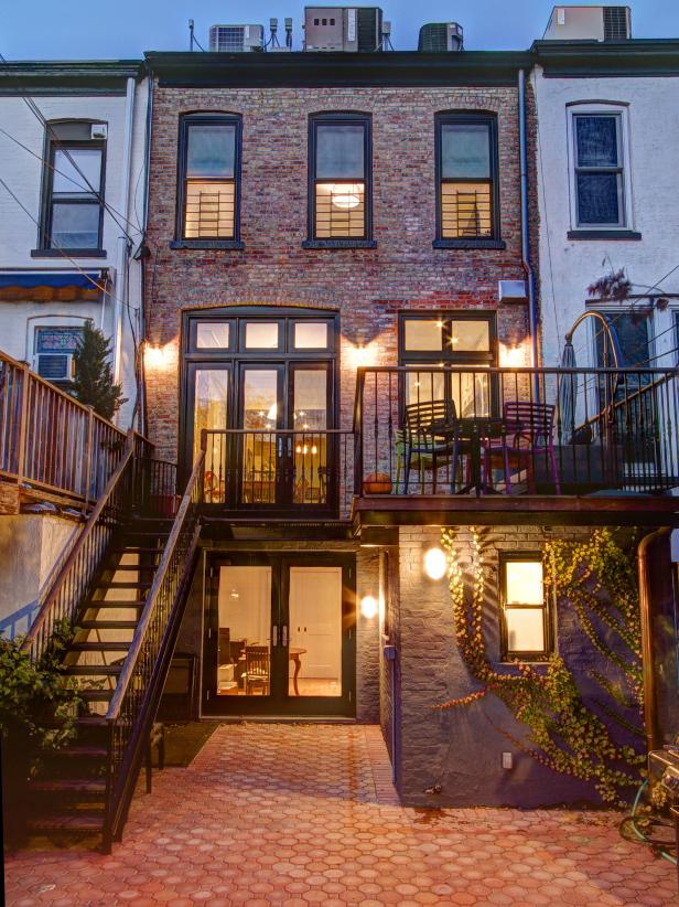
In order to bring in as much natural light as possible into the deep space, we removed some of the brick on the rear wall to create a large wall of windows and doors facing the rear garden. There are wonderful views of the garden from the kitchen and dining room, and an abundance of natural light now pours into the house from the rear.
How did the end result match your original vision?
This was one of our first projects when we started our office, so it was a very exciting experience. Our design process is client driven, so we work very closely with the owners to help them achieve their vision. We knew that we wanted to open up the house and make it look and feel brighter, but the details of how it actually ended up looking reflect the personality of our client. This was a wonderful collaboration between the architect and the client with very successful results. We are fortunate that we didn’t come across any major issues during the development of this project.
What lessons did you learn from this project?
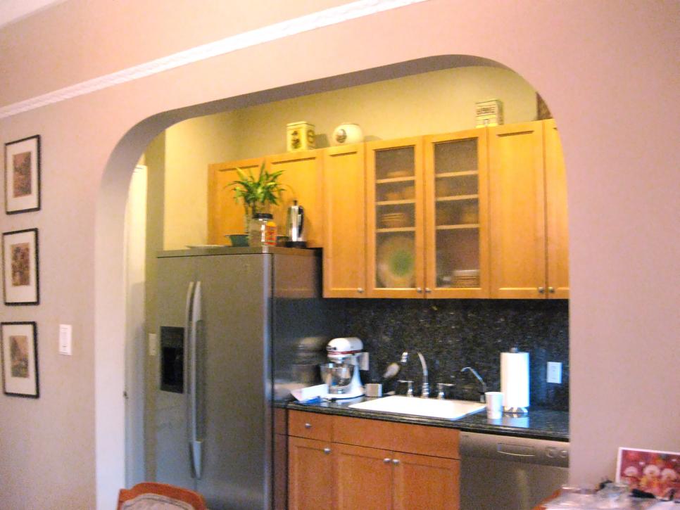
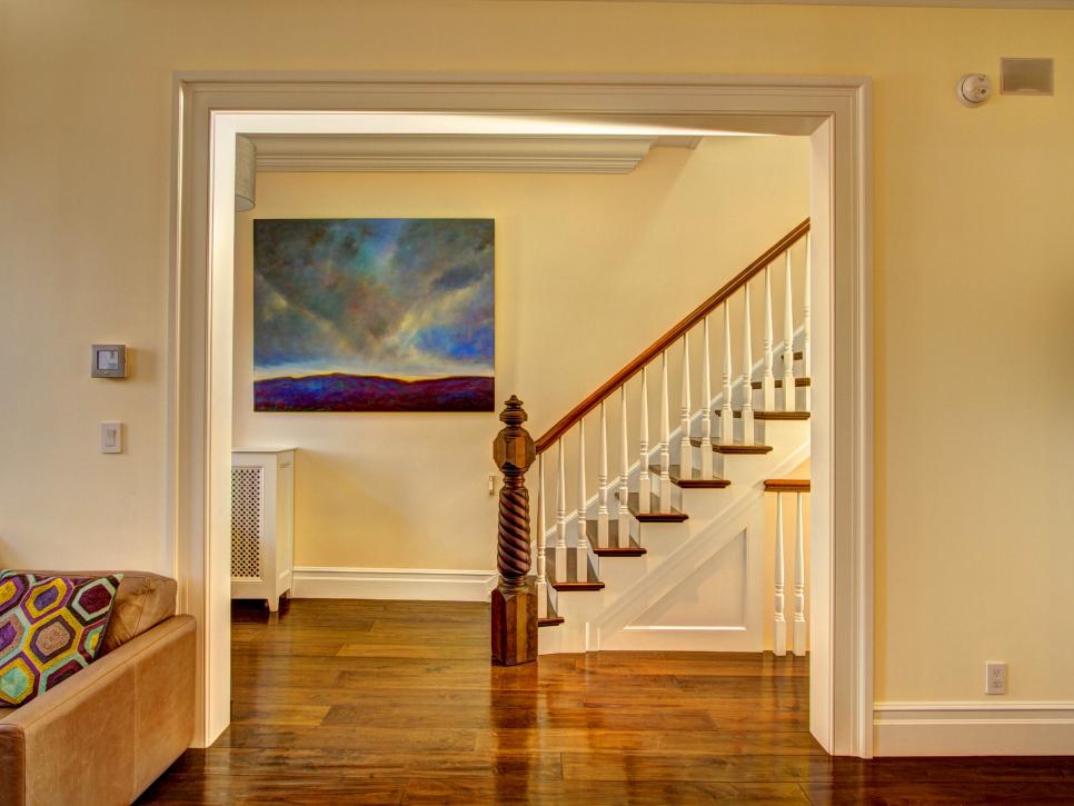
Renovating an old house brings up questions of how much of the original details should be preserved. There is no clear wrong or right answer to this, and it’s really a matter of taste. Some owners choose to preserve everything and try to bring a house back to its original state, while others choose to rip out everything and treat what’s left as a blank canvas. We worked closely with our client to find a perfect balance between the old and the new with the goal of creating a home that reflected the aesthetic tastes and functional needs of this family. This particular client wanted to keep some of the traditional touches, but also wanted to brighten up the house with clean modern lines while also maintaining warmth. We replaced the original casings around the doorways with a simpler profile, because the intricate details of the original didn’t fit in with the new cleaner, modern lines. However, we worked carefully to preserve the original tin ceiling. We rebuilt the main stairway but reused the original intricately-carved newel post. We replaced the wood flooring but used hand-planed 8” wide antique wood. We designed a new fireplace mantel with simple clean lines but used traditional materials such as marble and slate. Pulling together these divergent details into a coherent design was the challenge, and we really enjoyed the process of working closely with our client to find just the right balance. We believe it’s very important to understand the clients’ goals and help them realize their vision. Clients come to us with vague notions of what their goals may be, and our job as architects is to help them synthesize a bunch of separate ideas into a coherent whole.
What are the hidden gems that make a big difference?
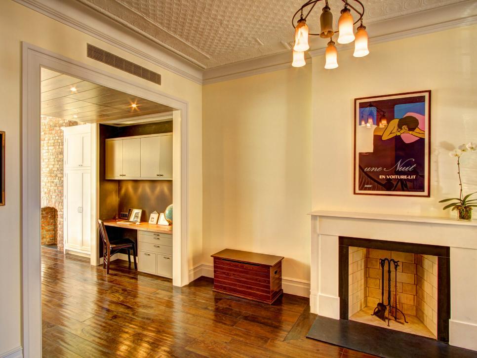
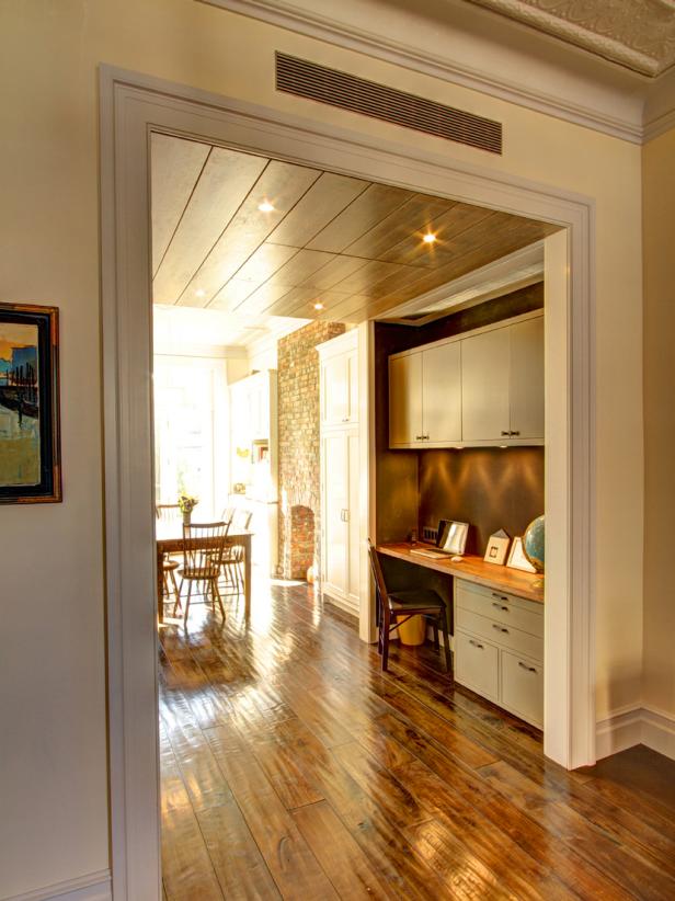
One of our favorite spaces in the house is the oak-paneled niche between the living room and the dining room. The walls and ceiling of this transitional space are paneled with 10”-wide rift cut oak that’s stained a bluish-gray. While the niche space may have more of a modern feel compared to the rest of the house, the wood brings warmth to the space and fits in quite beautifully with the rest of the house. Besides adding visual interest in the middle of this deep house, the niche is also a functional space that houses a bulletin board and desk area where the family can keep track of their busy schedules.


