


15 Designer Tricks for Picking a Perfect Color Palette
Our insider tips will make it easy to fill every room in your home with color.
Pick a Color, Any Color
If only choosing a color palette for your interiors was that easy. Well .... actually, it is! Our palette-perfecting tips explain the color rules that designers follow and make it a snap to put them to work in your home.

Photo By: Tobi Fairley
Take a Cue From Your Clothes
Most people buy clothes in colors they like to wear and they look good in. Similarly, you should dress your rooms in colors that flatter you. If denim is your go-to, consider a navy sofa or if you look (and feel!) perkiest in bright yellows, try mixing in a few citrusy accents with pillows or accessories.

Photo By: Kathryn MacDonald © Photography by Kathryn MacDonald
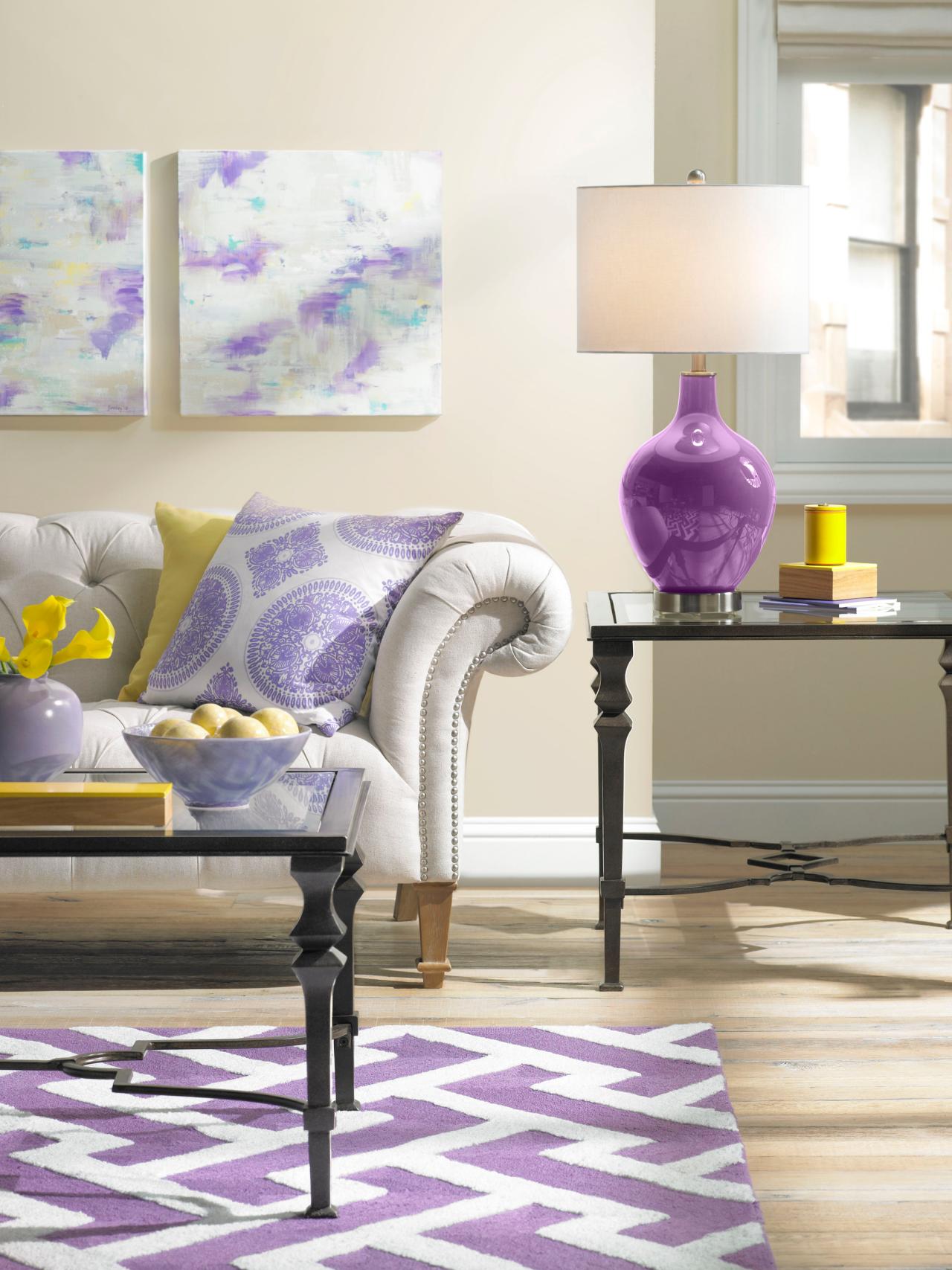
Use the Rule of 60-30-10
"When decorating a space, divide the colors into components of 60 percent of a dominant color (walls), 30 percent of a secondary color (upholstery) and 10 percent of an accent color (accessories)," advises desginer Mark McCauley. "Works every time!" he says. "This ratio ensures that the colors are properly balanced and there's just enought pop for interest."

Photo By: Judith Balis
Make Small Spaces Pop
If you have a small room in your house, don't paint it white to make it seem bigger. Instead, give it more oomph with a look-at-me color choice. Let your big rooms expand with light, and your small rooms envelop you.

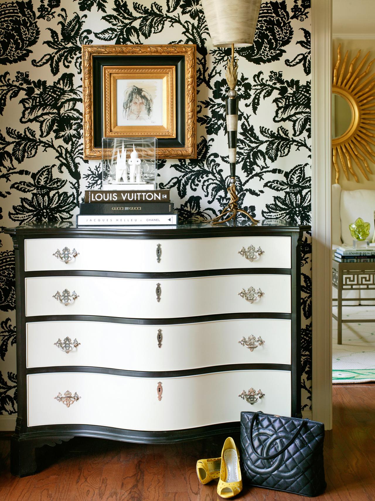
Rely on a Timeless Pairing
Always chic, black + white is one dynamic duo that never goes out of style. Here, designer Tobi Fairley proves that the two colors, accented by just a bit of metallic gold, are all you need to create a compelling color story.
Photo By: Nancy Nolan
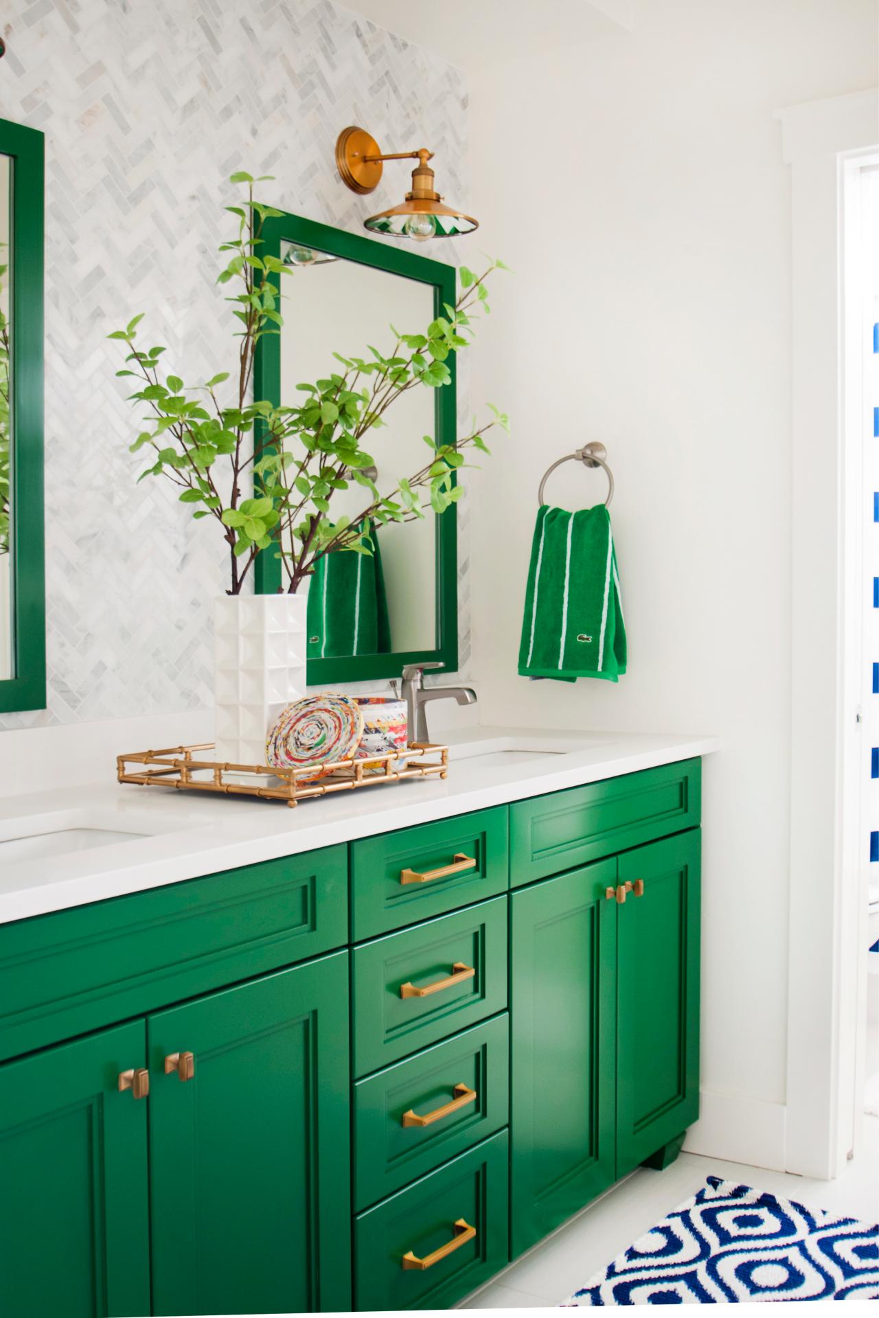
Rock a Monochromatic Look
Shine the spotlight on your favorite color by filling a small space, like a bathroom, with just that hue. Here, designer Judith Balis created a cheery master bathroom featuring the preppy color Kelly green. Balanced with white walls and floors, the saturated shade is eye-catching but not overpowering.
Photo By: Allison Corona Photography, Let It Shine Photography, Doug Petersen Photography
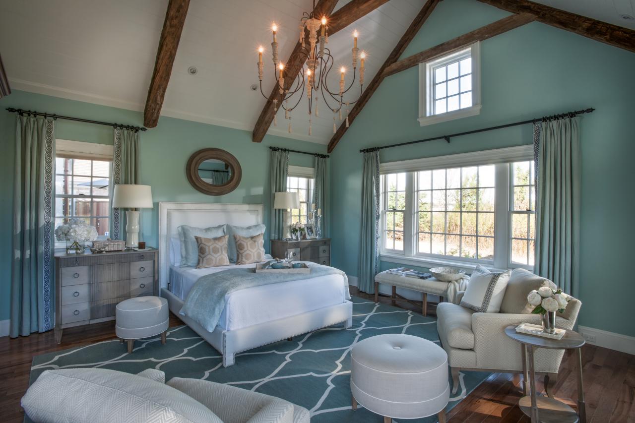
Follow the Rule of Three
Limiting your palette to just three colors is a can't-miss strategy in any space. In this cheery bedroom, saturated shades of sunny yellow, navy blue and grass green feel fresh, preppy and always on-trend. HGTV Magazine shares more ideas for pushing color boundaries.
Photo By: Mark Lohman (styled by Heather Chontos)
More from:
Do's & Don'ts of Design


Related Pages
- 10 Tips for Picking Paint Colors
- Best Colors to Paint a Kitchen
- 40 Living Room Color Palettes You've Never Tried
- Color Rules for Small Spaces
- 6 Perfect Color Palettes
- How To Pick Your Perfect Colors
- What Color Should You Paint Your Front Door?
- What Color Should You Paint Your Exterior Trim?...
- 68 Inviting Home Exterior Color Palettes