


Designer Secrets: Color Finds for HGTV Dream Home 2016

All About Balance
To keep spaces light, airy and neutral, pare vibrant colors back by layering in just a few shades to add energy but keep the space balanced.

Photo by: Flynnside Out Productions
Flynnside Out Productions
Anytime you read a post online that features a space enveloped in vibrant color, it's likely to warrant dozens or hundreds of comments, most of them disapproving. Why? Well, color is very personal and everyone responds to it differently.
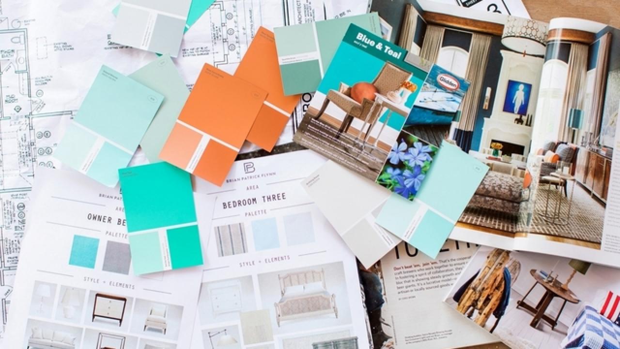
As a color-embracing interior designer whose work ends up online almost weekly, I avoid the comments sections altogether because interiors are subjective and there is no way that one space is going to appeal to every single person. And while I may opt for my own living room to be covered floor to ceiling in Yves Klein Blue lacquer and to paint my floors ultra-white, that may not make sense for a family with six kids and three dogs.
Creative Color Tips
See All Photos

When it came down to designing the HGTV Dream Home 2016 in Merritt Island, Florida, it was very important I keep in mind how people respond to color and how it works with all different lifestyles since I have no idea who is actually going to live in this house once it's given away.
Behind the Design
Interior designer Brian Patrick Flynn takes us through the creative process for the ultimate Floridian escape, from picking fabrics to creating a vision.
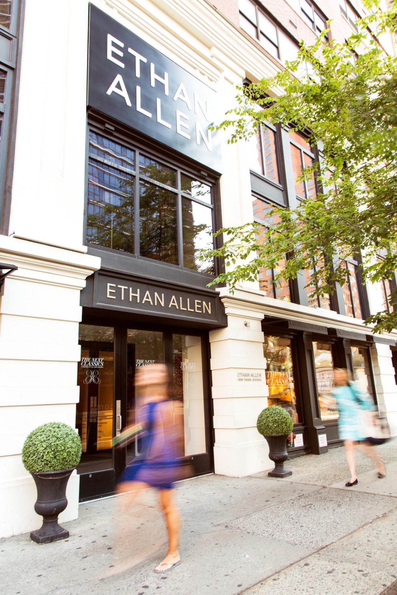
When my colleague Ashley and I headed to New York City to source furniture, lighting and rugs from Ethan Allen in Midtown, we had an overall idea of how color would factor into the home's design, but stayed flexible to ensure a mix of fresh neutrals, high energy hues, soothing spa-like tones and a clever play on Floridian palettes.
From a use of classic gray and punches of poppy coral to antique finishes on furniture, take a look at how we colored ourselves happy without needing a serious color detox. Balance, my friends, it's all about balance.

Early Morning Appointment
Keep in mind that the earlier you shop, the more likely you are to get top-notch service. I like to call a day or two before shopping to see if there will be an in-house design professional available to book an appointment with. A simple call ahead may result in having a store associate pre-select and lay out options in your planned palette.
Photo by: Flynnside Out Productions
Flynnside Out Productions
Something that's simple, yet important when power-shopping for your home is to wear the proper shoes. Seriously. Being stylish is great and all, but if you're going to be walking for 10 hours and making decisions on the fly, wear sensible shoes.

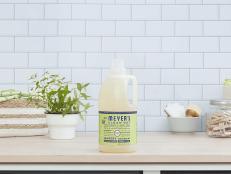
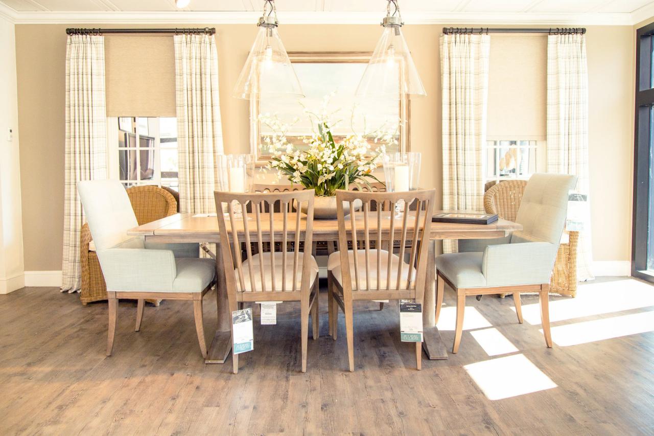
New Neutrals
“New neutrals” are colors that have enough gray undertones to render them washed out and more on the neutral side but still retain a sense of personality. Blue-gray and “greige” (a mash-up of gray with beige) are both ideal options that work with different levels of taste and different design styles.
Photo by: Flynnside Out Productions
Flynnside Out Productions
Also, keep in mind that the earlier you shop, the more likely you are to get top-notch service. I like to call a day or two before shopping to see if there will be an in-house design professional available to book an appointment with. A simple call ahead may result in having a store associate pre-select and lay out options in your planned palette. This tactic can save hours of searching so it's worth the time to pre-plan.

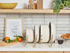
Washed Out and Casual
Color can be made less intimidating depending on how it's applied to furniture. Antique and aged furnishings infuse color without being too bold.
Photo by: Flynnside Out Productions
Flynnside Out Productions
There is really no way I'm ever going to be able to fully embrace space with beige on beige on beige. There has to be some sign of personality in a room to draw someone into it. That's why I'm into "new neutrals", which are colors that have enough gray undertones to render them somewhat washed out, understated and more on the neutral side. My favorite new neutrals, which seem to work with all different levels of taste and different design styles, are blue-gray and “greige”. It's a mash up of gray and beige.
Pops of Yellow

High-Energy Hues

High Energy Hues
Just a few touches of color amidst a soft, understated background can add a burst of energy that's colorful but not overwhelming.
Photo By: Flynnside Out Productions
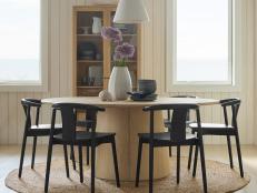
Test Bold Colors in Secondary Spaces
If you’re wary about trying bold colors in main spaces, try applying muted tones in the primary spaces and bolder colors in more private spaces like bathrooms and guest bedrooms. This way you retain pops of personality while keeping it isolated from other spaces that draw more traffic.
Photo By: Flynnside Out Productions
If you want a few spaces to be bright and happy, but you worry about becoming tired of them, try this rule: Muted tones in the primary spaces, bolder colors in the private spaces.
I decided to go with grays, blue-grays and washed out woods for the main spaces at HGTV Dream Home 2016. These colors are forgiving so they're a perfect fit for active homeowners with active kids and pets, plus there's just enough color for the space to feel more personalized, and the selected colors won't detract from the house's view of the water, which is its most spectacular feature.
For example, the canary yellow accents in this living room are fantastic; however, if you have commitment phobia when it comes to color, why not apply that hue to a space where you only spend a few waking hours per day like a bedroom, bathroom, laundry room or hallway?
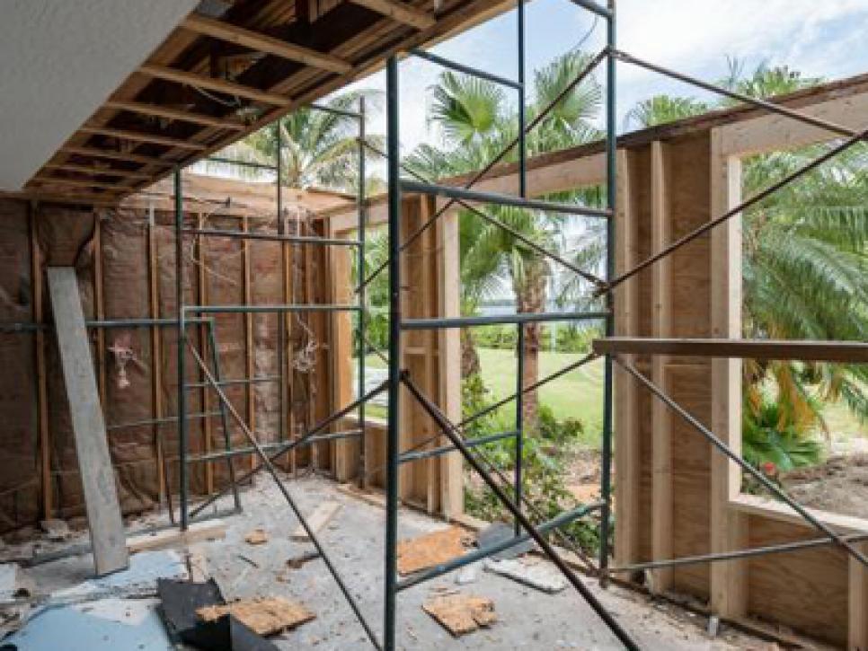
Beauty Behind the Build
See All Photos


A few bold-colored pieces of furniture in a bedroom can instantly elevate it to another level. All you need is one or two key pieces and you've got tons of personality, but it's isolated from the other spaces where you spend most of your waking hours.
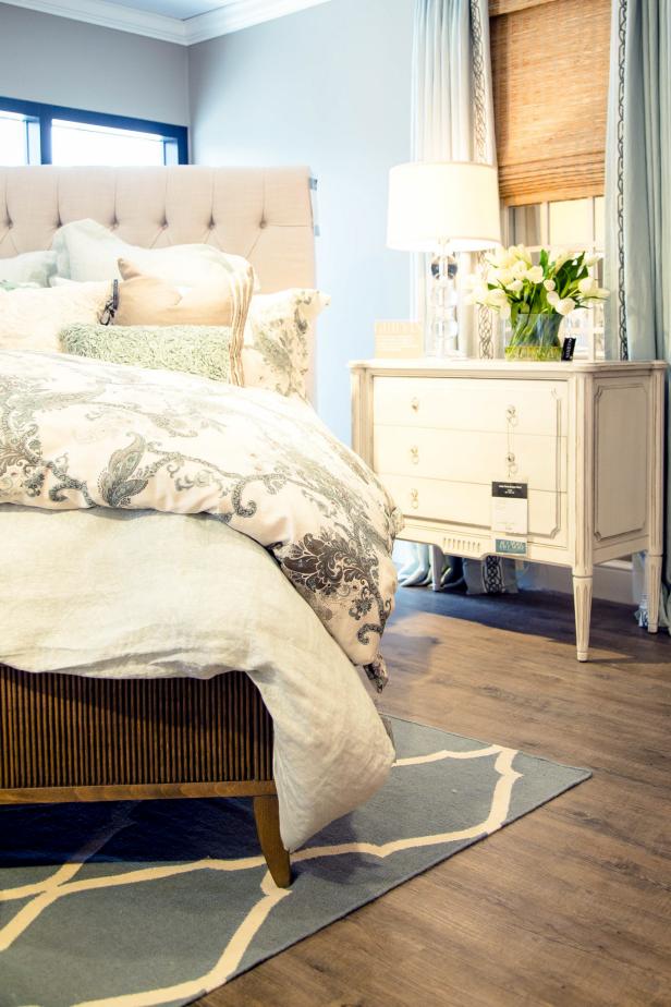
Photo by: Flynnside Out Productions
Flynnside Out Productions
Color can also be less intimidating depending on how it's applied to furniture. For example, many of the chests, dressers, tables and consoles we're using for the house have painted finishes in bold colors. But since some are antiqued and aged, they're knocked down a few levels of intensity, making them less overwhelming in the space.
The chest (above) was available in several finishes, some in vivid hues, but we opted for an antiqued white, which isn't as bright as a ultra-white and therefore infuses color without being too bold.

New Spin On Cliche Colors
For the HGTV Dream Home 2016, interior designer Brian Patrick Flynn is taking a more subtle approach to popular Floridian colors with blue-grays, washed out turquoise tones and isolated jolts of Terra-cotta and coral.
Photo by: Flynnside Out Productions
Flynnside Out Productions
A lot of interior designers go out of their way to stay clear of any clichés in regards to certain styles of architecture or locations of homes. Although HGTV Dream Home 2016 is in Florida, it's being outfitted with a unique approach to Floridian color.

Photo by: Flynnside Out Productions
Flynnside Out Productions
While coral, salmon, sea foam and turquoise are popular colors for Floridian interiors and exteriors, a subtle approach was taken with blue-grays, washed out turquoise tones with isolated jolts of terra cotta and coral, just like the exact shade of coral seen here in my pants. I'm pretty much wearing the palette as I look at swatches.
If you're open to bolder colors in the main areas of your home, here's a way to introduce them in a more toned-down, well-edited manner. First of all, it's all about layering different shades and tints of the same color to keep the space from looking too monotonous.
Tone Down With White

Try Coral and Terra Cotta

Tone Down Bold Colors
In a space infused with bold colors, dial down the intensity by introducing large and small doses of white.
Photo By: Flynnside Out Productions
Photo By: Flynnside Out Productions
Let's say you're all about salmon, but are worried it will look nuclear. Bring in salmon with one bold shade that's more muted and another that has shades of a different color in it, like a cross between salmon and orange (terra cotta). The mix of colors will help add depth and also calm one another down.
To take the intensity down even more, introduce large and small doses of white. This will take the look from being in your face like a screaming loud version of coral to an approach more like, "Hey, my name is salmon, and it's nice to meet you. Sit down and share a cup of tea with me."
Ethan Allen fully furnished the HGTV® Dream Home 2016. Shop the looks you love at ethanallen.com. Or visit your nearest Ethan Allen Design Center to start living the dream today—their design pros can show you how!


